cancel
Showing results for 
Show  only  | Search instead for 
Did you mean: 
JMP is taking Discovery online, April 16 and 18. Register today and join us for interactive sessions featuring popular presentation topics, networking, and discussions with the experts.
Choose Language Hide Translation Bar
Graphical output options using JMP

The best way to make an impact when sharing your statistical discoveries is with compelling graphical output – an area where the data visualization paradigm of JMP is ideal.


Graph Builder Contour Plot with ColorsThis four-part blog series will look at some of the options you have for exporting your visualizations created in JMP to graphic files that are ideally suited to your needs.


This first article will look at the graphical output options that are available. The second will focus on preparing graphics created in JMP for publication. The third will be a step-by-step video tutorial that explains the output process. Finally, in the fourth installment of this series, I’ll highlight some exciting options that will be available in the upcoming release of JMP 10 regarding graphical output. You won’t want to miss that!


JMP has many options for taking the visualizations generated in various platforms and saving them for use in other media – whether that is a report, Web page, print document or presentation.


Because the goals for these different output destinations are varied, it is important to understand the options for graphical output in JMP and to know which file types are most appropriate to your output destination.


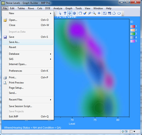
JMP makes it easy to save a figure using the selection tool. Just select the part of the graphic that you desire to output from JMP and then click on File -> Save As. This is shown in the figure below: The elements highlighted in blue will be output to a file when you save them. You can save the selection within a report that you choose to highlight in a variety of graphic output formats.


Options for saving graphical output in JMP


These include:


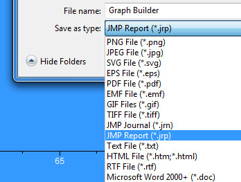
Additionally, you can save the selection as a JMP Journal, JMP Report, text file, HTML File, RTF File or a Microsoft Word 2000 + File. Since we are going to assume for the sake of this article that you are interested in using the output in something else (whether that be a report, presentation or print document), we will concern ourselves with the options for standard graphical output listed in the above list. In the figure below, you will see the options available when you select Save as type in JMP.


The File Output Menu in JMP


There are generally two file formats that I output my graphs from JMP in. The first is a .tiff file, and the second is a .eps file. I use the .eps files for any graphics that will need to be printed at a high resolution. I will explain why I choose this format over the other options in the second installment of this blog series.


The details of each file format is outside the scope of this overview article, but there are basically two types of graphical output formats: scalable, vector formats and fixed-scale, bitmap formats. Files saved as .png, .gif, .jpg and .tiff are bitmap formats that are either lossy (.gif or .jpg) or lossless (.png and .tiff). Lossy means that the file format is compressed to minimize the data storage requirement of an individual file at the expense of discarding some of it. While a .jpg image saved from JMP might be 29 KB, a .tiff image of the same dimensions might be 336 KB, or 11 times larger in size.


This size differences becomes an issue when you are outputting files for display in a presentation or online. You can run into memory issues quickly if you have users trying to look at a Web page that has multiple uncompressed files.


Vector images can be scaled to any size without a loss of clarity because they rely on math equations to render the image based on the intended size and resolution. This will become an important concept when we look at creating documents for print in the next installment of this series.


The problem with using vector images like an .eps is that it cannot be displayed by any Web browser – because that image file type is not supported. Certain vector image formats are supported by Web browsers – the .svg format, for example.


In general, as I mentioned earlier in the article, I like to output any graphics that are destined for a Web page, presentation or computer screen in the .tiff file format. Because .tiff saves the graphic in a lossless format, I can tweak the output look of the graph in any third-party image editing software and save the result as many times as I need without any further degradation of the image file. When I am happy with the result, I can save the image in a compressed format, like a .jpeg and then place the final image file in a presentation or on the Web.


These output options are what I have found to work best for me, but I encourage you to try some of the other file formats as well and experiment.


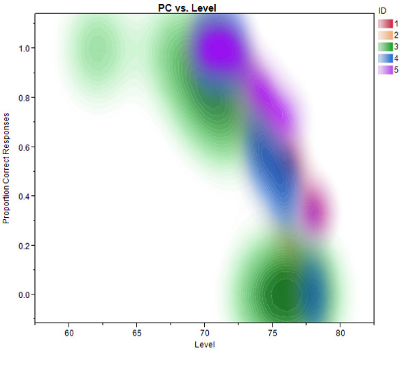
P.S. For those of you wondering about the data presented in this blog post – I made this plot in the Graph Builder platform of JMP. Graph Builder makes it very easy to drag and drop variables and change the visualization type that is displayed. In this case, I’ve chosen a Contour Plot for this data set.


What we are looking at is an experiment where I collected how well subjects were able to repeat back sentences played over headphones at the same time a masking background noise was played at various levels. I was interested in collecting a threshold for a specific level of performance – in this case, that signal-to-noise ratio (fixed level of the speech – the level of the noise) required to get 3/5 keywords correct 71% of the time. But in the process of collecting those thresholds, I also have access to the trial-by-trial data of how the subject arrived at that threshold (the noise is started at a low level and then gets progressive louder based on fixed decision rules – 2 correct answers and the noise increase, 1 incorrect answer and the noise decrease. These rules converge on the signal-to-noise ratio required for 71% correct criteria).


The individual trials for each subject shown in a different color gives me a nice sense of the slope of performance decline as the listening conditions get progressively harder. What you can see in the first figure is that when the noise level is low, the subject is performing close to 100% correct; as the noise level gets louder, performance at the task declines steeply to the point where the subject is unable to identify any words in the sentence correctly. Using the Contour Plot in Graph Builder is an excellent way to visualize this performance data across multiple subjects to see if I had any outliers, and also the concentration of trials at different noise levels.

Last Modified: Jan 20, 2017 10:26 AM
Comments
WP_Comment
Visitor

MS wrote:

Can you share with us if these improvements also make it into the Mac version of JMP 10? The graphics export options is limited and more difficult to use on the mac in comparison with JMP 9 on Windows. Thanks!

WP_Comment
Visitor

Daniel Valente wrote:

Hi -

Thanks for the comments. While there are more output file type options in JMP software for the Windows platform, Mac systems do have the option to output both uncompressed raster graphics with the .tiff file extension as well as vector images in the .eps format. The trick is to just journal the results first (selecting what you want to output) and then click File -> Export, and then pick .eps or .tiff. I'm going to be showing a step-by-step video demo of the process coming up, on the Mac, but if you have any other questions, feel free to email me.

WP_Comment
Visitor

Dave wrote:

Slightly OT - but I have had problems putting tiff in to PP on the Mac (off 2008) because it gets compressed and that compression is not supported on the Windows PP.

It is a problem when you do not take the Mac to the conference :(

I do not think eps is suported in PP/Mac so is png the best alternative - or should PICT be considered.

Can JMP/ mac create PICT? I think I did not see it. I am using JMP 9.

thanks, it is a good subject and I look forward to the other articles.

BTW is it possible to crop the contours - because shading out 0-1 looks a bit weird...

(logit transforms for axis settings ;)

WP_Comment
Visitor

Dave Garbutt wrote:

Sorry part II of my name got lost somehow...

WP_Comment
Visitor

Daniel Valente wrote:

Dave -

The other option if you are using PP is to directly copy and paste graphs into your presentation. If you use the grabber tool to select the graph you want, and then copy and paste it into your PP presentation, you'll avoid the above mentioned .tiff problem when presenting on a Windows machine. I also just verified this, but you are able to drag in .eps files into a powerpoint slide (testing with Microsoft PP on the mac). If you save a graph out as an .eps file and then drag it on to a slide you'll have it in a format that can be easily resized without any loss of clarity.

WP_Comment
Visitor

Preparing print-ready graphics that look great using JMP - JMP Blog wrote:

[...] Note: The first part of this series was "Graphical output options in JMP." tags: bitmap image, eps, JMP for publication, JMP graphics, png, print-ready images, vector image [...]

WP_Comment
Visitor

Print-ready graphics from JMP: Step-by-step video tutorial wrote:

[...] you missed the last two articles in the series, check out the articles on "Graphical output options using JMP" and "Preparing print-ready graphics that look great using [...]

WP_Comment
Visitor

Ping Hsu wrote:

Upon performing survivorship analysis, the output has product limit survival fit and survival plot. By using EDIT--Select, we can Copy and Paste the output to WORDS. But we do not see the Save As as you described in this blog.

Do we miss something? Your assistance guiding to do as you described would be appreciated. Our goal is to obtain eps file.

PH

WP_Comment
Visitor

Dan Valente wrote:

Hi Ping -- are you using JMP on a Windows or Mac OS? If you are using a Mac, the way to save .eps files from JMP is a bit different. Use the selection tool and highlight the part of the JMP report you want to save as an .eps file, then journal the results. To save the file correctly on a Mac you have to use FILE->EXPORT->IMAGE->EPS. This will save the graph in the proper .eps file format that you are looking for. If you see my video: "Print-ready graphics from JMP: Strep-by-step video tutorial" (Linked above), I go through this procedure on a Mac version of JMP.

WP_Comment
Visitor

Print-ready graphics from JMP revisited wrote:

[...] Graphical output options using JMP [...]

WP_Comment
Visitor

Ping wrote:

Hi Dan,

Thanks for the reply using MAC. But we are using JMP on Window 7. What would be the solution under such setting?

Ping

Daniel_Valente
Staff

Daniel Valente wrote:

Hi Ping - if you see my post "Print-ready graphics from JMP revisited", I show the procedure for saving graphics in the .eps file format on a Windows 7 machine. You would follow the same steps outlined in that video.

WP_Comment
Visitor

Curt Pollman wrote:

Hi, Daniel -

I am using the Mac OS and both JMP 9 and 10. With both JMP versions, when I select the part of the graph I want to output to another program as an .eps file (using FILE->EXPORT->IMAGE->EPS), the file that is created includes the entire JMP graph window, and not just the part of the graph I selected. This seems like a bug. I know that a workaround is to paste the eps file into a graphics program and crop the image to include just what I want, but it seems like the export function from JMP should generate a file that includes only that part of the image that I selected.

Daniel_Valente
Staff

Daniel Valente wrote:

Hi Curt,

Thank you for the comment. I normally just grab the graph parts that I want my final graph to be using the Selection tool (fat plus) and then journal the results (CMD-J). From that journaled result, I will go ahead and save out the .eps file (File -> Export -> Image -> Format:.eps). This assures that I only have the graph that I want in the .eps file and nothing more. It also means a lot less post-processing work after the .eps file has been saved. This workflow has always worked for me, but if you need more information on the behavior you are seeing, I suggest you please contact our tech support.

-Dan

WP_Comment
Visitor

Gerulf Rieger wrote:

Dear Dan,

These are great explanations. I have a question related to the above and I hope you have advise.

I am working on a Mac and have been holding on to an old version of JMP (5) and and old version of PowerPoint (2004) until very now for one reason: With these versions I can paste JMP graphs into PowerPoint and then convert them into Microsoft Drawing Objects (by un-grouping the objects). This allows further editing of each line, which is a huge advantage for presenting graphs. With later versions of these programs I could not find a way of doing this. However, sooner than later I need to give up the old versions.

Following your discussion, I have exported (in JMP 10 for Mac) a graph into EPS format, and inserted this format into Powerpoint (2011 for Mac). I have read somewhere that with Windows, you can then ungroup them and modify the graphs as needed. It seems that on the Mac this is not possible, though.

Do you have any advice? Basically I would like to be able to edit each dot and line of a JMP graph, once in PowerPoint, may it be through un-grouping the object or by other means.

Thank you,

Gerulf

Daniel_Valente
Staff

Daniel Valente wrote:

Hello Gerulf --

You are following the right workflow. And when you import your EPS files into Powerpoint, you are getting nice vector images in that can be resized or scaled without losing quality. However, I do not believe, (as you have stated) that you can't edit the individual components of the vector file, once it is in Powerpoint (at least on the Mac version). Being able to edit each dot and line on a JMP graph is the exact reason I like outputting my graphics in a vector format. As far as advice, I can tell you what I do. If you output a graph as a vector and then open in a vector editing software (Like Adobe Illustrator), you can ungroup everything, edit all the lines and points, and then save out as a vector PDF to insert into to your Powerpoint presentation.

I do know that this requires adding another piece of software to your workflow, but it affords you great flexibility in how your modify your raw output graphs into the custom graphs you need for your given presentation.

I will say that new versions of JMP do have a multitude of ways to modify and customize your graphs before outputting them from the software. Often, I find myself now getting the graph the way that I want it in JMP, then outputting the file and importing to Powerpoint as a vector PDF with no further modification needed. And the nice thing is that in JMP, all the customizations can be either saved to the preferences or saved as a script, so that if you need to re-output your graphs, you don't need to spend the extra time customizing the graph again in the vector editing software.

WP_Comment
Visitor

Florence wrote:

Hi Dan,

I'm using JMP11.1 on a Mac OS X 10.7.5. I created a Scatterplot 3D that I want to save as an .eps file to use in adobe illustrator. I watched your tutorial and did what you explained:

-I selected the graph with the fat plus (only the space outside the graph becomes blue even though I tried a million times),

-I created a journal using CMD + J,

-I exported the journal as an .eps image file.

When I open the file in illustrator I get an empty graph with a legend but no axis nor data points.

Should I be selecting the scatterplot a different way?

Thanks for your help!

Florence

Daniel_Valente
Staff

Daniel Valente wrote:

Hi Florence -- on the Mac, try using the workflow I described in a follow-up article. Basically, use the Selection tool (S), copy (CMD-C) and open the Preview app. Then paste from clipboard (CMD-N) and save. This will create a PDF of the output. However, with the Scatterplot 3D, or any output that is created using openGL, the output will not be a vector image. This is why you are seeing a blank canvas when you try to output as a EPS file. On our learning library, we have a new one-page guide for outputting publication graphics on the Mac that you may want to check out that describes this workflow in more detail.

WP_Comment
Visitor

Rabia El-hawaz wrote:

Hi, I have the same problem with the surface profile and I am using JMP 10. How I can save it as a tiff file with high resolution 300 and up? I fallow what you did with JMP 11 but it did not work. Could you help me?

Daniel_Valente
Staff

Daniel Valente wrote:

Hi there -- You may want to read my article on output options for graphics in JMP 10. This has details about saving 300 dpi raster images, which can be in the .tiff format as you desire. The issue with the surface profilers (and other objects, which use OpenGL) is that they do not output in higher resolution like other plots in JMP. As a result you get a 300 dpi-sized file, but it's just enlarged in a lossy way. The best workaround is to increase the size of the Surface Profiler, increase the font size, and increase the line widths and then output. This way you have the highest quality graphic coming out of JMP. So step one would be to resize the Surface until it takes most of your screen. Then right-click and click settings. Increase the Text Size and the Line Width. Then use your selection tool to select the surface. Finally edit > save selection as and output as a .tiff file.

jehangirkhan
Level I

hi how i can de describe or analyze the following fig.

thank you