Welcome back to Analytics With Confidence. In this series, I am exploring the key to success with modern data analytics: validation. In the first post, I talked with Ron Kenett and Chris Gotwalt about the need for generalisability. In this post will see the problems with models that do not generalise. To do this, we need to hack our way around the protections in JMP that prevent you from “overfitting” models.
Reaction Recipes – A Case Study from Science and Engineering
Let’s make this real with a case study about investigating thousands of variations on a recipe for making a high-value chemical product [1]. The reaction requires five critical ingredients:
 Reaction schematic hand-drawn by me . Don't worry if you are not a chemist - the important thing is there are lots of different possible recipes.
For each of these there are several variants to choose from: four electrophiles, three nucleophiles, 12 ligands, eight bases, and four solvents:
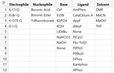
This means that there are 4608 possible recipes (4 x 3 x 12 x 8 x 4). What combination of ingredient choices will give us the highest yield (the most complete conversion to the final product)? Why? The “best” ingredients might be too expensive or undesirable for safety or environmental reasons, and there may be other options that give could give us similarly high yields.
We have data to help us answer these questions. We have 150 of the possible recipes that have been tested and the % yield determined. Visualising these is a good start:
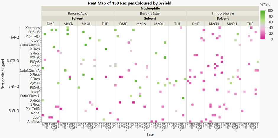
The recipes that gave a poor yield are in strong pink, and the higher yielding reactions are in green. The surrounding white space represents all the recipes that have not been tried. It’s not easy to see with so many variables, but Trifluoroborate nucleophile appears to result in lower yields (right third). The recipes using the other nucleophiles and 6-I-Q as the electrophile (upper left) are generally better.
Interactive distribution plots in JMP show what is common to the highest yielding recipes:

But it is still hard to see all the patterns between the inputs or “predictors” (in blue here) and the %Yield outcome or “response” (in orange) in a complex system like this.
A decision tree or “partition” analysis is the basis for some of the most popular machine learning methods for big data situations. The algorithm searches for the best way to split all the observations (recipes here) in two using one of the predictor variables. The “best” split has the largest difference in the average response between the two branches.
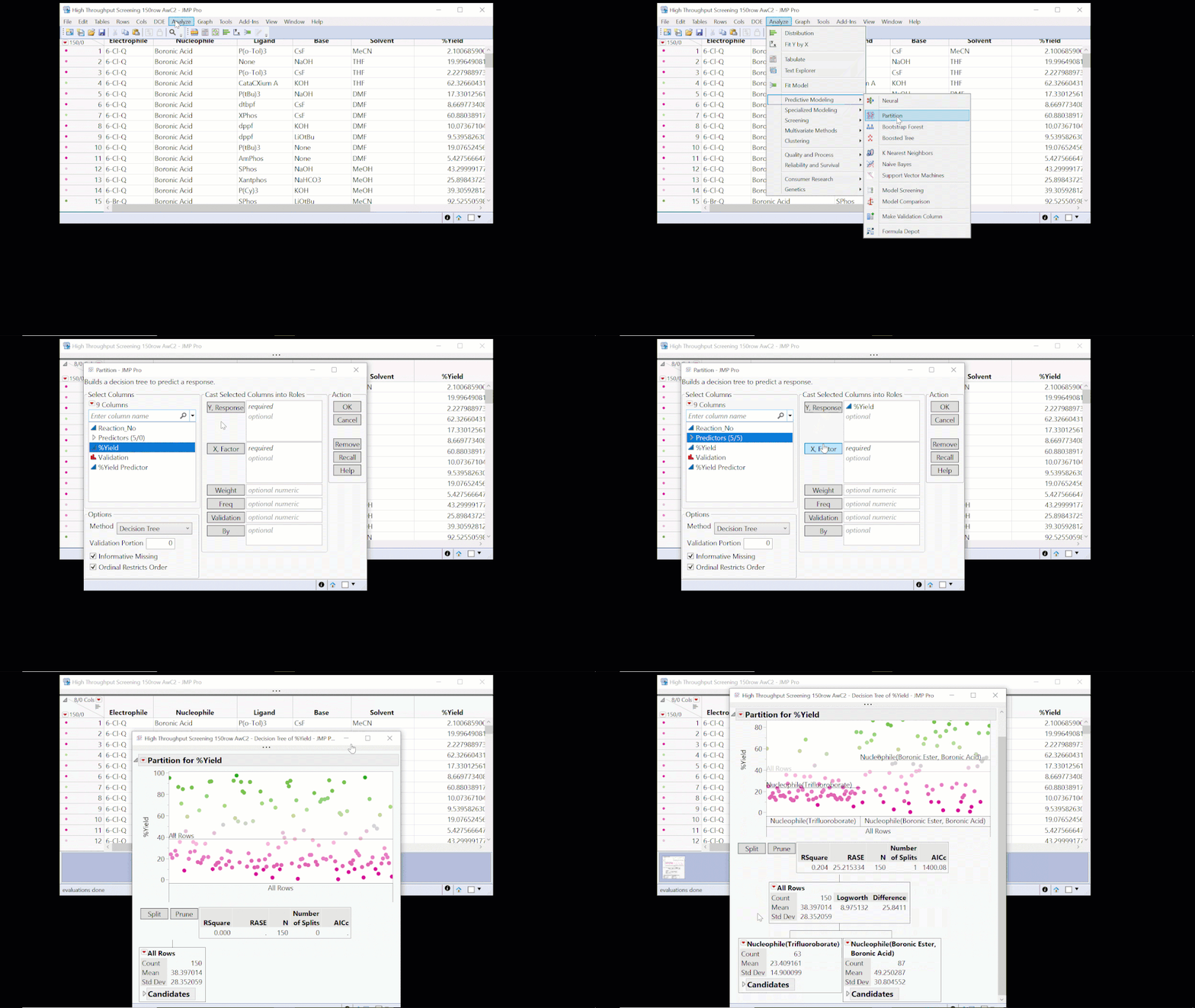 You can launch the Partition platform from Analyze > Predictive Modeling.
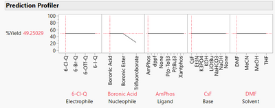
Here we find that the best split is on Nucleophile, with an average yield of 49.3% for the Boronic Ester or Boronic Acid, and 23.4% for Trifluoroborate. This tells us that choice of nucleophile is important but doesn’t give us precise predictions. If we use Boronic Ester or Boronic Acid, the model predicts a yield of 49.3%. From actual values in the visual above, we can see that we could expect yields anywhere in the range from 0 to almost 100%! And it tells us nothing about the effect of the other factors on the yield:
We can improve the model by repeating the partitioning algorithm on each new branch. The RSquare is a useful measure to track how the model “fit” is improving. It tells us how much variation in our response is explained by the effects of the factors in the model. The closer it is to 1, the more variation is explained by the model.
The RSquare increases from 0.204 to 0.442 with a second split. After 24 splits, it is 0.825:
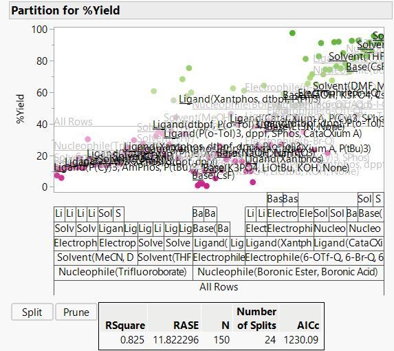
At this point JMP stops us from splitting further because we have hit the limit on the minimum split size of 5. This is one of the guardrails in JMP to prevent you from making silly models. For this example we will set the minimum size to 1 and keep splitting.
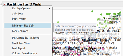 You can change the minimum size split from the red triangle menu.
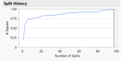
After 97 splits we can't split anymore, and the RSquare is 0.985, meaning our model captures 98.5% of the variation in yield. We can see how RSquare has increased with increasing model complexity with the Split History:
The model is now much more complex, as we can see from the prediction profiler:
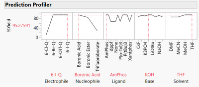
We could use the model to predict yield for recipes we have not tested to optimise the recipe and to understand how changing recipes affects the yield. We can infer which predictors are most important, and we can see how the factors interact with each other.
How good is this model?
We can see from the RSquare and the Actual versus Predicted plot that the model fits very well to the data. That is, the model mostly makes accurate predictions of the yields of the recipes that were used to train the model.
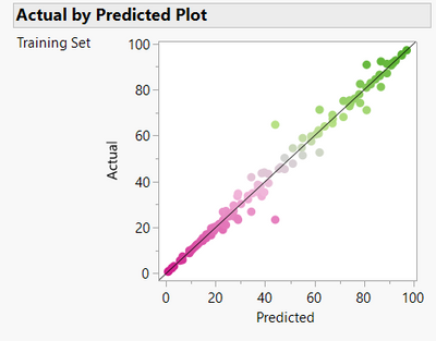
But does it generalise? Should we be confident about predictions for the recipes we haven’t tested?
In this case we can answer that question directly because all 4,608 possible recipes were executed using automated high throughput screening experiment. The 150 recipes we used were just randomly sampled by me from the full data as an illustration. The heatmap for the model predictions shows some similarity to the actual yields but also obvious differences.

The plot of the actual %yield of all 4,608 recipes versus the predictions of the partition model does not look very good:
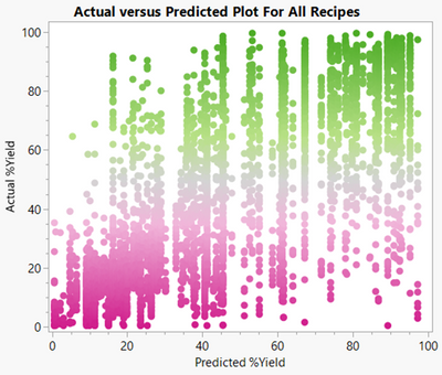
Oh no! The partition model predicted yields close to 100% for several recipes that actually had yields closer to 0 (lower right of plot). The RSquare is 0.5. Clearly this “overfit” model does not generalise well at all.
In the next post we will see how validation and some of the other tools in JMP Pro can help us build prediction models that generalise so that you can apply analytics with confidence.
Learn more:
[1] Data from Perera D, Tucker JW, Brahmbhatt S, Helal CJ, Chong A, Farrell W, Richardson P, Sach NW. A platform for automated nanomole-scale reaction screening and micromole-scale synthesis in flow. Science. 2018 Jan 26;359(6374):429-434. doi: 10.1126/science.aap9112. PMID: 29371464. The sampled and full datasets are attached as JMP data tables.
High Throughput Screening 150row AwC2.jmp
High Throughput Screening AwC2.jmp