 It’s common knowledge that a balanced diet of plants, good fats and whole grains is what our bodies need to function at their best. If we want to be good analysts, we need to fuel our gray matter properly, right? Well, our modeling projects need a complete set of nutrients, too.
This is part four of a five-part series where I am proposing a framework to help analysts who want to apply modeling to their work. This framework is aimed at addressing the common pain points I hear articulated as, “Which model outputs should I look at? There are so many!” and “What do they mean? What statements can I make from the numbers I see in the outputs?”
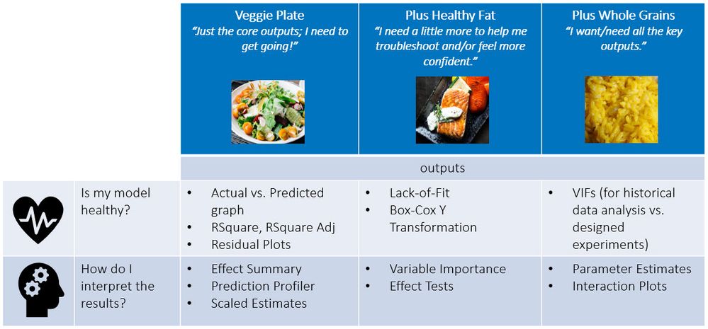
This framework is in the form of a menu (from a restaurant your mom would approve!) where you, the analyst/diner, selects outputs based on the complexity of your data and your disposition as an analyst (refer to Figure 1 below). Some analyses are straightforward and don’t require that you consider many modeling outputs, while some others need you to look at more options. Equally, some analysts need to move quickly with their projects or don’t enjoy getting into the statistical weeds, while others enjoy diving in head first and setting up camp :smiling_face_with_smiling_eyes: to look at their problem from many different angles.
When your analysis is straightforward, you may choose to just order the big salad or “Veggie Plate.” When the model needs a little more attention, you can add some salmon (“Healthy Fat”) to your salad. Finally, if you’re modeling historical data where a lot of the predictors may be correlated or if you want to look at additional data to tease out signals and get a deeper understanding, you can add a side of brown rice to your meal.
 Figure 1: Key outputs in Standard Least Squares. Choose your meal based on your appetite!
Check out post #2 and post #3 for details on the outputs in the Veggie Plate and Healthy Fat options. In this post, I am focusing on the Whole Grain outputs. We will start with the output that helps you figure out if your model is healthy when you are working with historical data. Next, we will look at the outputs that can further increase your understanding of the process and effectively communicate the findings with collaborators.
For each output, I will describe: 1) what the output is, 2) what you should be looking for and 3) the actions can you take, given the information. My goal has been to simplify but that, of course, comes at a risk of potentially oversimplifying. If you want to get a deeper understanding, I recommend the Statistical Thinking for Industrial Problem Solving course (see the end of the blog post for a recommendation on the specific modules).
Oh – and if you want to follow along and generate these outputs yourself in JMP, see the first blog post in this series where I describe the data set and how you can get access to JMP if you don’t have it.
Is my model healthy?
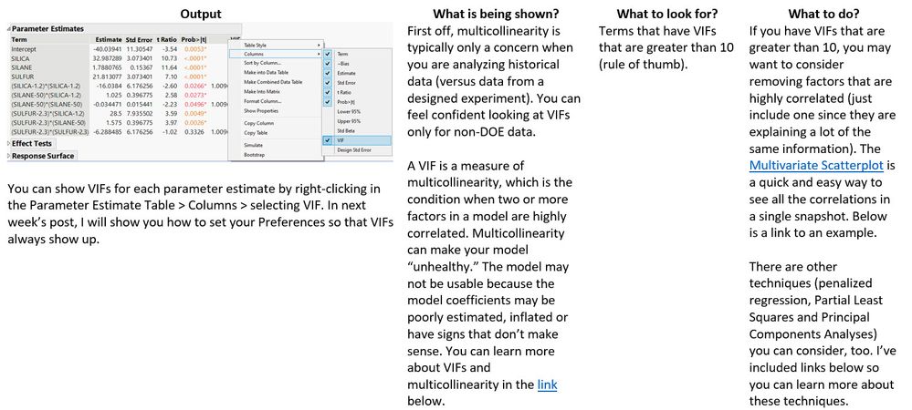
VIFs (variance inflation factors)

What is Multicollinearity? Why is it a problem?
Multivariate Scatterplot Example
Penalized Regression
Principal Components Analysis
Partial Least Squares
How do I interpret the results?
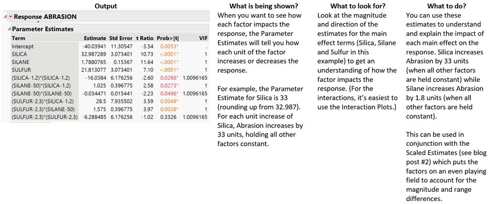
Parameter estimates

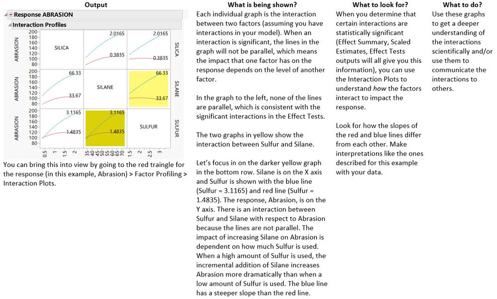
Interaction Plots

Summary
The Whole Grains outputs are the ones you go to when you are analyzing historical data or when you want to get additional views into understanding the process you are studying…just as whole grains are what you should add to your diet when you need the most fuel for that hard workout or busy day.
When you are analyzing historical data (versus data from a designed experiment), your predictors may be highly correlated, which can result in model bias – and ultimately drawing incorrect conclusions from your data. VIFs are a good way to diagnose if this is an issue you may be facing.
When it comes to interpreting and using your model, the Parameter Estimates can help you describe the degree to which a particular factor individually impacts the response; they also map directly to the model equation for those who want to see what’s behind the Prediction Profiler. Finally, the Interaction Plots can be a helpful way to picture how factors interact with each other visually in a single static snapshot.
Next week, in the final post, I will describe how you can set your Preferences in JMP so that certain model outputs always show up – regardless of the report Emphasis that’s selected in the Fit Model dialog.
I would be remiss if I didn’t remind you, one last time, to check out the Correlation and Regression and Design of Experiments courses that are part of the Statistical Thinking for Industrial Problem Solving course. If this blog series leaves you more curious about the underlying statistical concepts, this course will satisfy that curiosity. It has been designed specifically for scientists and engineers who want to better use data and statistics to advance their work.
You must be a registered user to add a comment. If you've already registered, sign in. Otherwise, register and sign in.