 If you have resolved to use models to solve more problems, this blog series is for you.
One of the biggest barriers I have seen from analysts who want to do this is that they are overwhelmed and/or confused with all the outputs they need to look at once they’ve built a model.*
In the first blog post in this series, I talked about how JMP’s default Emphasis is a good place to start when it comes to figuring out which model outputs to focus on. However, even with those default settings as a starting place, there are still many outputs that one has to prioritize and figure out how to interpret.
To help demystify and simplify model output interpretation, I have developed the menu in Figure 1 to help analysts focus on the key outputs based on how deep they want to go (or how hungry they are, so to speak) and to what extent the problem requires the extra attention (or “nutrition” :smiling_face_with_smiling_eyes:).
*We are focusing on Standard Least Squares modeling in this blog series because that is the most common type of model new users try first because of the accessibility in JMP (versus JMP Pro) and the ease of interpretation of the model equations back to the real world.
 Figure 1: Key outputs in Standard Least Squares. Choose your meal based on your appetite!
In this week’s post, I am focusing on the core outputs for users who are looking to move quickly with their analysis and decision making and whose data allows for the simplicity. This set of outputs are collectively referred to as “The Veggie Plate” in the menu because it’s always best practice to eat a healthy serving of veggies, right? They are staples for good health in humans just as they are staples for healthy and useful models.
If you want to follow along with the sample data set that I use in the screenshots, see the first blog post.
Is my model healthy?
Actual by Predicted
 ** Did you know that if you change your cursor to a question mark (Tools menu) and click on any output, you will be taken to the specific section of JMP documentation? Try it with the Actual by Predicted Plot.RSquare and RSquare Adjusted

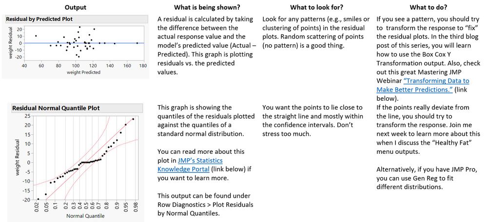
Residual Plots

JMP's Statistics Knowledge Portal
Transforming Data to Make Better Predictions
How do I interpret the results?
Effect Summary

Prediction Profiler

Four-Minute Video: Prediction Profiler
Scaled Estimates

Summary
I hope you found this post helpful in focusing in on the essential outputs to get you started on your modeling goals.
If the Veggie Plate outputs get you what you need to make decisions, it will probably make you a hero on your project team and you should go celebrate by eating a hefty serving of veggies! (Whomp! OK – maybe a sundae – all things in moderation, right?).
If you think your model may need more work or if you are just hungry to learn more, you can join me next week where I will describe the “Healthy Fat” outputs. This set of outputs will help you diagnose and remedy model fit issues and enable you to go a deeper in order to clearly communicate your results to others.
I invite you to stick around with me through this blog series. In the last blog post on Feb. 10, I will describe how you can customize your Preferences so that your favorite model outputs always show up.
P.S. If you are looking for foundational understanding, please consider taking the Correlation and Regression module of the Statistical Thinking for Industrial Problem Solving course (cheaper than any meal because it’s free!).
You must be a registered user to add a comment. If you've already registered, sign in. Otherwise, register and sign in.