- New to JMP? Let the Data Analysis Director guide you through selecting an analysis task, an analysis goal, and a data type. Available now in the JMP Marketplace!
- See how to install JMP Marketplace extensions to customize and enhance JMP.
- Subscribe to RSS Feed
- Mark Topic as New
- Mark Topic as Read
- Float this Topic for Current User
- Bookmark
- Subscribe
- Mute
- Printer Friendly Page
Discussions
Solve problems, and share tips and tricks with other JMP users.- JMP User Community
- :
- Discussions
- :
- time course data in microtiter plate format
- Mark as New
- Bookmark
- Subscribe
- Mute
- Subscribe to RSS Feed
- Get Direct Link
- Report Inappropriate Content
time course data in microtiter plate format
can anyone help me with the graph builder to build the time course data that are recorded using a microtiter plate reader?
I have read the post about microplate map thing. While that is for 2 dimensional data. With the time data, how one can define the map role data? Thanks
Accepted Solutions
- Mark as New
- Bookmark
- Subscribe
- Mute
- Subscribe to RSS Feed
- Get Direct Link
- Report Inappropriate Content
Re: time course data in microtiter plate format
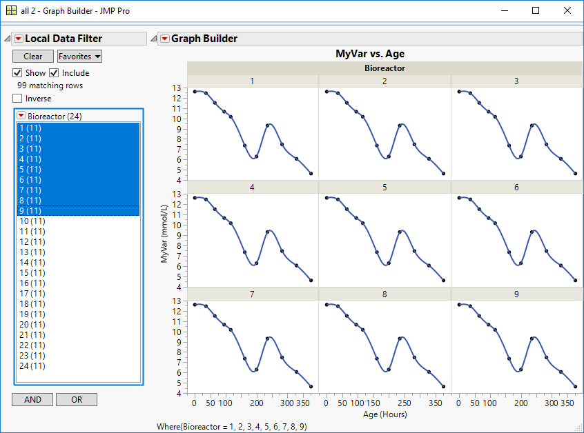
I'm not sure you need to use the map. I would just plot my variables versus time, wrapped or filtered by vessel
- Mark as New
- Bookmark
- Subscribe
- Mute
- Subscribe to RSS Feed
- Get Direct Link
- Report Inappropriate Content
Re: time course data in microtiter plate format
As I said before, you can use a local data filter with Graph Builder to animate the display with your time variable. Drop the data column with the well locations in the Map zone. Drop the data column with the responses in the canvas. This much is the same as the 'template.' Now click the red triangle and select Local Data Filter. Select the data column with your times and click Add. Change the interval to make it small enough to be and then either drag the interval or click the red triangle next to Local Data Filter and select Animate.
- Mark as New
- Bookmark
- Subscribe
- Mute
- Subscribe to RSS Feed
- Get Direct Link
- Report Inappropriate Content
Re: time course data in microtiter plate format
The answer depends on what you want to do with this data. For example, if you want to examine the change in the response over time while looking at the display of the microtiter plate, then you could use animation through a data dilter, which is set to filter on the time variable, and simply add a new column for time. Drag the column with the well location to the Map zone to get the shape. Drag the column with the response to the canvas to get the mean response. Now click the red triangle next to Graph Builder and select Script > Redo > Local Data Filter. Select the column with the time for the filter.
Does this example help or are you trying to do something very different?
- Mark as New
- Bookmark
- Subscribe
- Mute
- Subscribe to RSS Feed
- Get Direct Link
- Report Inappropriate Content
Re: time course data in microtiter plate format
I have a time course data in each well for 96 wells. The layout from the plate reader usually is that in the column direction it is the different time, in the row will different wells.
then the real readout data is in the table. I can draw the readout as Y and time as X in graph builder. How could you draw all the 96 sets of data as Y vs. X curve in the 96 well plate layout?
Best,
Hui
- Mark as New
- Bookmark
- Subscribe
- Mute
- Subscribe to RSS Feed
- Get Direct Link
- Report Inappropriate Content
Re: time course data in microtiter plate format
If you want to use the microtiter plate shapes (wells) in Graph Builder, then do NOT drag the column and row to the X and Y. Instead, only drag the column with the location to the Map zone. You should then see the shapes (8 rows by 12 columns). Then drag the column with the response into the middle of the shapes.
Please see this entry in the File Exchane section of the JMP Community: Micro-Titre-Plate-Shapes
It will explain how to use them and it includes an example so you can verify that it is working as intended. You can also use the example to confirm that it will give you the result that you want.
- Mark as New
- Bookmark
- Subscribe
- Mute
- Subscribe to RSS Feed
- Get Direct Link
- Report Inappropriate Content
Re: time course data in microtiter plate format
How could you draw that?
Hui
- Mark as New
- Bookmark
- Subscribe
- Mute
- Subscribe to RSS Feed
- Get Direct Link
- Report Inappropriate Content
Re: time course data in microtiter plate format
As I said before, you can use a local data filter with Graph Builder to animate the display with your time variable. Drop the data column with the well locations in the Map zone. Drop the data column with the responses in the canvas. This much is the same as the 'template.' Now click the red triangle and select Local Data Filter. Select the data column with your times and click Add. Change the interval to make it small enough to be and then either drag the interval or click the red triangle next to Local Data Filter and select Animate.
- Mark as New
- Bookmark
- Subscribe
- Mute
- Subscribe to RSS Feed
- Get Direct Link
- Report Inappropriate Content
Re: time course data in microtiter plate format
Thanka lot for your patient answers. I understand the way to use graph build to do it with your description theoretically.
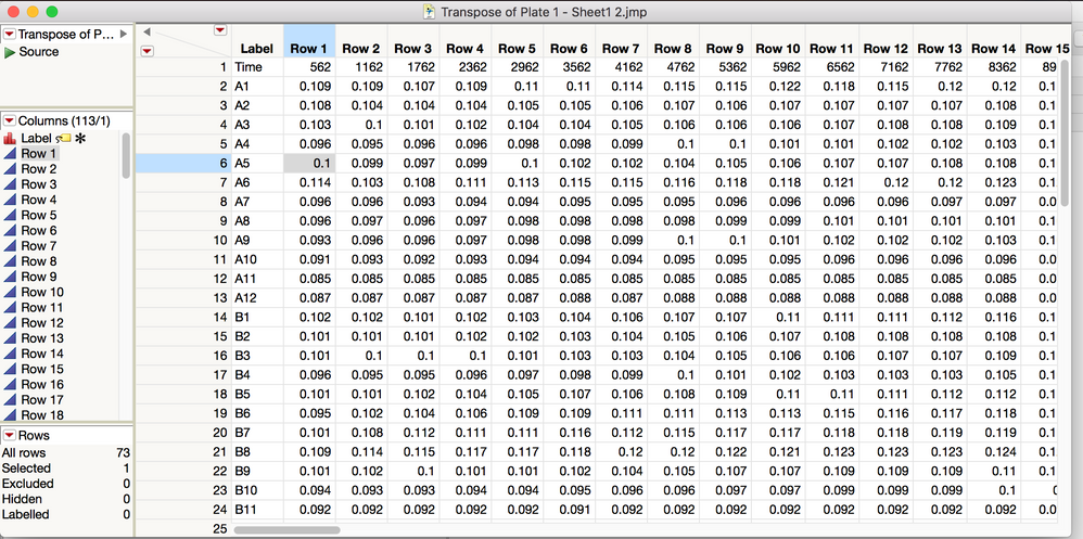
I think I am still stuck in one point that how you input the data in the table. Since my data format has one dimension of time series by hh:mm:ss and one dimension of well position (A1, B2 etc). If you put well ID in a column, then the time data will be in row. While my exact time info will be as a separate row, which means under a column, the data is mixed up. How do you deal with this? Thanks
- Mark as New
- Bookmark
- Subscribe
- Mute
- Subscribe to RSS Feed
- Get Direct Link
- Report Inappropriate Content
Re: time course data in microtiter plate format
It looks like the data table was transposed. You want to have three columns: Location, Time, and Response. So you could eliminate the first row from the example and rename the columns as Location, 562, 1162, and so on. That is, the name for the second to last column is the time value. Then stack all the columns except the first one (Location). Name the new data column Response and the new label column Time. Change the data type to Numeric and the modeling type to Continuous for Time. Those changes should give you the proper layout for this exercise.
- Mark as New
- Bookmark
- Subscribe
- Mute
- Subscribe to RSS Feed
- Get Direct Link
- Report Inappropriate Content
Re: time course data in microtiter plate format
I can send you a sample data if you like.
Thanks,
Hui
- Mark as New
- Bookmark
- Subscribe
- Mute
- Subscribe to RSS Feed
- Get Direct Link
- Report Inappropriate Content
Re: time course data in microtiter plate format
I'm not sure you need to use the map. I would just plot my variables versus time, wrapped or filtered by vessel
Recommended Articles
- © 2026 JMP Statistical Discovery LLC. All Rights Reserved.
- Terms of Use
- Privacy Statement
- Contact Us


