- New to JMP? Let the Data Analysis Director guide you through selecting an analysis task, an analysis goal, and a data type. Available now in the JMP Marketplace!
- See how to install JMP Marketplace extensions to customize and enhance JMP.
- Subscribe to RSS Feed
- Mark Topic as New
- Mark Topic as Read
- Float this Topic for Current User
- Bookmark
- Subscribe
- Mute
- Printer Friendly Page
Discussions
Solve problems, and share tips and tricks with other JMP users.- JMP User Community
- :
- Discussions
- :
- scripting two group XY graph with stats
- Mark as New
- Bookmark
- Subscribe
- Mute
- Subscribe to RSS Feed
- Get Direct Link
- Report Inappropriate Content
scripting two group XY graph with stats
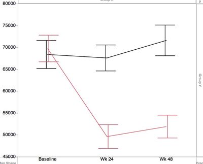
Data has subjects belonging to either red and black group, time of assessment (stacked, use as x) and measurement value (y). Need mean/SE or mean/CI plotted and statistical differences between the groups at each of the timepoints assessed.
I can draw this in graph builder but no stats, and I am trying to find a way to script this, as I have recurrent uses for this.
Accepted Solutions
- Mark as New
- Bookmark
- Subscribe
- Mute
- Subscribe to RSS Feed
- Get Direct Link
- Report Inappropriate Content
Re: scripting two group XY graph with stats
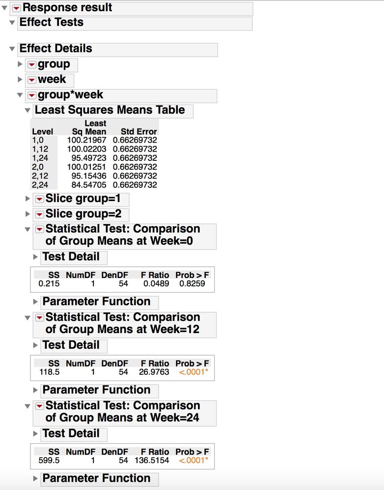
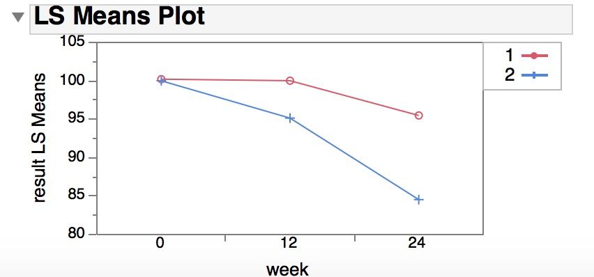
I thought about this for a while, and here is one approach, based on the specific analysis you describe. The data is best analyzed in "Fit Model", using least squares regression to estimate the effects of group, time period, and their interaction. You can also, in this analysis platform, get the plot you are interested in and do the statistical tests to to see if the group means are the same or different at each individual time point. If you were doing this manually, in the Fit Least Square report, make sure under Effect Details you find the results for the interaction term (group*week), and turn on the LS mean table, the LS Means Plot (use "group" as the grouping variable) and Test Slices. Test Slices will do all comparisons groups within a "slice" (one level of one factor held constant) -- the slice analysis for week=0 is testing if the group means are different at week=0, ...
This analysis uses "out of the box" functionality in JMP, and with some minor adjustment of the output (manually or with scripting), you can get the results and analysis you need. If you are newer user, this is often the better approach to use.
A more customized output often requires a bit more learning about JSL, particularly about how the report displays are built, and that takes a while to learn. Overlaying text on a graph is a bit tricky sometimes (@txnelson gave some hints on how to do this in his reply).
The script below simulates some data similar to what you described, and does the analysis and modifies the output report slightly to focus on just the question you are interested in. See comments in the code to follow along with what I'm doing.
//settings for the data simulation
//means for each group at time 0, 12, 24 is given in the matrix
/*

means =
	  t=0  t=12  t=24
group 1 [ ..   ..    ..   ,
group 2 [ ..   ..    ..  ]
*/
means=[
100 100 95,
100	95	85
];
// standard deviation of individual result for each subject
sd=2;
//simulate the data
data=[];
for(group=1, group<=2, group++,
	for(w=1, w<=3, w++,
		week=(w-1)*12;
		for(subject=1, subject<=10, subject++, /* 10 subjects per group*/
			result=means[group,w]+ sd*Random Normal();
			data= data |/ (group || week || subject || result);
		)
	)
);
// put the simulated data into a data table and set the column properties appropriately
dt=as table(data, <<column names({"group", "week", "subject", "result"}));
column(dt, "week") << Modeling Type(Nominal);
column(dt, "group") << Modeling Type(Nominal);
column(dt, "subject") << Modeling Type(Nominal);


// setup fit the 2 way anova model
/* note that I do this in two steps;  1) specify the model in Fit Model; 2) run the model with specific
model settings */
//specify model
fm=dt <<
Fit Model(
	Y( :result ),
	Effects( :group, :week, :group * :week ),
	Personality( "Standard Least Squares" ),
	Emphasis( "Minimal Report" ));
//run model.
fls = fm<<	Run(
		:result << {Summary of Fit( 1 ), Analysis of Variance( 1 ),
		Parameter Estimates( 1 ), Lack of Fit( 0 ), Scaled Estimates( 0 ),
		Plot Actual by Predicted( 0 ), Plot Regression( 0 ),
		Plot Residual by Predicted( 0 ), Plot Studentized Residuals( 0 ),
		Plot Effect Leverage( 0 ), Plot Residual by Normal Quantiles( 0 ),
		Box Cox Y Transformation( 0 ),
		/* this last argument to the Run() message is what turns on the
		analysis that is needed for this problem*/
		{:group * :week << {Test Slices( 1 ),
		Least Squares Means Plot( Overlay Term List( group ) )}}}
		);


/* close many of the outline boxes in the report to only focus on the elements related to the specific problem
  and also do some minor modification of the text in the outline box titles for the analysis you are interested in */
rlsf=report(fls);
rlsf["Effect Summary"]<< close;
rlsf["Summary of Fit"]<< close;
rlsf["Analysis of Variance"]<<close;
rlsf["Parameter Estimates"]<<close;
rlsf["Effect Details"]<<close(0);
rlsf["Effect Details"]["group"]<<close;
rlsf["Effect Details"]["week"]<<close;
rlsf["Slice group=1"]<<close;
rlsf["Slice group=2"]<<close;
rlsf["Slice week=0"] << Set Title("Statistical Test: Comparison of Group Means at Week=0");
rlsf["Slice week=12"] << Set Title("Statistical Test: Comparison of Group Means at Week=12");
rlsf["Slice week=24"] << Set Title("Statistical Test: Comparison of Group Means at Week=24");
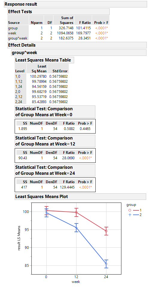
If you copy the report output and paste to Word or Powerpoint as an image, it looks like what is shown below. Maybe not quite as elegant as what you want, but
it fits on one page and has all the information I think you wanted. One other good thing about doing it this way is that the confidence intervals in the plot are the correct confidence intervals taking into account the entire data set, using the overall estimate of the error in the model and the full degrees of freedom for the error.
- Mark as New
- Bookmark
- Subscribe
- Mute
- Subscribe to RSS Feed
- Get Direct Link
- Report Inappropriate Content
Re: scripting two group XY graph with stats
Do you know what statistical tests or summary statistics you want for each time point?
Are you wanting that information overlaid in the white space of the graph, or to the side/below for reference?
Are the results longitudinal (repeated measurements on the same subjects/equipment) over time, or independent groups at each time point?
What is the real question that the analysis is addressing?
What is the mode of sharing these results? Within JMP? Or exported and shared in Word, Powerpoint, etc, ...?
There are several ways this type of data could be analyzed. After that is shared, some ideas on how to script up a nice summary report could be suggested.
- Mark as New
- Bookmark
- Subscribe
- Mute
- Subscribe to RSS Feed
- Get Direct Link
- Report Inappropriate Content
Re: scripting two group XY graph with stats
Below are the addtional details you asked for. Thanks!
Do you know what statistical tests or summary statistics you want for each time point?
- Mean ± SEM
Are you wanting that information overlaid in the white space of the graph, or to the side/below for reference?
- overlaid is preferable
Are the results longitudinal (repeated measurements on the same subjects/equipment) over time, or independent groups at each time point?
- Longitudinal. Majority of subjects have data for all tps but quite a few don't have one or more tps. Similar analyses have used 2-way ANOVA using time, group and time*group as factors
What is the real question that the analysis is addressing?
- is there a difference between the groups over time
What is the mode of sharing these results? Within JMP? Or exported and shared in Word, Powerpoint, etc, ...?
- graphs to be used in powerpoint; stand alone PDF report option would be useful as well.
- Mark as New
- Bookmark
- Subscribe
- Mute
- Subscribe to RSS Feed
- Get Direct Link
- Report Inappropriate Content
Re: scripting two group XY graph with stats
I thought about this for a while, and here is one approach, based on the specific analysis you describe. The data is best analyzed in "Fit Model", using least squares regression to estimate the effects of group, time period, and their interaction. You can also, in this analysis platform, get the plot you are interested in and do the statistical tests to to see if the group means are the same or different at each individual time point. If you were doing this manually, in the Fit Least Square report, make sure under Effect Details you find the results for the interaction term (group*week), and turn on the LS mean table, the LS Means Plot (use "group" as the grouping variable) and Test Slices. Test Slices will do all comparisons groups within a "slice" (one level of one factor held constant) -- the slice analysis for week=0 is testing if the group means are different at week=0, ...
This analysis uses "out of the box" functionality in JMP, and with some minor adjustment of the output (manually or with scripting), you can get the results and analysis you need. If you are newer user, this is often the better approach to use.
A more customized output often requires a bit more learning about JSL, particularly about how the report displays are built, and that takes a while to learn. Overlaying text on a graph is a bit tricky sometimes (@txnelson gave some hints on how to do this in his reply).
The script below simulates some data similar to what you described, and does the analysis and modifies the output report slightly to focus on just the question you are interested in. See comments in the code to follow along with what I'm doing.
//settings for the data simulation
//means for each group at time 0, 12, 24 is given in the matrix
/*

means =
	  t=0  t=12  t=24
group 1 [ ..   ..    ..   ,
group 2 [ ..   ..    ..  ]
*/
means=[
100 100 95,
100	95	85
];
// standard deviation of individual result for each subject
sd=2;
//simulate the data
data=[];
for(group=1, group<=2, group++,
	for(w=1, w<=3, w++,
		week=(w-1)*12;
		for(subject=1, subject<=10, subject++, /* 10 subjects per group*/
			result=means[group,w]+ sd*Random Normal();
			data= data |/ (group || week || subject || result);
		)
	)
);
// put the simulated data into a data table and set the column properties appropriately
dt=as table(data, <<column names({"group", "week", "subject", "result"}));
column(dt, "week") << Modeling Type(Nominal);
column(dt, "group") << Modeling Type(Nominal);
column(dt, "subject") << Modeling Type(Nominal);


// setup fit the 2 way anova model
/* note that I do this in two steps;  1) specify the model in Fit Model; 2) run the model with specific
model settings */
//specify model
fm=dt <<
Fit Model(
	Y( :result ),
	Effects( :group, :week, :group * :week ),
	Personality( "Standard Least Squares" ),
	Emphasis( "Minimal Report" ));
//run model.
fls = fm<<	Run(
		:result << {Summary of Fit( 1 ), Analysis of Variance( 1 ),
		Parameter Estimates( 1 ), Lack of Fit( 0 ), Scaled Estimates( 0 ),
		Plot Actual by Predicted( 0 ), Plot Regression( 0 ),
		Plot Residual by Predicted( 0 ), Plot Studentized Residuals( 0 ),
		Plot Effect Leverage( 0 ), Plot Residual by Normal Quantiles( 0 ),
		Box Cox Y Transformation( 0 ),
		/* this last argument to the Run() message is what turns on the
		analysis that is needed for this problem*/
		{:group * :week << {Test Slices( 1 ),
		Least Squares Means Plot( Overlay Term List( group ) )}}}
		);


/* close many of the outline boxes in the report to only focus on the elements related to the specific problem
  and also do some minor modification of the text in the outline box titles for the analysis you are interested in */
rlsf=report(fls);
rlsf["Effect Summary"]<< close;
rlsf["Summary of Fit"]<< close;
rlsf["Analysis of Variance"]<<close;
rlsf["Parameter Estimates"]<<close;
rlsf["Effect Details"]<<close(0);
rlsf["Effect Details"]["group"]<<close;
rlsf["Effect Details"]["week"]<<close;
rlsf["Slice group=1"]<<close;
rlsf["Slice group=2"]<<close;
rlsf["Slice week=0"] << Set Title("Statistical Test: Comparison of Group Means at Week=0");
rlsf["Slice week=12"] << Set Title("Statistical Test: Comparison of Group Means at Week=12");
rlsf["Slice week=24"] << Set Title("Statistical Test: Comparison of Group Means at Week=24");
If you copy the report output and paste to Word or Powerpoint as an image, it looks like what is shown below. Maybe not quite as elegant as what you want, but
it fits on one page and has all the information I think you wanted. One other good thing about doing it this way is that the confidence intervals in the plot are the correct confidence intervals taking into account the entire data set, using the overall estimate of the error in the model and the full degrees of freedom for the error.

- Mark as New
- Bookmark
- Subscribe
- Mute
- Subscribe to RSS Feed
- Get Direct Link
- Report Inappropriate Content
Re: scripting two group XY graph with stats
This seems to accomplish most of what I'd wanted. Thank you so much for the detailed response.
Just a couple things if you can help further:
1. My report doesn't quite look like that in this simulation. Not sure if that is a limitation of the version (mine is JMP12). The plot is not open by default and it doesn't feature error bars, when I enable it manually.
2. Additionally, when I adapt it (just change the Y and effect names) in my actual data table and run, it pauses for a 'Run' click at the fit model dialog - and the report looks like a default one. ie Effect details is closed, Test slices are not enabled, LS mean plot is closed as above.
- Mark as New
- Bookmark
- Subscribe
- Mute
- Subscribe to RSS Feed
- Get Direct Link
- Report Inappropriate Content
Re: scripting two group XY graph with stats
I did do this in JMP 14.3. There are probably some differences in the versions that may not allow you to get the exact same output. The JSL syntax may have also changes between the versions.
- Mark as New
- Bookmark
- Subscribe
- Mute
- Subscribe to RSS Feed
- Get Direct Link
- Report Inappropriate Content
Re: scripting two group XY graph with stats
With these additional info, any suggestions?
Thanks!
- Mark as New
- Bookmark
- Subscribe
- Mute
- Subscribe to RSS Feed
- Get Direct Link
- Report Inappropriate Content
Re: scripting two group XY graph with stats
Here are a couple of ways to do this
- Add a graphics script to your graph. Look in the Scripting Guide for "Add Graphics Script". Within the script that you develop, you can create the statistics you want, and then you can display them on the graph.
- Add a summary table after the graph. This can be of your own development using JSL, or very posibly you can find the table you want in the Fit Y by X platform. The graph and the table can then be placed into a new display window
- Mark as New
- Bookmark
- Subscribe
- Mute
- Subscribe to RSS Feed
- Get Direct Link
- Report Inappropriate Content
Re: scripting two group XY graph with stats
Recommended Articles
- © 2026 JMP Statistical Discovery LLC. All Rights Reserved.
- Terms of Use
- Privacy Statement
- Contact Us
