- Learn how to build custom Python data connectors and further customize JMP’s Data Connector Framework with the Python Data Connector Demo, available now in the JMP Marketplace!
- See how to create experiments to support product design and ID useful product features. Register for June 12 webinar, 2pm US Eastern Time.
- Subscribe to RSS Feed
- Mark Topic as New
- Mark Topic as Read
- Float this Topic for Current User
- Bookmark
- Subscribe
- Mute
- Printer Friendly Page
Discussions
Solve problems, and share tips and tricks with other JMP users.- JMP User Community
- :
- Discussions
- :
- recreate color map from hierarchical clustering in graph builder

- Mark as New
- Bookmark
- Subscribe
- Mute
- Subscribe to RSS Feed
- Get Direct Link
- Report Inappropriate Content
recreate color map from hierarchical clustering in graph builder
Dear JMP community
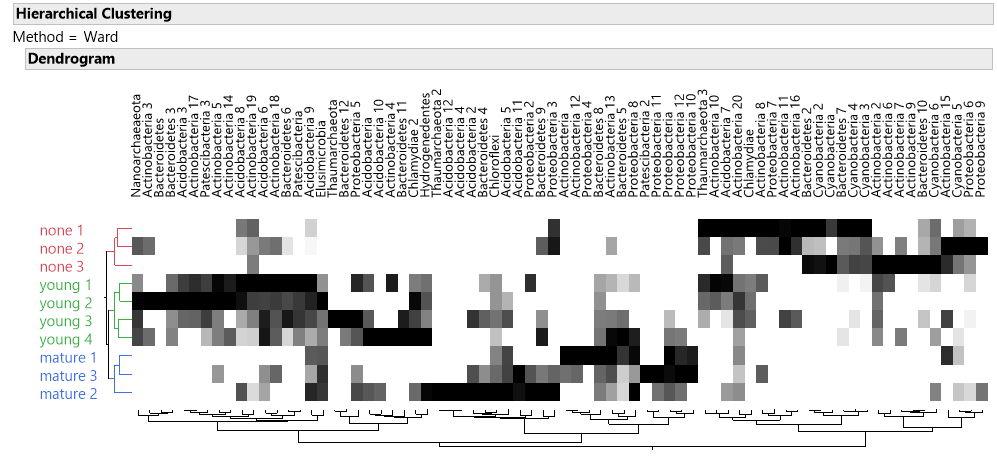
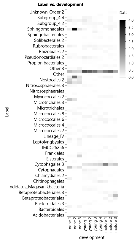
The two way cluster option in hierarchical cluster provides a really great color map that scales each column individually, such that if I have a column with high values it does not overshadow the rest of the columns. Whereas if i try to make the plot in graph builder e.g. as a heat map, the variables scale together and i lose a lot of data.since only the extreme cases show up. The problem is that the hierarchical cluster messes with my label order.
So, how can I recreate a color map the maintains the same label order as in my data table but has the unique feature of individually scaling each variable?
Thanks!
Accepted Solutions

- Mark as New
- Bookmark
- Subscribe
- Mute
- Subscribe to RSS Feed
- Get Direct Link
- Report Inappropriate Content
Re: recreate color map from hierarchical clustering in graph builder
Hi @ezorlo ,
It's difficult to tell for sure from your visualizations, but it looks like your data might be in the "stacked" format based on the Heat Map output you provided. It would be helpful to see a sample table to see how your data are arranged since clustering can be done either with data "stacked" (tall) or "as usual" (wide)... but I'll take a stab at it.
The "color map" that you want to produce can be done using the Graph->Cell Plot platform, however, your data would need to be in the "wide" format. If my assumption is correct, and your data are stacked, use the Tables->Split utility to rearrange your data by placing "development" in the Split By role, "Data" in the Split Columns role, and "Label" in the Group role (I based these roles on the heat map output you provided). You may need to resort the resulting table to match your desired order.
Now use the Graph->Cell Plot platform on the new table: place the new data columns (none, young, etc) in the Y, Response role and "Label" in the Label role. This should generate the cell plot you're looking for.
Again, if this doesn't work for you, you may need to provide more info (preferably some sample data).
-Jerry

- Mark as New
- Bookmark
- Subscribe
- Mute
- Subscribe to RSS Feed
- Get Direct Link
- Report Inappropriate Content
Re: recreate color map from hierarchical clustering in graph builder
I'm not sure if I'm correct but it looks like the two-way clustering data was standardized by columns (standard option for hierarchical clustering) while the recreated heatmap is using the original scale.
If it is the case, you can easily standardize your data by selecting the data columns > right-click on the header > select New Formula Column > Distributional > Standardized. Then, use the standardized column as your Color variable in your heatmap.
I hope it helps.
Best,
TS

- Mark as New
- Bookmark
- Subscribe
- Mute
- Subscribe to RSS Feed
- Get Direct Link
- Report Inappropriate Content
Re: recreate color map from hierarchical clustering in graph builder
Have you tried turning on the Row Order Property in the column with your labels?

- Mark as New
- Bookmark
- Subscribe
- Mute
- Subscribe to RSS Feed
- Get Direct Link
- Report Inappropriate Content
Re: recreate color map from hierarchical clustering in graph builder
Hi @ezorlo ,
It's difficult to tell for sure from your visualizations, but it looks like your data might be in the "stacked" format based on the Heat Map output you provided. It would be helpful to see a sample table to see how your data are arranged since clustering can be done either with data "stacked" (tall) or "as usual" (wide)... but I'll take a stab at it.
The "color map" that you want to produce can be done using the Graph->Cell Plot platform, however, your data would need to be in the "wide" format. If my assumption is correct, and your data are stacked, use the Tables->Split utility to rearrange your data by placing "development" in the Split By role, "Data" in the Split Columns role, and "Label" in the Group role (I based these roles on the heat map output you provided). You may need to resort the resulting table to match your desired order.
Now use the Graph->Cell Plot platform on the new table: place the new data columns (none, young, etc) in the Y, Response role and "Label" in the Label role. This should generate the cell plot you're looking for.
Again, if this doesn't work for you, you may need to provide more info (preferably some sample data).
-Jerry

- Mark as New
- Bookmark
- Subscribe
- Mute
- Subscribe to RSS Feed
- Get Direct Link
- Report Inappropriate Content
Re: recreate color map from hierarchical clustering in graph builder
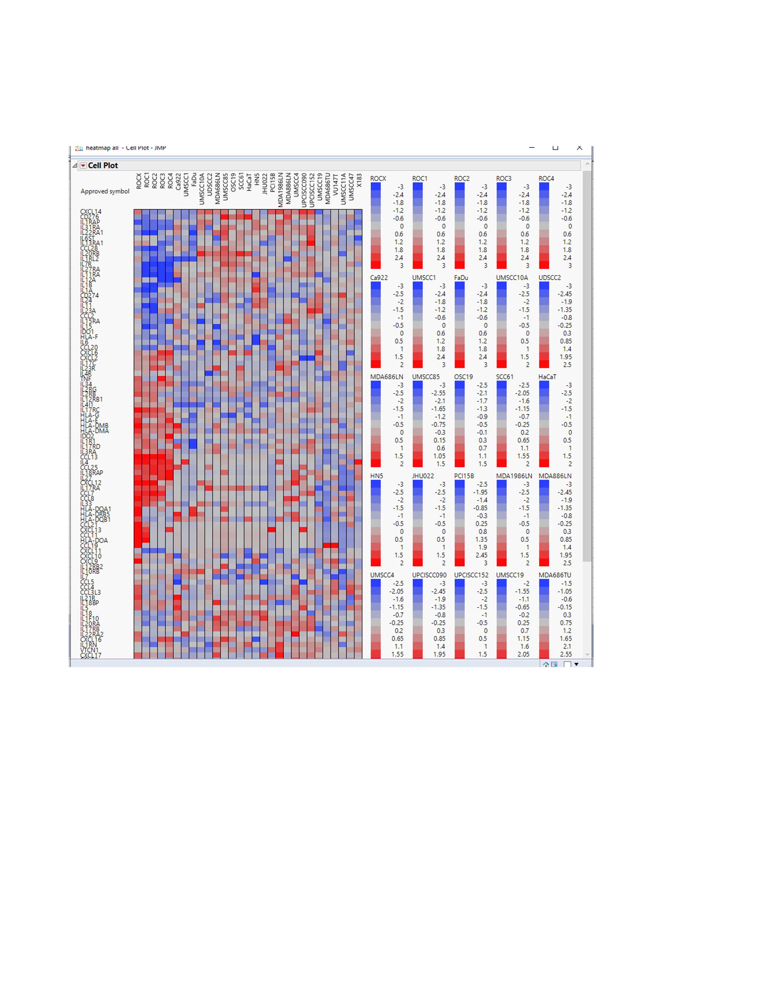
Sorry for the delayed response. I am new to the forum. I agree with others that you can do this well in Graphs>Cell plot , to make a customizable heatmap with control over scaling. However, I have a few simple tips. First, represent your data as a matrix with the variable you want to control scale over as columns and the other variable in the X dimension. When you chose Cell plot under graph, place all your column variables in the Y, response box and then select the one column heading that has your other variables (rows) listed and place it into the box that says "label" (not X). Make sure you unselect the box underneath that says scale uniformly. Now all your Y categories are scaled independently from each other. If you click on the upside down red triangle you can select "legend" and pull up the scale for each individual column. If you still have issues within a single column, because an outlier value is color washing out the other values then you should probably be plotting the Z-scores as was alluded to in a previous answer. However, even then you can still lose color. Typically, what people do is set a limit for the allowed upper and lower values, and for the case of Z values we usually set that limit to Z =-3 and +3 so all values fall in between. Just be sure your legend indicates a value may be greater than or equal to ( or less than or equal) to the chosen limits. You can easily transform your values in excel with the formula = median (-X, cell value, Y) where X and Y are the allowed lower and upper limits. Attached is an example of one of my heatmaps done this way. The scales all look the same because I set upper and lower limits to 3, -3. If every Y value has the same upper and lower limits, then you might as well check the scale uniformly box. But again you can set whatever upper and low limits you want for each column. Just transform the data in excel to manually accomplish this before plotting. Also you can right click on the heatmap to eliminate the border lines between cells or squares. Hope that helps.
Mitch
Recommended Articles
- © 2026 JMP Statistical Discovery LLC. All Rights Reserved.
- Terms of Use
- Privacy Statement
- Contact Us