Turn on suggestions
Auto-suggest helps you quickly narrow down your search results by suggesting possible matches as you type.
- New to JMP? Let the Data Analysis Director guide you through selecting an analysis task, an analysis goal, and a data type. Available now in the JMP Marketplace!
- See how to install JMP Marketplace extensions to customize and enhance JMP.
Options
- Subscribe to RSS Feed
- Mark Topic as New
- Mark Topic as Read
- Float this Topic for Current User
- Bookmark
- Subscribe
- Mute
- Printer Friendly Page
Discussions
Solve problems, and share tips and tricks with other JMP users.- JMP User Community
- :
- Discussions
- :
- points on graph not color coded according to legend
- Mark as New
- Bookmark
- Subscribe
- Mute
- Subscribe to RSS Feed
- Get Direct Link
- Report Inappropriate Content
points on graph not color coded according to legend
Created:
Sep 22, 2020 10:40 PM
| Last Modified: Jun 11, 2023 4:06 AM
(2192 views)
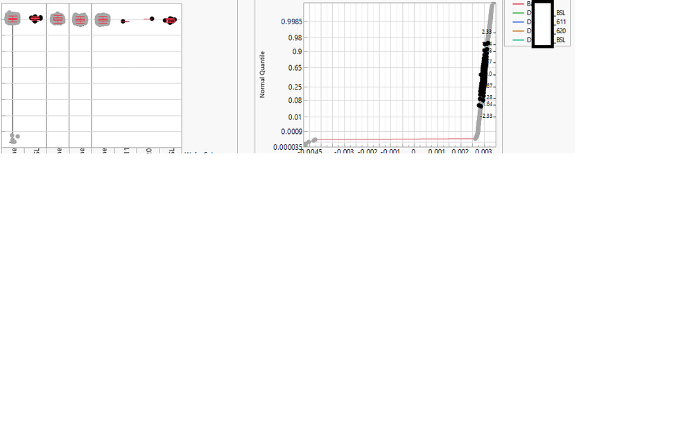
I am running into a different issue. I made the variability plots and normal quantile plots so that the points on the graph appear highlighed and color coded according to the legend category but every legend category has turned into a blob of black dots. How can I fix this issue?
current data table(dt);
dt<<bring window to front;


colNameList=dt<< Get Column Names();
vlb=V list Box();
j2=New Window("Plots",<<journal,vlb);
current data table(dt);
print(colNameList)
For (i=16, i<18, i++,
vp=Expr(
Variability Chart(
	Y( Column(dt,colNameList[i]) ),
	X( :product, :Wafer Category ),
	Max Iter( 100 ),
	Conv Limit( 0.00000001 ),
	Number Integration Abscissas( 128 ),
	Number Function Evals( 65536 ),
	Analysis Type( "Choose best analysis (EMS REML Bayesian)" ),
	Std Dev Chart( 0 ),
	Points Jittered( 1 ),
	Show Box Plots( 1 ),
	SendToReport(
		Dispatch(
			{"Variability Chart for"|| colNameList[i]},
			"Variability Chart",
			FrameBox,
			{Frame Size( 320, 250 ), DispatchSeg(
				Box Plot Seg( 1 ),
				{Box Type( "Outlier" ), Line Color( "Red" )}
			), DispatchSeg(
				Box Plot Seg( 2 ),
				{Box Type( "Outlier" ), Line Color( "Red" )}
			), DispatchSeg(
				Box Plot Seg( 3 ),
				{Box Type( "Outlier" ), Line Color( "Red" )}
			), DispatchSeg(
				Box Plot Seg( 4 ),
				{Box Type( "Outlier" ), Line Color( "Red" )}
			), DispatchSeg(
				Box Plot Seg( 5 ),
				{Box Type( "Outlier" ), Line Color( "Red" )}
			), DispatchSeg(
				Box Plot Seg( 6 ),
				{Box Type( "Outlier" ), Line Color( "Red" )}
			), DispatchSeg(
				Box Plot Seg( 7 ),
				{Box Type( "Outlier" ), Line Color( "Red" )}
			), DispatchSeg(
				Box Plot Seg( 8 ),
				{Box Type( "Outlier" ), Line Color( "Red" )}
			)}
		),
		Dispatch(
			{"Variability Chart for " || colNameList[i]},
			"",
			NomAxisBox,
			{Set Width( 320 ), Set Height( 100 )}
		),
		Dispatch(
			{"Variability Chart for " || colNameList[i]},
			"",
			NomAxisBox( 2 ),
			{Set Width( 309 ), Set Height( 100 )}
		)
	)
)
);
dt<<select where(:Wafer Category!="Baseline");
owp=Expr(
Oneway(
	Y( Column(dt,colNameList[i]) ),
	X( :Wafer Category ),
	All Graphs( 0 ),
	Plot Quantile by Actual( 1 ),
	Line of Fit( 0 ),
	Comparison Circles( 1 ),
	X Axis Proportional( 0 ),
	Grand Mean( 0 ),
	SendToReport(
		Dispatch(
			{},
			"Oneway Analysis of "||colNameList[i]|| "By Wafer Category",
			OutlineBox,
			{Set Title( "ProbPlot" )}
		),
		Dispatch(
			{"Normal Quantile Plot"},
			"1",
			ScaleBox,
			{Label Row( Label Orientation( "Vertical" ) )}
		),
		Dispatch(
			{"Normal Quantile Plot"},
			"2",
			ScaleBox,
			{Format( "Best", 15 ), Add Ref Line( 0.5, "Solid", "Black", "", 1 ),
			Label Row( Label Orientation( "Vertical" ) )}
		),
		Dispatch(
			{"Normal Quantile Plot"},
			"Oneway QuantilePlot",
			FrameBox,
			{Frame Size( 428, 369 ), Row Legend(
				Wafer Category,
				Color( 1 ),
				Color Theme( "JMP Default" ),
				Marker( 1 ),
				Marker Theme( "Standard" ),
				Continuous Scale( 0 ),
				Reverse Scale( 0 ),
				Excluded Rows( 0 )
			)}
		),
		Dispatch(
			{"Normal Quantile Plot"},
			"",
			PlotColBox,
			{Visibility( "Collapse" )}
		),
		Dispatch(
			{"Normal Quantile Plot"},
			"",
			StringColBox,
			{Visibility( "Collapse" )}
		)
	)
)
);
vlb<<append (H List Box(Eval(Eval Expr(vp)),
	           Eval(Eval Expr(owp))
	           ));
);
2 REPLIES 2
- Mark as New
- Bookmark
- Subscribe
- Mute
- Subscribe to RSS Feed
- Get Direct Link
- Report Inappropriate Content
Re: points on graph not color coded according to legend
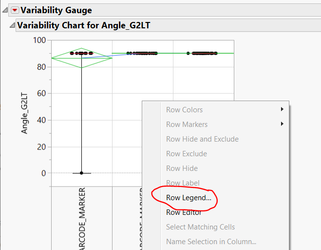
Right click inside your Variability Graph and choose Row Legend
Thuong Le
- Mark as New
- Bookmark
- Subscribe
- Mute
- Subscribe to RSS Feed
- Get Direct Link
- Report Inappropriate Content
Re: points on graph not color coded according to legend
I did and then pasted that script in my JSL script thinking that I will be able to produce the same results for every graph that my for-loop makes but for some reason it does not seem to work. Any ideas why?
Recommended Articles
- © 2026 JMP Statistical Discovery LLC. All Rights Reserved.
- Terms of Use
- Privacy Statement
- Contact Us


