- New to JMP? Let the Data Analysis Director guide you through selecting an analysis task, an analysis goal, and a data type. Available now in the JMP Marketplace!
- See how to install JMP Marketplace extensions to customize and enhance JMP.
- Subscribe to RSS Feed
- Mark Topic as New
- Mark Topic as Read
- Float this Topic for Current User
- Bookmark
- Subscribe
- Mute
- Printer Friendly Page
Discussions
Solve problems, and share tips and tricks with other JMP users.- JMP User Community
- :
- Discussions
- :
- Re: plotting confidence intervals output via SAS lsmeans
- Mark as New
- Bookmark
- Subscribe
- Mute
- Subscribe to RSS Feed
- Get Direct Link
- Report Inappropriate Content
plotting confidence intervals output via SAS lsmeans
All,
I have an output SAS data set consisting of multivariate lsmeans and their upper and lower CIs. I can plot the means in graph builder however I need to add the confidence intervals for each mean. Is there a way to do this in JMP? The lsmeans are from a repeated measures analysis using PROC MIXED. I know JMP has the ability to do mixed models but my knowledge of how to translate the SAS model/repeated/random code exactly in JMP is still a bit sketchy.
I welcome your thoughts.
Thanks.
Accepted Solutions
- Mark as New
- Bookmark
- Subscribe
- Mute
- Subscribe to RSS Feed
- Get Direct Link
- Report Inappropriate Content
Re: plotting confidence intervals output via SAS lsmeans
Below is a script that adds the error bars as you request;
Names Default To Here( 1 );
dt = Current Data Table();
gb = dt << Graph Builder(
Size( 922, 752 ),
Variables( X( :DAP ), Y( :Estimate ), Overlay( :Join ) ),
Elements( Line( X, Y, Legend( 15 ), Error Bars( "Confidence Interval" ) ) )
);
Report( gb )[Frame box( 1 )] << Add Graphics Script(
Transparency( 1 );
For( i = 1, i <= N Rows( dt ), i++,
from = {};
to = {};
topfrom = {};
topto = {};
bottomfrom = {};
bottomto = {};
Insert Into( to, dt:dap[i] );
Insert Into( to, dt:upper[i] );
Insert Into( from, dt:dap[i] );
Insert Into( from, dt:lower[i] );
Insert Into( topfrom, dt:dap[i] - 1 );
Insert Into( topfrom, dt:upper[i] );
Insert Into( topto, dt:dap[i] + 1 );
Insert Into( topto, dt:upper[i] );
Insert Into( bottomfrom, dt:dap[i] - 1 );
Insert Into( bottomfrom, dt:lower[i] );
Insert Into( bottomto, dt:dap[i] + 1 );
Insert Into( bottomto, dt:lower[i] );
Line( from, to );
Line( topfrom, topto );
Line( bottomfrom, bottomto );
);
);
- Mark as New
- Bookmark
- Subscribe
- Mute
- Subscribe to RSS Feed
- Get Direct Link
- Report Inappropriate Content
Re: plotting confidence intervals output via SAS lsmeans
How to plot the CIs is somewhat dependent upon what form you have them in. What is the structure of your JMP data table or can you attach the table for the JMP Community to view?
- Mark as New
- Bookmark
- Subscribe
- Mute
- Subscribe to RSS Feed
- Get Direct Link
- Report Inappropriate Content
Re: plotting confidence intervals output via SAS lsmeans
Thank you for the speedy reply. The structure of my JMP data table is exactly the same as the output SAS lsmeans data set, which I have exported to JMP. There is one column of estimates (the means) and for each estimate there is a column with the upper and lower CI. See the attached JMP data table. Non-relevant variables in the original data set have been deleted. Thanks!
https://drive.google.com/open?id=0B94zTjHJfpnIUi1lV1p5bTFYZk0
- Mark as New
- Bookmark
- Subscribe
- Mute
- Subscribe to RSS Feed
- Get Direct Link
- Report Inappropriate Content
Re: plotting confidence intervals output via SAS lsmeans
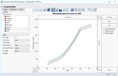
Is this what you are looking for?
Here is the script that is generated from the above display:
Graph Builder(
Variables(
X( :DAP ),
Y( :Estimate ),
Y( :Lower, Position( 1 ) ),
Y( :Upper, Position( 1 ) )
),
Elements( Line( X, Y( 1 ), Y( 2 ), Y( 3 ), Legend( 31 ) ) )
);
- Mark as New
- Bookmark
- Subscribe
- Mute
- Subscribe to RSS Feed
- Get Direct Link
- Report Inappropriate Content
Re: plotting confidence intervals output via SAS lsmeans
Jim,
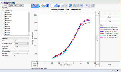
Sorry for not being more explicit in how I was plotting the data, but the attached JMP graph selects the variable 'estimate' for the Y-axis (=Canopy Height), DAP for the X-axis, and the variable "Join" is overlaid. I want to create vertical CI bars for each of six mean point data across DAP. The curve lines are only for approximating the shape and are not derived from the mixed model information. Is there is way to code the CI information back into the graph builder script to achieve this?
Thanks!
- Mark as New
- Bookmark
- Subscribe
- Mute
- Subscribe to RSS Feed
- Get Direct Link
- Report Inappropriate Content
Re: plotting confidence intervals output via SAS lsmeans
Below is a script that adds the error bars as you request;
Names Default To Here( 1 );
dt = Current Data Table();
gb = dt << Graph Builder(
Size( 922, 752 ),
Variables( X( :DAP ), Y( :Estimate ), Overlay( :Join ) ),
Elements( Line( X, Y, Legend( 15 ), Error Bars( "Confidence Interval" ) ) )
);
Report( gb )[Frame box( 1 )] << Add Graphics Script(
Transparency( 1 );
For( i = 1, i <= N Rows( dt ), i++,
from = {};
to = {};
topfrom = {};
topto = {};
bottomfrom = {};
bottomto = {};
Insert Into( to, dt:dap[i] );
Insert Into( to, dt:upper[i] );
Insert Into( from, dt:dap[i] );
Insert Into( from, dt:lower[i] );
Insert Into( topfrom, dt:dap[i] - 1 );
Insert Into( topfrom, dt:upper[i] );
Insert Into( topto, dt:dap[i] + 1 );
Insert Into( topto, dt:upper[i] );
Insert Into( bottomfrom, dt:dap[i] - 1 );
Insert Into( bottomfrom, dt:lower[i] );
Insert Into( bottomto, dt:dap[i] + 1 );
Insert Into( bottomto, dt:lower[i] );
Line( from, to );
Line( topfrom, topto );
Line( bottomfrom, bottomto );
);
);
- Mark as New
- Bookmark
- Subscribe
- Mute
- Subscribe to RSS Feed
- Get Direct Link
- Report Inappropriate Content
Re: plotting confidence intervals output via SAS lsmeans
Jim,
Thank you so much for the jsl code. That is what I was aiming for, although the tightly clustered means for this particular data are not really well differentiated by CI bars. Going further, is there code to (1) specify the width of the horizontal fence, and (2) specify color of the bars? An example would suffice, I can edit the code as needed.
Thank you for your excellent help!
- Mark as New
- Bookmark
- Subscribe
- Mute
- Subscribe to RSS Feed
- Get Direct Link
- Report Inappropriate Content
Re: plotting confidence intervals output via SAS lsmeans
All you have to do to control the Line Size is to use the Pen Size(); function.
And for the color, you use Pen Color();
You can look up examples in
Help==>Scripting Index
Just type in to the search field, Pen Size or Pen Color
And Karen's solution is "Very Cool"!
- Mark as New
- Bookmark
- Subscribe
- Mute
- Subscribe to RSS Feed
- Get Direct Link
- Report Inappropriate Content
Re: plotting confidence intervals output via SAS lsmeans
Jim has provided you a jsl solution - I being not so proficient in jsl can offer you a non-jsl solution:
1. Tables>Stack>
2. select estimate, Lower, Upper and click stack columns, click ok
3. Graph Builder from the new table
4. Data = Y
5. DAP = X
6. Overlay = Join
Now the trick: off to the left in there are more options under the column list
7. Summary statistic = median
8. Error Bars = range
9. use the line to connect
By stacking the data you have plotted 3 points (LCL, Est, UCL) for each group. The summer statistic plots the median (the middle point which in your case is your estimate) and then the range puts bars between the minimum value (you lower confidence limit) and the max (your upper confidence limit). To control colors you can use the value color column property on the join column or you can right click on the legend in graph builder and change colors. I like the value color property as it is easy to control and then stays with the data table.
- Mark as New
- Bookmark
- Subscribe
- Mute
- Subscribe to RSS Feed
- Get Direct Link
- Report Inappropriate Content
Re: plotting confidence intervals output via SAS lsmeans
Karen and Jim:
Your help is much appreciated!
Recommended Articles
- © 2026 JMP Statistical Discovery LLC. All Rights Reserved.
- Terms of Use
- Privacy Statement
- Contact Us


