- Don’t miss your chance to experience Discovery Summit Europe at our best available rate! Early bird registration through 31 Oct.
- Graph Builder Toolbar streamlines interactive graphing. Creates shortcuts on Report and GraphBuilder Helpers toolbars. Download and install the extension.
- Subscribe to RSS Feed
- Mark Topic as New
- Mark Topic as Read
- Float this Topic for Current User
- Bookmark
- Subscribe
- Mute
- Printer Friendly Page
Discussions
Solve problems, and share tips and tricks with other JMP users.- User Community
- :
- Discussions
- :
- Re: pie graphs+heat maps

- Mark as New
- Bookmark
- Subscribe
- Mute
- Subscribe to RSS Feed
- Get Direct Link
- Report Inappropriate Content
pie graphs+heat maps
Hello everyone,
As a marine biologist, I recently stumbled across a visual presentation of coral reef data that I really like (see attachment). In it, you will see various pie graphs in which the individual wedges are essentially heat maps to show relative levels of certain parameters. I would like to adapt this for my own research, and I THINK it cn be done with Graph Builder, though not as a heat map, per se. Here is my idea: say I want four pie wedges representing four response variables (A, B, C, and D). The size is unimportant, so I will give each a value of 0.25 so that they occupy equal areas. I realize I can overlay color, so I created a "color" column and assigned values for the four response variables, but then my graph didn't change accordingly. 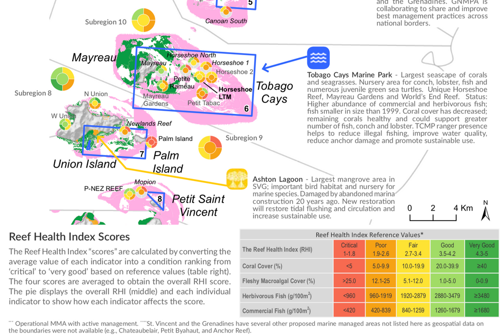

- Mark as New
- Bookmark
- Subscribe
- Mute
- Subscribe to RSS Feed
- Get Direct Link
- Report Inappropriate Content
Re: pie graphs+heat maps
While this solution (and many of the other contributions) are quite innovative, I have to say that I don't find the pie charts very useful at all (it reminds me of the Tufte quote, which I'll paraphrase since I can't remember exactly where he said it: "the only thing worse than one stupid pie chart is more than one stupid pie chart). Doughnuts, as usual, are better than pie charts, but I think bar graphs work much better in this case. With the multiple comparisons across the 4 dimensions you have a couple of issues: first is the ordering of the pieces and the second is the size of the pieces. It is easier to order bars than slices of pie and the sizes are also much better compared with bars. There may well be other displays that work even better, but I really don't see these pie charts as easy to decipher at all.

- Mark as New
- Bookmark
- Subscribe
- Mute
- Subscribe to RSS Feed
- Get Direct Link
- Report Inappropriate Content
Re: pie graphs+heat maps
I agree with you on that point, nevertheless, that a request from my stakeholders .... pie charts ( and even worst, radar charts) it is !
- « Previous
- Next »
Recommended Articles
- © 2026 JMP Statistical Discovery LLC. All Rights Reserved.
- Terms of Use
- Privacy Statement
- Contact Us