- New to JMP? Let the Data Analysis Director guide you through selecting an analysis task, an analysis goal, and a data type. Available now in the JMP Marketplace!
- See how to install JMP Marketplace extensions to customize and enhance JMP.
- Subscribe to RSS Feed
- Mark Topic as New
- Mark Topic as Read
- Float this Topic for Current User
- Bookmark
- Subscribe
- Mute
- Printer Friendly Page
Discussions
Solve problems, and share tips and tricks with other JMP users.- JMP User Community
- :
- Discussions
- :
- Re: pie graphs+heat maps
- Mark as New
- Bookmark
- Subscribe
- Mute
- Subscribe to RSS Feed
- Get Direct Link
- Report Inappropriate Content
pie graphs+heat maps
Hello everyone,
As a marine biologist, I recently stumbled across a visual presentation of coral reef data that I really like (see attachment). In it, you will see various pie graphs in which the individual wedges are essentially heat maps to show relative levels of certain parameters. I would like to adapt this for my own research, and I THINK it cn be done with Graph Builder, though not as a heat map, per se. Here is my idea: say I want four pie wedges representing four response variables (A, B, C, and D). The size is unimportant, so I will give each a value of 0.25 so that they occupy equal areas. I realize I can overlay color, so I created a "color" column and assigned values for the four response variables, but then my graph didn't change accordingly. 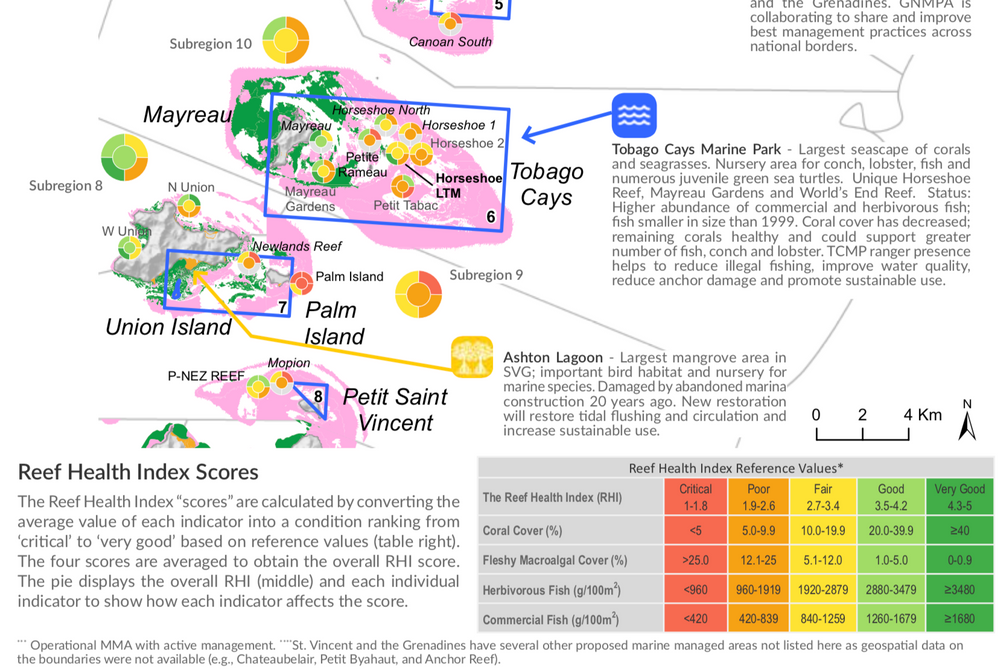
Accepted Solutions
- Mark as New
- Bookmark
- Subscribe
- Mute
- Subscribe to RSS Feed
- Get Direct Link
- Report Inappropriate Content
Re: pie graphs+heat maps
With the columns of interest stacked, a custom map can be used to acheive the visualization you're looking for.
Here's an example on JMP public using the data you've supplied.
You can find the custom map and modified data table at:
https://public.jmp.com/packages/5d5aa110f40f010268e63cf4
~John
- Mark as New
- Bookmark
- Subscribe
- Mute
- Subscribe to RSS Feed
- Get Direct Link
- Report Inappropriate Content
Re: pie graphs+heat maps
I am still stumped, so I thought I'd attach the actual data file. Basically, I want to put the last five columns into a pie graph in which the wedge colors reflect the colors in the cells (wrapped by sample number). I am beginning to think this may not be possible with Graph Builder.....
- Mark as New
- Bookmark
- Subscribe
- Mute
- Subscribe to RSS Feed
- Get Direct Link
- Report Inappropriate Content
Re: pie graphs+heat maps
With the columns of interest stacked, a custom map can be used to acheive the visualization you're looking for.
Here's an example on JMP public using the data you've supplied.
You can find the custom map and modified data table at:
https://public.jmp.com/packages/5d5aa110f40f010268e63cf4
~John
- Mark as New
- Bookmark
- Subscribe
- Mute
- Subscribe to RSS Feed
- Get Direct Link
- Report Inappropriate Content
Re: pie graphs+heat maps
I'm really interested in trying my hand at this to see if I could adapt it to some of the reporting my business does.
You mention that you stacked by the columns of interest, but which ones are those? I downloaded the data table, but can't figure out which columns are needed to stack. And, does JMP automatically generate the pie chart as a sectional "bullseye", or is this a separate setting. I haven't seen one like this before. It's a nice visualization, and new to me, which is why I'm curious about it.
Thanks!,
DS
- Mark as New
- Bookmark
- Subscribe
- Mute
- Subscribe to RSS Feed
- Get Direct Link
- Report Inappropriate Content
Re: pie graphs+heat maps
I stacked columns named: Sym GE HMS, host GE HMS, colony color, variability, and summed aberrancy index . In the table attached to the JMP Public post, they are now under the column named Responses with the label for each response(the old column names) in the Label column.
JMP doesn't automatically create sectional "bullseye" charts. There are a few steps involved:
- I created the custom map shape files provided with the JMP Public posting that define the sections and bullseye.
- In Graph Builder, I dragged the Label column to the Shape role (bottom left), which displayed the outline of the custom shape.
- To get the colors applied, I dragged the Responses column to the Color role(on the right). This fills in the shape with the average responses for each sector.
- To separate out each sample, I dragged the sample number column into the Wrap role(top right).
I can't take credit for the nice visualization idea. It came from the original poster.
I'm glad to see it may help you out too.
~John
- Mark as New
- Bookmark
- Subscribe
- Mute
- Subscribe to RSS Feed
- Get Direct Link
- Report Inappropriate Content
Re: pie graphs+heat maps
Thanks for your quick and clear reply. Before I had received your response, I re-read the original post and realized I skimmed it too quickly and noted the mention of the last five columns.
I then downloaded your content from JMP Public and looked more into the details there and noticed the reference to the map shape for the label column properties. I hadn't explored that possibility in the past, so have been reading a bit and experimenting with your maps. Very cool!
I was hoping to maybe also overlay in the background the longitude/latitude position of where the data was collected on the world map -- like in the example from the original poster. I think that's beyond what can be done in graph builder, though; however it would be cool. It is a nice visualization idea. Yes, I can definitely see how that be useful for my work. I tested it out on some of our data, and all I have to do is adjust the Name for the shape ID, and it works. Very nice, thank you!
By the way, I would mark your post as a solution (at least for the pie graph), but I don't think I can do that. Can JMP do both the pie graph and contour (or heatmap) as the original poster was hoping for?
Thanks!,
DS
- Mark as New
- Bookmark
- Subscribe
- Mute
- Subscribe to RSS Feed
- Get Direct Link
- Report Inappropriate Content
Re: pie graphs+heat maps
Thanks for your kind words @SDF1 .
You're right that I didn't completely answer the part about overlaying theses graphics over a background map.
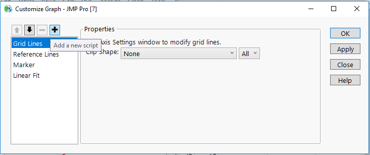
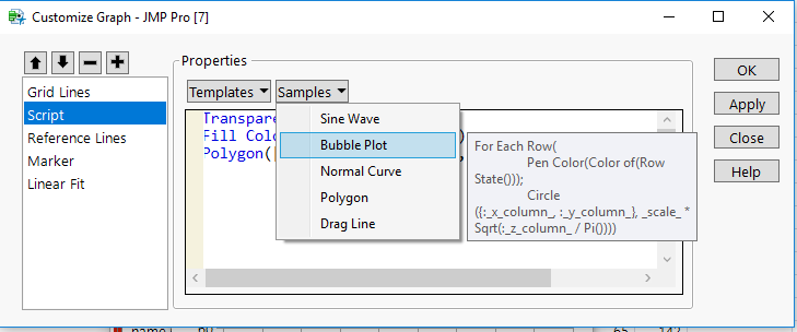
Overlaying on a map would require a different mechanism, like using the script in the Customize dialog:
There are some sample scripts provided:
You can find information on the Customize feature here:
https://www.jmp.com/support/help/14-2/customize-graphical-elements.shtml
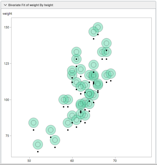
Here's a small example using circles:
Bivariate Fit of weight By height | JMP Public
Example of a Customize graphics script.
https://public.jmp.com/packages/5d56a884f40f010268e63cb3- Mark as New
- Bookmark
- Subscribe
- Mute
- Subscribe to RSS Feed
- Get Direct Link
- Report Inappropriate Content
Re: pie graphs+heat maps
Thanks for the additional information. I've bookmarked this discussion so I can have it on file and then also go back to re-read the additional info you sent.
Sorry, I worry I might have not explained what I meant about marking your post as a solution -- I don't think I can because I wasn't the original poster (and therefore don't have that option), not because you didn't address the heatmap. My apologies if it read that way -- I went back and re-read it, and it does kind of sound like I was saying it that way (not good on my part).
I'm familiar with JSL and use it for many other things, but have not attempted using it for customized graphing like this, so this will be a new area for me to learn!
Thanks!,
DS
- Mark as New
- Bookmark
- Subscribe
- Mute
- Subscribe to RSS Feed
- Get Direct Link
- Report Inappropriate Content
Re: pie graphs+heat maps
Wow! This is great. Thanks for all the help and info John. I had no idea that the custom map feature existed, so I went down that "rabbit hole" for a day or two just thinking about all the cool ways I could use that to plot data onto traced images of the corals I study (sadly, though, I rarely take tons of samples WITHIN the same colony, though it's definitely a backburner project idea, and this would be a cool way to display the findings).
I think having the ability to plot data onto whichever kind of shape, image, etc. is definitely a JMP feature that more people should know about, and I suggest having it be an actual feature within the package in the future (rather than as an add-in, though the add-in works fine for the time being).
To DS: I had actually just thought about making my pie graphs and maps in JMP (plotting data on maps is pretty straight-forward with JMP once you've done it a time or two), then using Adobe to make the types of figures shown in my original post, but JMP has ways to annotate data points on plots, evening pinning images to them. Therefore, with a bit of practice and work, you very well could likely make virtually the ENTIRE map+data figure in my original post in JMP alone. In fact, I may try to do just this in the coming weeks.
Thanks again to John for providing the solution!
- Mark as New
- Bookmark
- Subscribe
- Mute
- Subscribe to RSS Feed
- Get Direct Link
- Report Inappropriate Content
Re: pie graphs+heat maps
Your welcome Anderson and DS,
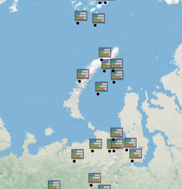
I published a better custom graphics script example annotating three variables per point on a map.
It's on JMP Public. Just click on the following following link:
https://public.jmp.com/packages/5d605bce3560ce0d2cafd48b
I used simple bars(thick lines) to represent three contrived cell values per point. Pie shapes would take a bit more work, but I wanted to offer this up as a proof of concept. The JSL script can be seen and downloaded from the post details on JMP Public.
~John
Recommended Articles
- © 2026 JMP Statistical Discovery LLC. All Rights Reserved.
- Terms of Use
- Privacy Statement
- Contact Us


