- New to JMP? Let the Data Analysis Director guide you through selecting an analysis task, an analysis goal, and a data type. Available now in the JMP Marketplace!
- See how to install JMP Marketplace extensions to customize and enhance JMP.
- Subscribe to RSS Feed
- Mark Topic as New
- Mark Topic as Read
- Float this Topic for Current User
- Bookmark
- Subscribe
- Mute
- Printer Friendly Page
Discussions
Solve problems, and share tips and tricks with other JMP users.- JMP User Community
- :
- Discussions
- :
- Re: making a graph of a sequence
- Mark as New
- Bookmark
- Subscribe
- Mute
- Subscribe to RSS Feed
- Get Direct Link
- Report Inappropriate Content
making a graph of a sequence
Hi all,
I have a data table that presents a sequence over time and records only when there is a change (un equal time intervals).
I would like to produce a graph with time on the horizontal axis and parallel horizontal lines representing the three categorical variables (place, condition and condition 2).
The colors along the lines will represent the different categories of place and conditions.
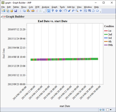
I manage to produce a somewhat fake presentation by setting start time as X and end time as Y, connecting with a line, coloring by category and compressing the Y axis so the line looks horizontal.
attached is the data table with two scripts to run.
I would be very thankful for any suggestions,
Thanks,
Ron
Accepted Solutions
- Mark as New
- Bookmark
- Subscribe
- Mute
- Subscribe to RSS Feed
- Get Direct Link
- Report Inappropriate Content
Re: making a graph of a sequence
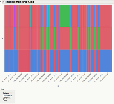
FWIW, I wrote the attached script, which generates this kind of plot (basically a 'Cell Plot' with a proportionate time axis):
No doubt it could be much improved, but it's a start if anyone has the inclination to do more. I've also attached a modified version of the data from ron_horne.
- Mark as New
- Bookmark
- Subscribe
- Mute
- Subscribe to RSS Feed
- Get Direct Link
- Report Inappropriate Content
Re: making a graph of a sequence
Ron,
There is a Gantt Chart addin in the JMP File Exchange, that you may want to look at. It uses a method to produce a chart of sequences.
- Mark as New
- Bookmark
- Subscribe
- Mute
- Subscribe to RSS Feed
- Get Direct Link
- Report Inappropriate Content
Re: making a graph of a sequence
thanks txnelson,
I know about that add in, just couldn't get it to do what i want. in terms of that platform my "tasks" start and end multiple times. for example, The location "task" switches from "in" to "out" many times and i didn't get the platform to represent that. Did i miss anything?
using the example given with the add in, i would like to have all the tasks in one bar with different segments of time indicating the different tasks. in my case there is no overlap in time between "in" and "out"
ron
- Mark as New
- Bookmark
- Subscribe
- Mute
- Subscribe to RSS Feed
- Get Direct Link
- Report Inappropriate Content
Re: making a graph of a sequence
Hi Ron,
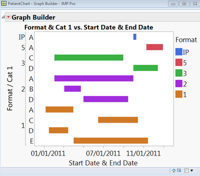
See the image below and let me know if this is more like what you are looking for or not.
Best,
Bill
- Mark as New
- Bookmark
- Subscribe
- Mute
- Subscribe to RSS Feed
- Get Direct Link
- Report Inappropriate Content
Re: making a graph of a sequence
hi bill,
this is quite close since it allows "Format" categories to start and end multiple times. do you think it is possible to show in one bar various starting and ending points of the same category?
ron
- Mark as New
- Bookmark
- Subscribe
- Mute
- Subscribe to RSS Feed
- Get Direct Link
- Report Inappropriate Content
Re: making a graph of a sequence
(Just want to check my understanding of what you are looking for . . . ).
You have three 'processes' (say p1, p2 and p3), each one of which can exist in several states (n1, n2 and n3 respectively). Each state is to be represented as a colour. You add a new row to the table when any one of the variables changes its state, and record the time at which that happens. You then want a (horizontal) timeline for each process showing changes in state.
Is that correct, please? If so, that doesn't sound too hard with a graphics script using a series of filled rectangles.
- Mark as New
- Bookmark
- Subscribe
- Mute
- Subscribe to RSS Feed
- Get Direct Link
- Report Inappropriate Content
Re: making a graph of a sequence
yes Ian@JMP
i think you got it right.
i was trying to produce this graphe using bars and ranges but without successes so far.
thanks,
ron
- Mark as New
- Bookmark
- Subscribe
- Mute
- Subscribe to RSS Feed
- Get Direct Link
- Report Inappropriate Content
Re: making a graph of a sequence
FWIW, I wrote the attached script, which generates this kind of plot (basically a 'Cell Plot' with a proportionate time axis):
No doubt it could be much improved, but it's a start if anyone has the inclination to do more. I've also attached a modified version of the data from ron_horne.
- Mark as New
- Bookmark
- Subscribe
- Mute
- Subscribe to RSS Feed
- Get Direct Link
- Report Inappropriate Content
Re: making a graph of a sequence
- Mark as New
- Bookmark
- Subscribe
- Mute
- Subscribe to RSS Feed
- Get Direct Link
- Report Inappropriate Content
Re: making a graph of a sequence
Ron,
I was playing around with my data set and I cannot come up with a way to make your graph. Do you have a sample data set you can share?
Bill
Recommended Articles
- © 2026 JMP Statistical Discovery LLC. All Rights Reserved.
- Terms of Use
- Privacy Statement
- Contact Us


