cancel
Showing results for 
Show  only  | Search instead for 
Did you mean: 
New to using JMP? Hit the ground running with the Early User Edition of Discovery Summit. Register now, free of charge.
Register for our Discovery Summit 2024 conference, Oct. 21-24, where you’ll learn, connect, and be inspired.
Choose Language Hide Translation Bar
maryam_nourmand
Level III

kernel control chart

Hello.
my question is how can I fit a kernel density plot for my predictive model residuals in a way that first identifies and removes outliears data points, and then presents the final kernel plot with no outliears data along with its confidence bounds and shape?

1 REPLY 1
Byron_JMP
Staff

Re: kernel control chart

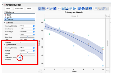
There are multiple ways to identify putative outliers. Once the rows with outliers are identified, use the hide and exclude option to remove them from calculations and hide them from graphs.


What you're looking for isn't a "Control Chart" but something like a Run Chart.


Try using Control Chart Builder"
Byron_JMP_0-1715021457416.png


JMP Systems Engineer, Health and Life Sciences (Pharma)