- New to JMP? Join us Sept. 23-24 for the Early User Edition of Discovery Summit, tailor-made for new users. Register now for free!
- Your voice matters! Tell us how you prefer to receive JMP updates, so we can tailor our communication to your needs. Take short survey.
- See how to access JMP Marketplace - and - find, create & share add-ins to extend your JMP. Watch video.
- Subscribe to RSS Feed
- Mark Topic as New
- Mark Topic as Read
- Float this Topic for Current User
- Bookmark
- Subscribe
- Mute
- Printer Friendly Page
Discussions
Solve problems, and share tips and tricks with other JMP users.- JMP User Community
- :
- Discussions
- :
- Re: how can I analyse a Split-Plot design?

- Mark as New
- Bookmark
- Subscribe
- Mute
- Subscribe to RSS Feed
- Get Direct Link
- Report Inappropriate Content
how can I analyse a Split-Plot design?
Please, does anyone can teach me how to analyse a split-plot design? It would be helpful a screnshot of the fit model window.
I have my data attached. Temperature is the whole plot and and time is the subplot.
Thank you very much!
P.S: I'm a beginner in statistics and in JMP.
Accepted Solutions

- Mark as New
- Bookmark
- Subscribe
- Mute
- Subscribe to RSS Feed
- Get Direct Link
- Report Inappropriate Content
Re: how can I analyse a Split-Plot design?
Congratulations, Bordini, you are specifying your model correctly. You matched the fixed effects.
Since you stated you are new to statistics and JMP, I'll try to keep it simple. Most classical statistics assumed independence (no correlation) within blocks (plots) and repeated measures. In the 1980's as compute power was radidly increasing so did the statistical methods that accomodate different assumptions, different covariance structure. For example, for an actual split plot design, the layout of the subplot could have spatial effects, etc. Independence no longer has to be assumed. Note, if you run your Mixed Model in JMP 12 you will get a zero effect for Shift not the -11.7776 result in JMP 13 and 14. JMP 13 and 14 uses a new method (Kackar-Harville), a correction that is applied to the variance matrix of the fixed effects.
I have not read through all the details, but it appears JMP 13 and 14 is using a random intercept covariance structure, where JMP 12 set the values to 0. See the left screenshot, this is where the -11.7776 is coming from. Minitab is likey using a different approximation method (since it's intercept is not zero). When using different software the parameterization can be different as well. JMP uses the kth effect to be the negative sum of effects 1-(k-1). From your screeshot of the output, it looks like Minitab uses the 1st block to be the sum of the others [I am guessing].
I know this "statistics" stuff might seem too complex, but don't give up yet. One of the reasons, I am a fan of JMP because it so easy to visualize variation and effects. See the variability plot of your data table. A good plot of the doesn't rely on best best methods. Note that, the size of the Temperature effect is large. Variation in the horizontal purple lines represent the Time effect. Look at the effect of Temperature at Time=30. It is different. That is the Temperature*Time interaction. Not shown here is the standard deviation plot. The variability of shift is smaller for high Temperature and high Time. The fixed effects model is an numeric estimation, this is the visual estimation.
I hope that helps.


- Mark as New
- Bookmark
- Subscribe
- Mute
- Subscribe to RSS Feed
- Get Direct Link
- Report Inappropriate Content
Re: how can I analyse a Split-Plot design?
You can find documentation on how to setup Split Plot analyses in the Fitting Linerar Models guide
Help==Books==>Fitting Linear Models
- Mark as New
- Bookmark
- Subscribe
- Mute
- Subscribe to RSS Feed
- Get Direct Link
- Report Inappropriate Content
Re: how can I analyse a Split-Plot design?
Thank you. I already looked at the resources in JMP, but I did not not come up with the correct results. I have a MINITAB output with the correct results, but mine from JMP are completely different. I honestly don't know what I'm doing wrong in JMP.
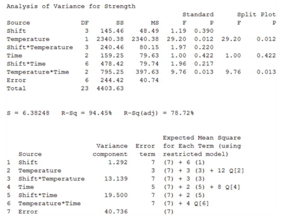
See MINITAB output attached, please. Thank you.

- Mark as New
- Bookmark
- Subscribe
- Mute
- Subscribe to RSS Feed
- Get Direct Link
- Report Inappropriate Content
Re: how can I analyse a Split-Plot design?
Bordini,
The data sets must be different. The Total Sums of Squares is based solely on the values of the response. Your Minitab output has 23 df and SS = 4403.63 The data you supplied has df=23 and SS = 5436.958
- Mark as New
- Bookmark
- Subscribe
- Mute
- Subscribe to RSS Feed
- Get Direct Link
- Report Inappropriate Content
Re: how can I analyse a Split-Plot design?
Hi, thank you very much for looking at my data. Through your comment, I was able to notice that there was a data entry error, which I fixed (that's why my sum of squares was different from the minitab output). I attached the corrected data here.
After fixing this data entry error, I was able to have the same Sum of Squares from the Minitab output. However, the variance and F value for factor "shift" are still different.
I have attached a screenshot of how I put my variables in the "Fit Model" window. I also attached the correct data entry, and the output from the Unrestricted and Restricted model (The last is the one I'm most interested in). Perhaps, the way I'm entering the factors in the Fit Model window is the problem, because this is a split plot design, being temperature whole plot and time is the subplot.
Thank you very much for your time and help!
- Mark as New
- Bookmark
- Subscribe
- Mute
- Subscribe to RSS Feed
- Get Direct Link
- Report Inappropriate Content
Re: how can I analyse a Split-Plot design?
The other attachments are here.


- Mark as New
- Bookmark
- Subscribe
- Mute
- Subscribe to RSS Feed
- Get Direct Link
- Report Inappropriate Content
Re: how can I analyse a Split-Plot design?
Congratulations, Bordini, you are specifying your model correctly. You matched the fixed effects.
Since you stated you are new to statistics and JMP, I'll try to keep it simple. Most classical statistics assumed independence (no correlation) within blocks (plots) and repeated measures. In the 1980's as compute power was radidly increasing so did the statistical methods that accomodate different assumptions, different covariance structure. For example, for an actual split plot design, the layout of the subplot could have spatial effects, etc. Independence no longer has to be assumed. Note, if you run your Mixed Model in JMP 12 you will get a zero effect for Shift not the -11.7776 result in JMP 13 and 14. JMP 13 and 14 uses a new method (Kackar-Harville), a correction that is applied to the variance matrix of the fixed effects.
I have not read through all the details, but it appears JMP 13 and 14 is using a random intercept covariance structure, where JMP 12 set the values to 0. See the left screenshot, this is where the -11.7776 is coming from. Minitab is likey using a different approximation method (since it's intercept is not zero). When using different software the parameterization can be different as well. JMP uses the kth effect to be the negative sum of effects 1-(k-1). From your screeshot of the output, it looks like Minitab uses the 1st block to be the sum of the others [I am guessing].
I know this "statistics" stuff might seem too complex, but don't give up yet. One of the reasons, I am a fan of JMP because it so easy to visualize variation and effects. See the variability plot of your data table. A good plot of the doesn't rely on best best methods. Note that, the size of the Temperature effect is large. Variation in the horizontal purple lines represent the Time effect. Look at the effect of Temperature at Time=30. It is different. That is the Temperature*Time interaction. Not shown here is the standard deviation plot. The variability of shift is smaller for high Temperature and high Time. The fixed effects model is an numeric estimation, this is the visual estimation.
I hope that helps.
- Mark as New
- Bookmark
- Subscribe
- Mute
- Subscribe to RSS Feed
- Get Direct Link
- Report Inappropriate Content
Re: how can I analyse a Split-Plot design?
Wow! Thank you so much for such comprehensive explanation! It helped me a lot! I had no idea that I could find such differences among statistic softwares! Thank you so much for showing and explaining the variability plot! You helped me a lot!
Thank you for your time, patience and all explanation! I really appreciate it!
Recommended Articles
- © 2026 JMP Statistical Discovery LLC. All Rights Reserved.
- Terms of Use
- Privacy Statement
- Contact Us