- New to JMP? Let the Data Analysis Director guide you through selecting an analysis task, an analysis goal, and a data type. Available now in the JMP Marketplace!
- See how to install JMP Marketplace extensions to customize and enhance JMP.
- Subscribe to RSS Feed
- Mark Topic as New
- Mark Topic as Read
- Float this Topic for Current User
- Bookmark
- Subscribe
- Mute
- Printer Friendly Page
Discussions
Solve problems, and share tips and tricks with other JMP users.- JMP User Community
- :
- Discussions
- :
- building a graph
- Mark as New
- Bookmark
- Subscribe
- Mute
- Subscribe to RSS Feed
- Get Direct Link
- Report Inappropriate Content
building a graph
I am trying to do something but can't find a solution.
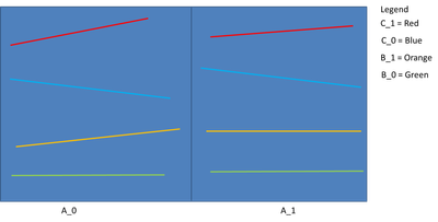
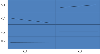
I have 6 columns: A_0, A_1, B_0, B_1, C_0, and C_1. Each column contains multiple values. I want to create a graph with 4 linear lines.
- All values from A_0 and A_1 should be on the same x-axis.
- All values from B_0, B_1, C_0, and C_1 should be on the y-axis.
Why 4 linear lines?
- A_0 with B_0 (first line)
- A_0 with C_0 (second line)
- A_1 with B_1 (third line)
- A_1 with C_1 (fourth line)
Do you have any suggestions on how to do this?
- Mark as New
- Bookmark
- Subscribe
- Mute
- Subscribe to RSS Feed
- Get Direct Link
- Report Inappropriate Content
Re: building a graph
Add your columns to your graph builder
Add four lines (right click add line).
Modify Variables of each line as needed
And depending on your data there might be other/better ways of doing this
- Mark as New
- Bookmark
- Subscribe
- Mute
- Subscribe to RSS Feed
- Get Direct Link
- Report Inappropriate Content
Re: building a graph
Hi @Liranlev ,
Based on what I understand, you would like to create;
- Line Chart
- Expected Result: You want to have 4 linear lines only.
- X-axis variable: A_0 & A_1
- Y-axis variable: B_0, B_1, C_0 & C_1
Questions:
- Do you want a 4 linear lines per X-axis Category?
- Do you want a stack Y-axis? I'm not sure if the value within the same?
Or
- Do you want an overlay Y-axis?
*Many ways to create through Graph Builder. How do you want to see it ?
1) Stack Y-Axis
2) Overlay Y-axis
3) Stack Y-axis (mute the color of unwanted lines)
Anyway, you need to tick "Row order" to display all raw Y-values
If you can draft the visual of the output, it is much easier to help.
Recommended Articles
- © 2026 JMP Statistical Discovery LLC. All Rights Reserved.
- Terms of Use
- Privacy Statement
- Contact Us


