- Subscribe to RSS Feed
- Mark Topic as New
- Mark Topic as Read
- Float this Topic for Current User
- Bookmark
- Subscribe
- Mute
- Printer Friendly Page
Discussions
Solve problems, and share tips and tricks with other JMP users.- JMP User Community
- :
- Discussions
- :
- Within sigma mismatch between IMR control chart & process screening platform
- Mark as New
- Bookmark
- Subscribe
- Mute
- Subscribe to RSS Feed
- Get Direct Link
- Report Inappropriate Content
Within sigma mismatch between IMR control chart & process screening platform
Hello,
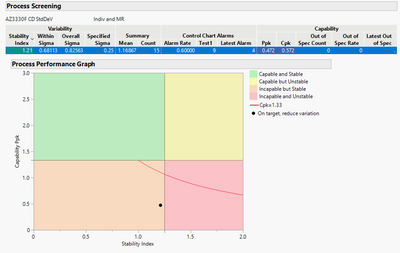
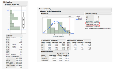
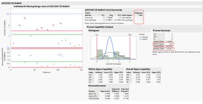
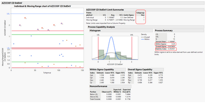
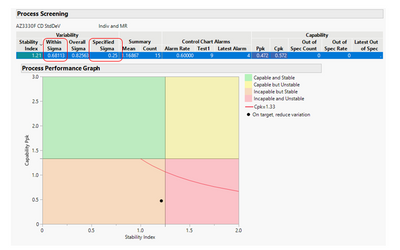
I am trying to plot control charts for various process parameters. My data is a monitoring data where I get one data point for each parameter every week. The parameter shown here is the std dev measurement from the monitor wafer. I am trying to plot these std dev. data points from multiple weeks into an IMR chart. I was trying to use JMP process screening platform to be able to short list among 100s of other parameters. The problem I am having is that when I use process screening summary, the stability index is showing as 1.21 (green). When I select the parameter and plot control chart for the selected item, the control chart shows a stability index of 3.302531.
Here are some snap shots
- Process screening summary
- Distributions & Process Capability
- IMR control chart --> Discrepancy for within sigma seen here. My sub group size is 1 and I have locked in the control limits. There is a note on the control chart that says "Within Sigma is set to a value derived from user-defined control limits".
So what should I be doing to plot this kind of data on a control chart using process screening? I wanted to use the process performance graph as a tool to shortlist the parameters whose control charts need to be plotted vs. plotting 100s of charts everyday for the manufacturing line. I am attaching the data set behind this graph.
Thanks in advance!!
- Mark as New
- Bookmark
- Subscribe
- Mute
- Subscribe to RSS Feed
- Get Direct Link
- Report Inappropriate Content
Re: Within sigma mismatch between IMR control chart & process screening platform
I may not understand exactly what the problem is, but for using a Moving Range chart (IR), the Range Span (surrogate subgroup size) should be 2.
- Mark as New
- Bookmark
- Subscribe
- Mute
- Subscribe to RSS Feed
- Get Direct Link
- Report Inappropriate Content
Re: Within sigma mismatch between IMR control chart & process screening platform
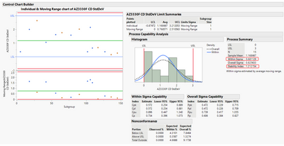
When I removed the user defined control limits from column properties, now I see the "Within Sigma" in the IMR control chart matching to the "Within sigma" on the process screening platform.
My question is what is the best chart I should use with user defined control limits on the data I have (similar to the file attached in my previous post)? I have 100s of parameters in the manufacturing line similar to this. I hoped to use the process performance graph to shortlist only specific processes that fall in the yellow, red & orange quadrants.
We are trying to operate the process in the control limits defined below. And the stability index shown on the control chart is 3.3 which should be in the red quadrant on the process performance graph for the Ppk listed below. But process performance graph shows this parameter in the orange quadrant.
Just trying to find out what are my best options to use this sort of individual measurements on the process screening platform so that I can consistently filter out good processes and just focus on unstable processes for charting purposes?
- Mark as New
- Bookmark
- Subscribe
- Mute
- Subscribe to RSS Feed
- Get Direct Link
- Report Inappropriate Content
Re: Within sigma mismatch between IMR control chart & process screening platform
Here are my thoughts/questions:
1. Not to be judgmental, but do you understand how control chart method works? The control limits are a function of the data and in particular how the data was obtained. First, the IMR chart is used for cases where there are no rational subgroups (you can do better at understanding and assigning sources of variation when you can create rational subgroups as a function of rational hypotheses. The MR chart answers the question is the variation in consecutive "data points" consistent and stable. The Individual chart answers the questions is there variation over and above the variation captured or predicted in the MR chart (the control limits are a function of the MR).
2. How did you get the "user defined" control limits? Are they appropriate to use for the given data set? What sources of variation would be captured in consecutive data points? What sources of variation would change over time (between subgroups)?
3. You can, of course, do any comparisons you want and chart the data however you want, but control charts are intended to do a specific comparison. They are intended to compare sources of variation (this is what the X-bar or individual charts do), however in order to do the comparison, you must first determine if the basis for comparison is stable. This is the purpose oof the Range or Moving Range chart. The range chart should always be assessed first to determine if the comparison is reasonable.
Please read Wheeler's books and papers:
Wheeler, Donald, and Chambers, David (1992) “Understanding Statistical Process Control” SPC Press (ISBN 0-945320-13-2)
Wheeler, Donald (2015) “Rational Sampling”, Quality Digest
Wheeler, Donald (2015) “Rational Subgrouping”, Quality Digest
And if you have the interest, the originator of the control chart method:
Shewhart, Walter A. (1931) “Economic Control of Quality of Manufactured Product”, D. Van Nostrand Co., NY
- Mark as New
- Bookmark
- Subscribe
- Mute
- Subscribe to RSS Feed
- Get Direct Link
- Report Inappropriate Content
Re: Within sigma mismatch between IMR control chart & process screening platform
Thank you @statman !! I am a rookie in SPC so I do not understand the full depth of it. I just ordered Donald Wheeler's book.
- Mark as New
- Bookmark
- Subscribe
- Mute
- Subscribe to RSS Feed
- Get Direct Link
- Report Inappropriate Content
Re: Within sigma mismatch between IMR control chart & process screening platform
No worries...I have ~40 years experience, so if you need some help just post here and we're happy to help.
Recommended Articles
- © 2026 JMP Statistical Discovery LLC. All Rights Reserved.
- Terms of Use
- Privacy Statement
- Contact Us
