- New to JMP? Let the Data Analysis Director guide you through selecting an analysis task, an analysis goal, and a data type. Available now in the JMP Marketplace!
- See how to install JMP Marketplace extensions to customize and enhance JMP.
- Subscribe to RSS Feed
- Mark Topic as New
- Mark Topic as Read
- Float this Topic for Current User
- Bookmark
- Subscribe
- Mute
- Printer Friendly Page
Discussions
Solve problems, and share tips and tricks with other JMP users.- JMP User Community
- :
- Discussions
- :
- Re: Why is this DropZone called "Color"
- Mark as New
- Bookmark
- Subscribe
- Mute
- Subscribe to RSS Feed
- Get Direct Link
- Report Inappropriate Content
Why is this DropZone called "Color"
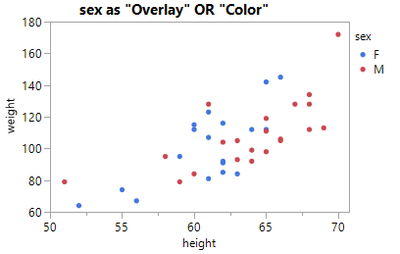
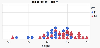
Day 1 with JMP and a user wants to generate a point plot with 2 different colors for male and female:
The easy solution: use the Color Dropzone
The surprise: The Overlay does the same.
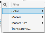
The second surprise: "Color" can do more than just "color":
For every entry in the legend, the user gets the possibility to define the Marker Style as well - as well as Size and Transparency.
A lazy user doesn't configure the colors manually - again and again for every single plot and subplot.
One alternative - definitely not the best!: row states to specify Colors and Markers.
disadvantages:
- the legend in Graph Builder doesn't fit
- row states are static. When the user changes the values in the table, they have to correct the row states manually. Otherwise the plots will be wrong!
Another alternative - by far better:
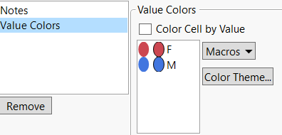
define suitable colors via Column Property: Value Columns
Pros:
- meaningful legends - automatically (!)
- separate settings for every column (not via rows)
- I can control (via the Overlay and Color dropzone) where I want to use the setting - and for wich plots I DON'T want to use the setting : )
- I can overwrite the setting for individual entries via the legend right click menu
The 3rd surprise: there is no Column Property: Value Markers *)
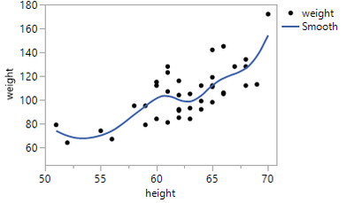
Day 2 - the JMP user detects the subtle (and not so subtle) differences between the Color and Overlay Dropzones:
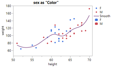
by adding a smoother:
Now, let's add Color to the plot
suprise 4: with Color via Color, there is just a single fit curve:
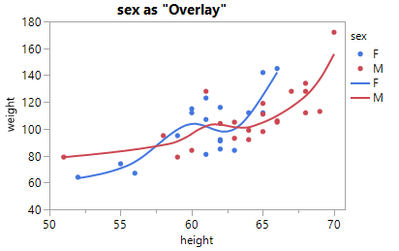
... this is when the user remembers surprise #1, tries Overlay, and falls in love with the Overlay dropzone:
So, for scatter plots there is no apparent difference between Color and Overlay - but for other plots it is !!!
And often Overlay is THE way to add color.
Another example:

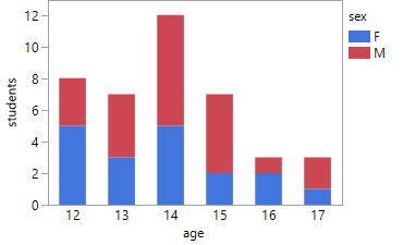
Now let's generate another points plot - where there is a difference between Color and Overlay:
Color just adds color to the points, Overlay generates separate plots for every color, overlays them
- and by doing so: hides some girls. -> dangerous!

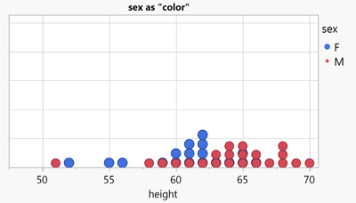
Let's keep the plot as a stacked bubble plot, and with the findings from surprise #2, let's now define Markers for different values
... with the help of the Color Dropzone
- Mark as New
- Bookmark
- Subscribe
- Mute
- Subscribe to RSS Feed
- Get Direct Link
- Report Inappropriate Content
Re: Why is this DropZone called "Color"
in Pictures from the Gallery#9, @scwise mentions this mismatch between Overlay encoding @ 21 min .
- Mark as New
- Bookmark
- Subscribe
- Mute
- Subscribe to RSS Feed
- Get Direct Link
- Report Inappropriate Content
Re: Why is this DropZone called "Color"
Interesting:
Overlay Dropzone:
The user can adjust the Line Color and the Fill Color for every item:
Color Dropzone:
- it says Fill color, but Graph Builder changes the Line Color.
What is the purpose of Fill Pattern?
no effect (A) - there is not even a fill pattern:
*) no effect (B) - after applying a Fill Color via the "box plot" settings:
[please note the difference between the legend and the plot]
Issue with Overlay and Color by Theme:
The color is applied as Line Color and as Fill Color:
Is there a trick to adjust the line color only?
- Mark as New
- Bookmark
- Subscribe
- Mute
- Subscribe to RSS Feed
- Get Direct Link
- Report Inappropriate Content
Re: Why is this DropZone called "Color"
I think of "color" as being strictly color, but "overlay" as being the equivalent of the old transparencies-on-a-projector apparatus where you could "overlay" different plots on top of each other. Yes, it's a little weird that overlay also drives the color, but I'm glad it does. Overlay is also one of my favorite features of Graph Builder because it lets me break line plots wherever I want using a specific variable.
- Mark as New
- Bookmark
- Subscribe
- Mute
- Subscribe to RSS Feed
- Get Direct Link
- Report Inappropriate Content
Re: Why is this DropZone called "Color"
Color is much more than just "Color", see :
Why is this DropZone called "Color"
@hogi wrote:Day 1 ...
The second surprise: "Color" can do more than just "color":
For every entry in the legend, the user gets the possibility to define the Marker Style as well - as well as Size and Transparency.
zoom out view:
For Color together with Overlay, you are right.
Overlay takes away most of of Color's superpowers - just Color and Transparency are left:
- Mark as New
- Bookmark
- Subscribe
- Mute
- Subscribe to RSS Feed
- Get Direct Link
- Report Inappropriate Content
Re: Why is this DropZone called "Color"
@hogi wrote:Overlay takes away most of of Color's superpowers - just Color and Transparency are left:
oh yes - and actually, there are some cases where the Color dropzone takes the full control for Transparency.
There is a Transparency setting for the individual Overlay entries, but without effect:
Transparency for Overlay Group?
I hope in a future version of JMP the user will get more flexibility to adjust which settings are controlled by Color or Overlay .
- Mark as New
- Bookmark
- Subscribe
- Mute
- Subscribe to RSS Feed
- Get Direct Link
- Report Inappropriate Content
Re: Why is this DropZone called "Color"
Graph Builder: support more than 2 'Color' columns (:green_heart:)
-> now available in JMP19 : )
- Mark as New
- Bookmark
- Subscribe
- Mute
- Subscribe to RSS Feed
- Get Direct Link
- Report Inappropriate Content
Re: Why is this DropZone called "Color"
How to synchronize color settings in JMP?
(same color for points and lines | same color for the left and right plot ...)
by far the best option: Color Properties / Value Colors & Color Gradient:
very easy to define -> all plots share the same settings | no "shifts" caused by subsets and local data filters
Within a plot window, one can specify a color setting which is applied to all plot types (lines, points) and subplots.
via red triangle/Color Settings:
It is important to note the following when the user wants to apply color settings manually:
- If only one entry is visible in the legend ("M" is displayed as points and lines, but there is only one item in the legend),
the setting is applied to every corresponding plot (points, lines and other regions of the plot) -> synchronized changes *) - If there are more entries visible in the legend (e.g. two 'M's), the changed setting will only apply to one plot type/subplot.
- The transition from Mode 1 to Mode 2 is irreversible. Once a setting has been changed, it is not possible to switch back to mode 1. Not even Revert is enough to reset the setting (useful workaround: open the script, delete the settings and run the script)
- revert:
*) this is not a bug, it is a feature
- Mark as New
- Bookmark
- Subscribe
- Mute
- Subscribe to RSS Feed
- Get Direct Link
- Report Inappropriate Content
Re: Why is this DropZone called "Color"
related topic: assign a color to axis labels (to match the color used in the plot)
Until now, assigning a color to axis ticks and labels was complicated.
Users had to apply the color via the 'Properties' menu on the right.
This type of assignment is fragile: The setting is applied to the Nth axis Box.
Changing the plot layout ruins the assignment:
With JMP19, there is now an easier and more robust way: just click 'Parallel Y Labels' in the red triangle menu.
This new functionality has been implemented Plotting several trends from sensor data that have different units (or scale)
nice: the color will match the color in the plot
- « Previous
-
- 1
- 2
- Next »
Recommended Articles
- © 2026 JMP Statistical Discovery LLC. All Rights Reserved.
- Terms of Use
- Privacy Statement
- Contact Us
