- New to JMP? Let the Data Analysis Director guide you through selecting an analysis task, an analysis goal, and a data type. Available now in the JMP Marketplace!
- See how to install JMP Marketplace extensions to customize and enhance JMP.
- Subscribe to RSS Feed
- Mark Topic as New
- Mark Topic as Read
- Float this Topic for Current User
- Bookmark
- Subscribe
- Mute
- Printer Friendly Page
Discussions
Solve problems, and share tips and tricks with other JMP users.- JMP User Community
- :
- Discussions
- :
- Re: Why is this DropZone called "Color"
- Mark as New
- Bookmark
- Subscribe
- Mute
- Subscribe to RSS Feed
- Get Direct Link
- Report Inappropriate Content
Why is this DropZone called "Color"
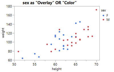
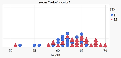
Day 1 with JMP and a user wants to generate a point plot with 2 different colors for male and female:
The easy solution: use the Color Dropzone
The surprise: The Overlay does the same.
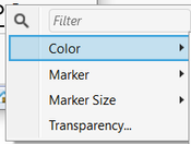
The second surprise: "Color" can do more than just "color":
For every entry in the legend, the user gets the possibility to define the Marker Style as well - as well as Size and Transparency.
A lazy user doesn't configure the colors manually - again and again for every single plot and subplot.
One alternative - definitely not the best!: row states to specify Colors and Markers.
disadvantages:
- the legend in Graph Builder doesn't fit
- row states are static. When the user changes the values in the table, they have to correct the row states manually. Otherwise the plots will be wrong!
Another alternative - by far better:
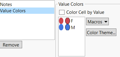
define suitable colors via Column Property: Value Columns
Pros:
- meaningful legends - automatically (!)
- separate settings for every column (not via rows)
- I can control (via the Overlay and Color dropzone) where I want to use the setting - and for wich plots I DON'T want to use the setting : )
- I can overwrite the setting for individual entries via the legend right click menu
The 3rd surprise: there is no Column Property: Value Markers *)
Day 2 - the JMP user detects the subtle (and not so subtle) differences between the Color and Overlay Dropzones:
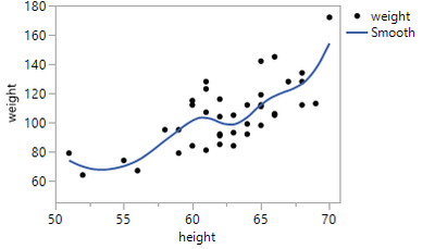
by adding a smoother:
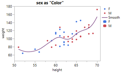
Now, let's add Color to the plot
suprise 4: with Color via Color, there is just a single fit curve:
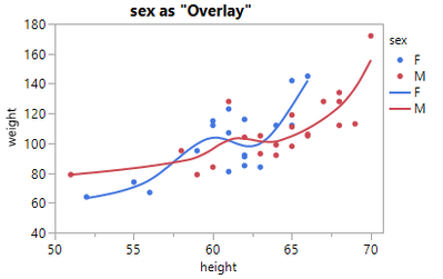
... this is when the user remembers surprise #1, tries Overlay, and falls in love with the Overlay dropzone:
So, for scatter plots there is no apparent difference between Color and Overlay - but for other plots it is !!!
And often Overlay is THE way to add color.
Another example:

Now let's generate another points plot - where there is a difference between Color and Overlay:
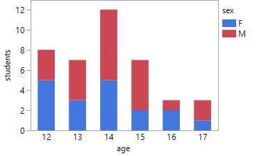
Color just adds color to the points, Overlay generates separate plots for every color, overlays them
- and by doing so: hides some girls. -> dangerous!

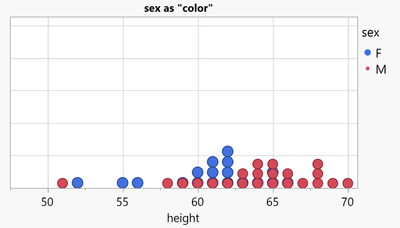
Let's keep the plot as a stacked bubble plot, and with the findings from surprise #2, let's now define Markers for different values
... with the help of the Color Dropzone
- Mark as New
- Bookmark
- Subscribe
- Mute
- Subscribe to RSS Feed
- Get Direct Link
- Report Inappropriate Content
Re: Why is this DropZone called "Color"
Day 3: The user likes the non.overlapping points, wants to add some Color (via age) .. and get the legend right.
- Mark as New
- Bookmark
- Subscribe
- Mute
- Subscribe to RSS Feed
- Get Direct Link
- Report Inappropriate Content
Re: Why is this DropZone called "Color"
differences between Overlay and Color:
:folded_hands: Graph Builder: support more than 2 'Color' columns
- > available since JMP19
Graph Builder - Overlay by multiple columns :
not yet available, still collecting Kudos ...
- Mark as New
- Bookmark
- Subscribe
- Mute
- Subscribe to RSS Feed
- Get Direct Link
- Report Inappropriate Content
Re: Why is this DropZone called "Color"
new Column Property: Value Markers *)
-> again open for voting
Just imagine how helpful it will be:
- meaningful legends in Graph Builder (compared to the alternative via row states)
- fully automatic + consistent (compared to assigning markers manually via the legend)
interested?
Follow the link and support the wish with a Kudo.
- Mark as New
- Bookmark
- Subscribe
- Mute
- Subscribe to RSS Feed
- Get Direct Link
- Report Inappropriate Content
Re: Why is this DropZone called "Color"
I really like JMP's approach, where users can define some default settings via column properties, meaning that every new graph is perfect from the outset with no manual changes required. Unfortunately, this approach isn't 100% effective.
Most of the time, I have to manually adjust the settings to get the graph I want.
Right-clicking on the legend to manually change the settings is very time consuming. This video demonstrates an alternative approach: It basically ignores the default settings and gives the user an interactive GUI to specify the settings for each individual element precisely. Compared to right-clicking on the legend items, this method can be orders of magnitude faster.
The drawback:
- too much flexibility - which can lead to inconsistent settings (can be intentional, like in the video - may be unintentional)
- I have not yet managed to create a meaningful legend for the final graph.
- Mark as New
- Bookmark
- Subscribe
- Mute
- Subscribe to RSS Feed
- Get Direct Link
- Report Inappropriate Content
Re: Why is this DropZone called "Color"
for "no zig-zag lines", there exists a wish to automatically implement the functionality in Graph Builder:
Graph Builder: Line - possibility to add breaks
- Mark as New
- Bookmark
- Subscribe
- Mute
- Subscribe to RSS Feed
- Get Direct Link
- Report Inappropriate Content
Re: Why is this DropZone called "Color"
I need this script...please share!
- Mark as New
- Bookmark
- Subscribe
- Mute
- Subscribe to RSS Feed
- Get Direct Link
- Report Inappropriate Content
Re: Why is this DropZone called "Color"
Did you know that Overlay Encoding can be used to Overrule the Color Dropzone:
[age used for the Color Dropzone - but the Overlay encoding is set to Color
- so, color of the points is determined by the Overlay settings, NOT by the Color Dropzone.
changing the color settings for age doesn't have an effect on the colors of the Graph]
Names Default to Here(1);
dt = Open( "$SAMPLE_DATA/Big Class.jmp" );
Graph Builder(
	Variables(
		X( :height ),
		Y( :weight ),
		Overlay( :sex, Overlay Encoding( "Color" ) ),
		Color( :age )
	),
	Elements( Points( X, Y, Legend( 1 ) ) ),
	SendToReport(
		Dispatch( {}, "400", ScaleBox,
			{Legend Model( 1, Properties( 6, {Marker( "Triangle" )}, Item ID( "female", 1 ) ) )}
		)
	)
); - Mark as New
- Bookmark
- Subscribe
- Mute
- Subscribe to RSS Feed
- Get Direct Link
- Report Inappropriate Content
Re: Why is this DropZone called "Color"
This rule holds ... till you use BLACK as Overlay color:
IF Overlay color is black, JMP will use the color from the Color Dropzone - despite Overlay Encoding = Color.
Names Default to Here(1);
dt = Open( "$SAMPLE_DATA/Big Class.jmp" );
Graph Builder(
	Variables(
		X( :height ),
		Y( :weight ),
		Overlay( :sex, Overlay Encoding( "Color" ) ),
		Color( :age )
	),
	Elements( Points( X, Y, Legend( 1 ) ) ),
	SendToReport(
		Dispatch( {}, "400", ScaleBox,
			{Legend Model(
				1,
				Properties(
					1,
					{Line Color( 0 ), Marker( "FilledCircle" ), Marker Size( 6 )},
					Item ID( "F", 1 )
				)
			)}
		)
	)
);
- Mark as New
- Bookmark
- Subscribe
- Mute
- Subscribe to RSS Feed
- Get Direct Link
- Report Inappropriate Content
Re: Why is this DropZone called "Color"
Another case where the above rule doesn't hold: Smoother, Bar, Contour , Box Plot & Line graphs *)
For Smoother and Line Graphs, the COLOR Dropzone controls the Color, independent of the Overlay Encoding for the Overlay.
This fact can lead to plots with inconsistent color settings:
*) Please note:
Line of Fit and Ellipse behave like points [but without the possibility to switch to Color by setting the Overlay color to black]
Area Graph seems to be a combination of both worlds:
Recommended Articles
- © 2026 JMP Statistical Discovery LLC. All Rights Reserved.
- Terms of Use
- Privacy Statement
- Contact Us
