- JMP will suspend normal business operations for our Winter Holiday beginning on Wednesday, Dec. 24, 2025, at 5:00 p.m. ET (2:00 p.m. ET for JMP Accounts Receivable).
Regular business hours will resume at 9:00 a.m. EST on Friday, Jan. 2, 2026. - We’re retiring the File Exchange at the end of this year. The JMP Marketplace is now your destination for add-ins and extensions.
- Subscribe to RSS Feed
- Mark Topic as New
- Mark Topic as Read
- Float this Topic for Current User
- Bookmark
- Subscribe
- Mute
- Printer Friendly Page
Discussions
Solve problems, and share tips and tricks with other JMP users.- JMP User Community
- :
- Discussions
- :
- What is graph builder's color ordering different than other charts?
- Mark as New
- Bookmark
- Subscribe
- Mute
- Subscribe to RSS Feed
- Get Direct Link
- Report Inappropriate Content
What is graph builder's color ordering different than other charts?
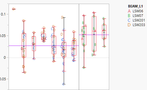
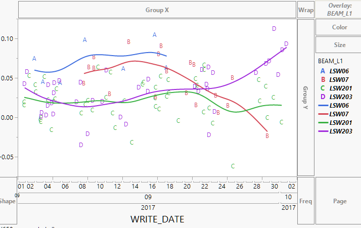
I have bivariate, oneway, and graphbuilder charts in a single report. There is a row legend applied so all the datapoints are alphanumeric with a specific color. The row legend is made with JMP Default color scheme and my Graph builder charts use the JMP Default color scheme for their overlay legends but for some reason the order in wich it assigns the colors is different than the other charts. See example below:
This variability chart is coloring in the order red, green, blue, orange for the LSW objects.
The graph builder however colors in the order blue, red, green, purple while the correct alphanumeric label is preserved from the row legend.
The only workaround I've found is to save the color property to the Beam_L1 columb but the problem with that is it does not Automatic Recalc as the filters change (which can change the number of BEAM_L1 objects). The row legend and graph builder colors do automatically change with filters but unfortunately they use different coloring orders even though they are both using the JMP Default color scheme.
Accepted Solutions
- Mark as New
- Bookmark
- Subscribe
- Mute
- Subscribe to RSS Feed
- Get Direct Link
- Report Inappropriate Content
Re: What is graph builder's color ordering different than other charts?
Some comments I made in a related thread:
Outside of Graph Builder, JMP will skip green when it needs two colors to avoid the common red/green color deficiency. However, Graph Builder is a little more dynamic and needs to be able to go from two to three colors without changing the first two colors, so it rearranges them from the start (each group of 3 gets a rotation around the color wheel). This only happens with the "JMP"-labeled color themes, so you avoid the dual sequencing by using a different color theme.
As far as the treatment of exclude goes, there's no option to change the behavior. I sometimes use value colors or add dummy values to get around any dynamic sensitivity.
- Mark as New
- Bookmark
- Subscribe
- Mute
- Subscribe to RSS Feed
- Get Direct Link
- Report Inappropriate Content
Re: What is graph builder's color ordering different than other charts?
If you set the column property "Value Color" for BEAM_L1 to the colors you want, and then startup Chart Builder, the colors used when overlaying the chart by BEAM_L1 will remain even when filtering.
JMP 13.2.1
Names Default To Here( 1 );
dt = New Table( "class",
	Add Rows( 40 ),
	New Column( "Age",
		Numeric,
		"Ordinal",
		Format( "Fixed Dec", 5, 0 ),
		Set Property(
			"Value Colors",
			{12 = -13977687, 13 = -3780931, 14 = -4222943, 15 = -13596966, 16 = -2211217, 17 =
			-10562780}
		),
		Set Values(
			[12, 12, 12, 12, 12, 12, 12, 12, 13, 13, 13, 13, 13, 13, 13, 14, 14, 14, 14, 14, 14,
			14, 14, 14, 14, 14, 14, 15, 15, 15, 15, 15, 15, 15, 16, 16, 16, 17, 17, 17]
		)
	),
	New Column( "Height",
		Numeric,
		"Continuous",
		Format( "Fixed Dec", 5, 0 ),
		Set Values(
			[59, 61, 55, 66, 52, 60, 61, 51, 60, 61, 56, 65, 63, 58, 59, 61, 62, 65, 63, 62, 63,
			64, 65, 64, 68, 64, 69, 62, 64, 67, 65, 66, 62, 66, 65, 60, 68, 62, 68, 70]
		)
	)
);
dt << Graph Builder(
	Variables( X( :age ), Y( :height ), Overlay( :age ) ),
	Elements( Box Plot( X, Y, Legend( 6 ) ) ),
	Local Data Filter(
		Add Filter(
			columns( :age ),
			Where( :age == {12, 13, 14, 15} ),
			Display( :age, Size( 160, 90 ), List Display )
		)
	)
);- Mark as New
- Bookmark
- Subscribe
- Mute
- Subscribe to RSS Feed
- Get Direct Link
- Report Inappropriate Content
Re: What is graph builder's color ordering different than other charts?
Setting Value Colors seems to match the Graph Builder colors but my variability chart seems to have it's own colors as set by the Row Legend. They both use the JMP defualt color theme, what do they seem to sample that theme differently?
Edit: It seems everything matches as long as I am not excluding any of the BEAM_L1 values due to my different filtering needs. So if I have no filtering (all beam_L1 values included), the colors match. But when I exclude a BEAM_L1, the colors on the variabiliy chart reset so the first BEAM_L1 is always red while the colors on the Graph Builder maintain the color for a given BEAM_L1, however the alphanumeric label change correctly (likely because this is set by row legend).
Basically it seems Graph Builder colors always consider excluded rows while row legend colors resample the color theme when rows are excluded.
- Mark as New
- Bookmark
- Subscribe
- Mute
- Subscribe to RSS Feed
- Get Direct Link
- Report Inappropriate Content
Re: What is graph builder's color ordering different than other charts?
Any comment on Graph Builder colors using a different logic from row legend colors (used in all other graphs). Graph builder always considers excluded rows for colors (Even if it doesn't display those excluded items in the legend) and there's no where to turn that off whereas row legend based coloring you have the option to consider excluded rows (however unlike graph builder, when considering excluded rows, those items DO show up in the legend even if not present in the graphed date)
So is there a way to have graph builder not consider excluded rows when assigning colors?
- Mark as New
- Bookmark
- Subscribe
- Mute
- Subscribe to RSS Feed
- Get Direct Link
- Report Inappropriate Content
Re: What is graph builder's color ordering different than other charts?
Some comments I made in a related thread:
Outside of Graph Builder, JMP will skip green when it needs two colors to avoid the common red/green color deficiency. However, Graph Builder is a little more dynamic and needs to be able to go from two to three colors without changing the first two colors, so it rearranges them from the start (each group of 3 gets a rotation around the color wheel). This only happens with the "JMP"-labeled color themes, so you avoid the dual sequencing by using a different color theme.
As far as the treatment of exclude goes, there's no option to change the behavior. I sometimes use value colors or add dummy values to get around any dynamic sensitivity.
- Mark as New
- Bookmark
- Subscribe
- Mute
- Subscribe to RSS Feed
- Get Direct Link
- Report Inappropriate Content
Re: What is graph builder's color ordering different than other charts?
To fix the issue, use JMP Blue Red Green
- no change for Graph Builder
- plus: same color scheme for the other platforms
- Mark as New
- Bookmark
- Subscribe
- Mute
- Subscribe to RSS Feed
- Get Direct Link
- Report Inappropriate Content
Re: What is graph builder's color ordering different than other charts?
@katharina_l , switching to JMP Blue Red Green solves a lot of issues.
Default-GraphBuilder-users won't even notice the difference - and when they use another report once in a while, they will find the same color scheme there ; )
- Mark as New
- Bookmark
- Subscribe
- Mute
- Subscribe to RSS Feed
- Get Direct Link
- Report Inappropriate Content
Re: What is graph builder's color ordering different than other charts?
Thank you very much Holger for bringing this up!
The actual setting (different color schemes for graph builder compared with other platforms) is really annoying for us, since in many of our internal reports we have to adjust color schemes of different platforms in order to avoid confusion
Recommended Articles
- © 2026 JMP Statistical Discovery LLC. All Rights Reserved.
- Terms of Use
- Privacy Statement
- Contact Us


