- New to JMP? Let the Data Analysis Director guide you through selecting an analysis task, an analysis goal, and a data type. Available now in the JMP Marketplace!
- See how to install JMP Marketplace extensions to customize and enhance JMP.
- Subscribe to RSS Feed
- Mark Topic as New
- Mark Topic as Read
- Float this Topic for Current User
- Bookmark
- Subscribe
- Mute
- Printer Friendly Page
Discussions
Solve problems, and share tips and tricks with other JMP users.- JMP User Community
- :
- Discussions
- :
- Re: Using graph builder to create graphs with grouped Y data
- Mark as New
- Bookmark
- Subscribe
- Mute
- Subscribe to RSS Feed
- Get Direct Link
- Report Inappropriate Content
Using graph builder to create graphs with grouped Y data
Hello,
I am a tropical ecologist specialising in the Amazonian canopy. I am writing my PhD thesis and using JMP Pro (I'm a fairly new user with no programming experience) to run PLS and other analyses on my data. I have a large dataset of leaves grouped by tree, leaf canopy level (sun or shade) and leaf age. For one of my first analyses I have 12 trees with 4 trees having both sun and shade leaves and the rest just sun leaves. I need to create graphs for different leaf traits such as leaf water content, leaf thickness, leaf fresh and dry weight, %Carbon content, etc. etc., these graphs need to be built such that:
X axis = leaf age
Y = leaf trait (e.g. leaf thickness) grouped by tree and by sun and shade canopy position
I have been trying to create these graphs but I keep getting a graph that splits the Y scale for each tree and when I try to put the sun and shade grouping into the graph it all just gets even worse. I would be very grateful if someone could advise me on how to create these Y-grouped graphs and how best to automise the production of numerous graphs. Many thanks in advance for the help!;
Accepted Solutions
- Mark as New
- Bookmark
- Subscribe
- Mute
- Subscribe to RSS Feed
- Get Direct Link
- Report Inappropriate Content
Re: Using graph builder to create graphs with grouped Y data
Hi Cecilia,
For getting all trees on one graph, you can put Tree in the Overlay slot (make sure the Tree column is marked as nominal since continuous variables can get binned otherwise). Then the Canopy variable will have to be in one of the Group X or Group Y slots.
If you really want all the lines in one plot, you can create a new variable that concatenates Tree and Canopy and then overlay by that variable. To do that, create a new character column and give it a Formula that concatenates the two other columns. Something like :Tree || " " || :Canopy. "||" is the text concatenation operation.
You can use a similar method to append the tree age values: :Age Class || "(" || Char(:age in weeks) || ")"
You can control the SU/SH order by adding a Value Order property to the Canopy column in the Column Info dialog.
For creating lots of similar graphs, you can use Column Switcher (under Red triangle > Script > Column Switcher) to do that interactively or use JSL scripting to do it programmatically (Red triangle > Script > Save to Script Window, then edit the Y name).
xan
- Mark as New
- Bookmark
- Subscribe
- Mute
- Subscribe to RSS Feed
- Get Direct Link
- Report Inappropriate Content
Re: Using graph builder to create graphs with grouped Y data
Hi CCHB,
I'm not sure exactly what you're looking for.
I mocked up some data and have attached it here so you can see what I started with.
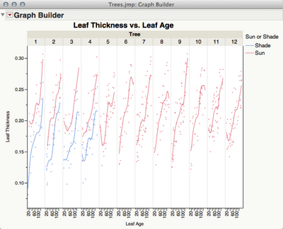
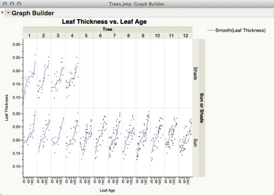
Here's a graph I created using the X Group role at the top of the graph. This gives you one graph for each Tree.
I also used the Sun or Shade column in the Overlay role to get one line for Sun and one for Shade for the trees that had both.
Alternatively you could use the Sun or Shade column in the Y Group role on the right side of the graph and get this.
If I've not guessed correctly, describe more completely what series of graphs you'd like and we can try to show you how to create them.
-Jeff
- Mark as New
- Bookmark
- Subscribe
- Mute
- Subscribe to RSS Feed
- Get Direct Link
- Report Inappropriate Content
Re: Using graph builder to create graphs with grouped Y data
Hola Jeff,
Many thanks for your reply and for taking the time to create example graphs, and apologies for not supplying enough information in my original post. Your graphs actually illustrate very well the problems I have been encountering. Using you graphs as an example:
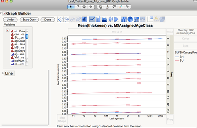
1. Thanks for the tip on using the Overlay role for the sun and shade leaf canopy position, that solves one problem. I have been using the Y group role at the left of graph for the different trees which gives me a graph that looks like yours but arranged horizontally rather than vertically. I have updated my graph using the Overlay role as shown below:
However, I would like the above to:
1. be one single graph rather than a graph for each tree.
2. I would like to add the equivalent number of weeks that each leaf age class represents in parenthesis, e.g. Y1(1), Y2(2), etc. I have this data in a separate column in my data table, how do you concatenate two or more columns in JMP Pro?
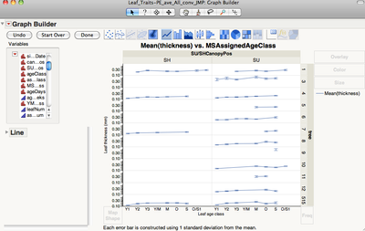
2. I have also re-created your second graph (I quite like this graph as it would be less busy than the previous one) as follows:
I would also like the above:
1. to be one single graph instead than one graph for each tree
2. to switch the order of the canopy position so SU is on the left and SH is on the right. I have reversed the order of the X and Y axis but I can't find this option for the X and Y grouping roles.
After organising the graphs to display the information correctly I would like to find a way of creating a whole lot of similar graphs but just changing the Y axis.
I hope that the above clarifies my questions and I thank you again for your help.
Cecilia
- Mark as New
- Bookmark
- Subscribe
- Mute
- Subscribe to RSS Feed
- Get Direct Link
- Report Inappropriate Content
Re: Using graph builder to create graphs with grouped Y data
Hi Cecilia,
For getting all trees on one graph, you can put Tree in the Overlay slot (make sure the Tree column is marked as nominal since continuous variables can get binned otherwise). Then the Canopy variable will have to be in one of the Group X or Group Y slots.
If you really want all the lines in one plot, you can create a new variable that concatenates Tree and Canopy and then overlay by that variable. To do that, create a new character column and give it a Formula that concatenates the two other columns. Something like :Tree || " " || :Canopy. "||" is the text concatenation operation.
You can use a similar method to append the tree age values: :Age Class || "(" || Char(:age in weeks) || ")"
You can control the SU/SH order by adding a Value Order property to the Canopy column in the Column Info dialog.
For creating lots of similar graphs, you can use Column Switcher (under Red triangle > Script > Column Switcher) to do that interactively or use JSL scripting to do it programmatically (Red triangle > Script > Save to Script Window, then edit the Y name).
xan
- Mark as New
- Bookmark
- Subscribe
- Mute
- Subscribe to RSS Feed
- Get Direct Link
- Report Inappropriate Content
Re: Using graph builder to create graphs with grouped Y data
Hola Xan,
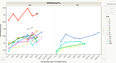
Many thanks for your recommendations, they were spot on. With both your and Jeff's help I have almost arrived at the graph I wish to create. Below is the graph I have come up with so far:
I have three further questions about these graphs:
1. How do I get rid of the X Group legend "SU/SHCanopyPos"? I have tried double clicking and right clicking the legend and playing around with the script (with my non-existent programming skills!) and I couldn't find a way of getting rid of this legend.
2. How can I superscript some of the text (e.i. units such as m2) in the Y legend?
3. This question I think is a bit more tricky: as you can see on the X Groupings, after I concatenated the "age in weeks" data onto the leaf age classes I ended up with two separate O/S1 age classes. This is because the sun leaves of this age class live shorter lives (61 weeks) than the shade leaves (79 weeks). Is there a way I could get just one O/S1 age class for each canopy position but with correct "age in weeks" for each one?
Finally, I used the Column Switcher to create similar graphs but didn't like it so much, I found it a bit cumbersome. So, I tried the scripting option and found it much more straight forward.
Many thanks again for the help,
Cecilia
- Mark as New
- Bookmark
- Subscribe
- Mute
- Subscribe to RSS Feed
- Get Direct Link
- Report Inappropriate Content
Re: Using graph builder to create graphs with grouped Y data
Nice work, Cecilia, in figuring all that out from my brief descriptions.
1. I don't think there's a way to turn off the Group X labels in the live view. You can right click and move it to the bottom, or you can change the styling of it in Preferences > Platforms > Graph Builder. Or you can Journal the graph, which makes a dead view, and then remove parts of it by using the "fat plus" selection tool.
2. JMP doesn't have a superscript style, but there are special Unicode characters for superscripted digits and you can use those in the name. Here's an example if this forum supports it: m².
3. The X axis is identical within grouping levels (in order to allow visual comparison across groups). However, you can nest Canopy and Leaf Age together on the X axis. In that case, missing sublevels will be omitted, which sounds like what you want.
- Mark as New
- Bookmark
- Subscribe
- Mute
- Subscribe to RSS Feed
- Get Direct Link
- Report Inappropriate Content
Re: Using graph builder to create graphs with grouped Y data
Hola Xan,
Many thanks for your prompt reply.
With respect to your comments:
1. Yes, I came to the same conclusion last night and have spent a frustrating morning and afternoon trying to rewrite some parts of the graph script to get it to do what I want. However, as I have VERY LITTLE programming experience I did not get very far! I have worked out what 95% of the different code sections are for but I have been unable to rewrite anything or add a line of code to get rid of the Group X labels. Below I have pasted the script for my latest graph (sorry, I don't know how to save it into a separate file). I have played around taking the "Name" part of the Group X variable declaration but it didn't work. I also tried to add a Dispatch line similar to the one that gets rid of the graph title but it this did not work either. Could you please help me with this? I have been avoiding learning to programme as I have a lot of work to do and taking a month or so (being very hopeful!) to learn a programming language just seems to take too much but I am coming to a point where I think its unavoidable, how difficult would it be to learn some basic scripting to be able to modify existing available graphs in Graph builder? Do you have any advise on this?
Graph Builder(
  Size( 868, 525 ),
  Show Footer( 0 ),
  Lock Scales( 1 ),
  Auto Stretching( 0 ),
  Variables(
  X( :Name( "Leaf Age Class (age in cummulative weeks)" ) ),
  Y( :thickness ),
  Group X( :Name( "SU/SHCanopyPos" ), Levels( 2 ) ),
  Overlay( :tree )
  ),
  Elements( Line( X, Y, Legend( 5 ), Row order( 0 ), Summary Statistic( "Mean" ) ) ),
  SendToReport(
  Dispatch(
  {},
  "Leaf Age Class (age in cummulative weeks)",
  ScaleBox,
  {Show Major Ticks( 0 ), Show Minor Ticks( 0 ), Rotated Labels( "Automatic" )}
  ),
  Dispatch( {}, "thickness", ScaleBox, {Min( 0.12 ), Max( 0.46 ), Inc( 0.05 ), Minor Ticks( 1 )} ),
  Dispatch( {}, "", ScaleBox, {Min( 0 ), Max( 0 ), Inc( 1 ), Minor Ticks( 0 )} ),
  Dispatch( {}, "", ScaleBox( 2 ), {Min( 0 ), Max( 0 ), Inc( 1 ), Minor Ticks( 0 )} ),
  Dispatch(
  {},
  "400",
  ScaleBox,
  {Legend Model(
  5,
  Properties( 0, {Marker( "FilledCircle" ), Marker Size( "Medium" ), Fill Color( 0 )} ),
  Properties( 1, {Line Color( -16715009 ), Marker( "FilledCircle" ), Marker Size( "Medium" ), Fill Color( 0 )} ),
  Properties( 2, {Line Color( 73 ), Marker( "FilledCircle" ), Marker Size( "Medium" ), Fill Color( 0 )} ),
  Properties( 3, {Line Color( 24 ), Marker( "FilledCircle" ), Marker Size( "Medium" ), Fill Color( 0 )} ),
  Properties( 4, {Line Color( -16739840 ), Marker( "FilledCircle" ), Marker Size( "Medium" ), Fill Color( 0 )} ),
  Properties( 5, {Line Color( 36 ), Marker( "FilledCircle" ), Marker Size( "Medium" ), Fill Color( 0 )} ),
  Properties( 6, {Line Color( 14 ), Marker( "FilledCircle" ), Marker Size( "Medium" ), Fill Color( 0 )} ),
  Properties( 7, {Line Color( 0 ), Marker( "FilledCircle" ), Marker Size( "Medium" ), Fill Color( 0 )} ),
  Properties( 8, {Line Color( 75 ), Marker( "FilledCircle" ), Marker Size( "Medium" ), Fill Color( 0 )} ),
  Properties( 9, {Line Color( 1 ), Marker( "FilledCircle" ), Marker Size( "Medium" ), Fill Color( 0 )} ),
  Properties( 10, {Line Color( 20 ), Marker( "FilledCircle" ), Marker Size( "Medium" ), Fill Color( 0 )} ),
  Properties( 11, {Line Color( 42 ), Marker( "FilledCircle" ), Marker Size( "Medium" ), Fill Color( 0 )} )
  )}
  ),
  Dispatch( {}, "400", LegendBox, {Set Title( "Tree" )} ),
  Dispatch( {}, "graph title", TextEditBox, {Set Text( "" )} ),
  Dispatch( {}, "Y title", TextEditBox, {Set Text( "Leaf Thickness (mm)" )} ),
  Dispatch( {}, "Graph Builder", FrameBox, {Marker Size( 2 ), Line Width Scale( 3 )} ),
  Dispatch( {}, "Graph Builder", FrameBox( 2 ), {Marker Size( 2 ), Line Width Scale( 3 )} )
  )
);
2. Many thanks for the Unicode tip, its done the job.
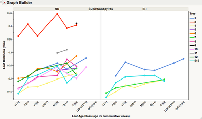
3. I tried nesting Canopy and Leaf Age together and did not like the result as it joins the graphs. The trees that have both sun and shade leaves end up having one continuous long with line with sun and shade lines joined up, which confuses things. So, what I did was put the two different age in weeks for leaf age class O/S1 together as you can see in the graph below.
Many thanks as always for your help.
Cecilia
- Mark as New
- Bookmark
- Subscribe
- Mute
- Subscribe to RSS Feed
- Get Direct Link
- Report Inappropriate Content
Re: Using graph builder to create graphs with grouped Y data
1. Can you explain more about the need to remove the Group X header? You must want to label the panels somehow. If you want a different style, you might be able to address it in Preferences. I did notice you can essentially hide the level names by using the Size message in Group X:
Open( "$SAMPLE_DATA/Big Class.jmp" );
Graph Builder(
  Variables( X( :height ), Y( :weight ), Group X( :sex, Size( 1 ) ) ),
  Elements( Points( X, Y ), Smoother( X, Y ) )
);
1b. Learning JSL is apparently not too hard. I say that not because I've been using it so long that it's easy for me, but because we had several student interns this summer who were cranking out nice projects in a few days and complex ones in a few weeks. In any case, the Scripting Index in the Help menu and the Save to Script you've already discovered are keys to getting up to speed quickly.
2. Great.
3. I forgot about how the nested X axis would connect the line all the way across. An ugly work-around is to join Canopy with your overlay variable, but then every line will be a different color and you'll have to manually change some of the colors to match across tree values.
- Mark as New
- Bookmark
- Subscribe
- Mute
- Subscribe to RSS Feed
- Get Direct Link
- Report Inappropriate Content
Re: Using graph builder to create graphs with grouped Y data
Hola Xan,
Many thanks again for your prompt reply.
1. I tried out your suggestion to use the Size message in Group X but that only moved the Group X header into the same level as the actual Canopy positions as you can see on the graph below:
I had already gone into Preferences and there is nothing there to format the Group X other than to change the Group X edge to the bottom of the graph.
With respect to explaining the need to remove the X Group heading, its because I just don't need it. I will have to add a note to explain what the "SU" and "SH" labels mean in the figure legend anyway so a heading is unnecessary. I have even tried to erase the name of the column so there is no heading but apparently a column without a name is not allowed.
I noticed in the bit of script I included below that the X group variable is declared using " " and these I think are used for text/heading names as in the X variable. I don't know why the X Group is also declared this way? Actually, I just changed the name of the X Group to Canopy Position and it is now declared as the Y variable so I am guessing that the " " are used when the name of a variable includes symbols, am I right?
Variables(
  X( :Name( "Leaf Age Class (age in cummulative weeks)" ) ),
  Y( :thickness ),
  Group X( :"SU-SHCanopyPos", Size(1), Levels( 2 ) ),
  Overlay( :tree )
  ),
OK, so far nothing I have tried has worked and I am confused about why it is not possible to customise the X and Y Group headers when this is easily done with all the other headers, this seems like a bit of a design fault ?! Do you or anyone else have any more ideas on how to get rid of the X Group header?
Many thanks,
Cecilia
- Mark as New
- Bookmark
- Subscribe
- Mute
- Subscribe to RSS Feed
- Get Direct Link
- Report Inappropriate Content
Re: Using graph builder to create graphs with grouped Y data
The whole group box can be deleted, but I don't know of a way to delete only the header. It seems to be of a special (undocumented) type of display box.
Below is an example on how to get rid of the the group box. It also shows how new group labels can be added.
dt = open("$sample_data\Big Class.jmp");
gb=graph Builder(
  Show Control Panel( 0 ),
  Variables( X( :age ), Y( :height ), Group X( :sex ) ),
);
Report( gb )[Graphbuildergroupbox( 1 )] << delete;
Report( gb )[framebox( 1 )]<<Add Text Annotation( Text( "F" ), Text Box( {11, 5, 37, 28} ) );
Report( gb )[framebox( 2 )]<<Add Text Annotation( Text( "M" ), Text Box( {11, 5, 37, 28} ) );
I use graph builder as a quick way to discover patterns and relationships in my data, and all the advanced options allow looking for rather complex patterns. However, once I've settled for a graph I almost always bring it into a vector drawing program where it can be edited in detail before use in presentations or manuscripts.
Recommended Articles
- © 2026 JMP Statistical Discovery LLC. All Rights Reserved.
- Terms of Use
- Privacy Statement
- Contact Us


