- New to JMP? Let the Data Analysis Director guide you through selecting an analysis task, an analysis goal, and a data type. Available now in the JMP Marketplace!
- See how to install JMP Marketplace extensions to customize and enhance JMP.
- Subscribe to RSS Feed
- Mark Topic as New
- Mark Topic as Read
- Float this Topic for Current User
- Bookmark
- Subscribe
- Mute
- Printer Friendly Page
Discussions
Solve problems, and share tips and tricks with other JMP users.- JMP User Community
- :
- Discussions
- :
- Tricky Question about the Graph Builder
- Mark as New
- Bookmark
- Subscribe
- Mute
- Subscribe to RSS Feed
- Get Direct Link
- Report Inappropriate Content
Tricky Question about the Graph Builder
Hi JMPers,
I'm trying to convince a large customer to use JMP. Now I'm having a hard time to reproduce one of their applications in JMP.
The first problem I face, is that we would like to keep the colors from the row-states while using the Overlay-option.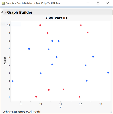
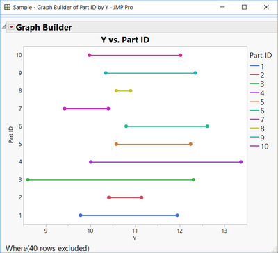
At the same time we will have to add multiple upper- and lower-spec-limits to the graph.
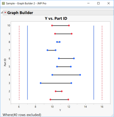
At the end we would like to have something like the following graph:
I was able to produce the graph using multiple manual steps (like Copy & Paste Frame Content) but the goal would be to generate this plot just with the standard graph-builder-tools - especially to keep the interactivity.
I would be very glad for any kind of advice.
Thanks,
Sebastian
This would be the given data structure:
New Table( "Sample",
	Add Rows( 20 ),
	New Column( "Part ID",
		Numeric,
		"Nominal",
		Format( "Best", 12 ),
		Set Values( [1, 2, 3, 4, 5, 6, 7, 8, 9, 10, 1, 2, 3, 4, 5, 6, 7, 8, 9, 10] )
	),
	New Column( "X1",
		Numeric,
		"Continuous",
		Format( "Best", 12 ),
		Set Values( [0, 0, 0, 0, 0, 0, 0, 0, 0, 0, 0, 0, 0, 0, 0, 0, 0, 0, 0, 0] )
	),
	New Column( "X2",
		Character,
		"Nominal",
		Set Values(
			{"cold", "cold", "cold", "cold", "cold", "cold", "cold", "cold", "cold",
			"cold", "medium", "medium", "medium", "medium", "medium", "medium",
			"medium", "medium", "medium", "medium"}
		)
	),
	New Column( "Y",
		Numeric,
		"Continuous",
		Format( "Best", 12 ),
		Formula(
			If(
				:X2 == "cold", Random Normal() + 10,
				:X2 == "medium", Random Normal() + 12,
				Random Normal()
			)
		)
	),
	New Column( "Y_USL",
		Numeric,
		"Continuous",
		Format( "Best", 12 ),
		Set Values(
			[15, 15, 15, 15, 15, 15, 15, 15, 15, 15, 16, 16, 16, 16, 16, 16, 16, 16,
			16, 16]
		)
	),
	New Column( "Y_LSL",
		Numeric,
		"Continuous",
		Format( "Best", 12 ),
		Set Values( [7, 7, 7, 7, 7, 7, 7, 7, 7, 7, 6, 6, 6, 6, 6, 6, 6, 6, 6, 6] )
	),
	Set Row States(
		[768, 768, 1280, 1280, 1280, 1280, 1280, 1280, 768, 768, 768, 768, 1280,
		1280, 1280, 1280, 1280, 1280, 768, 768]
	)
)
By the way: Your link to the "JSL Syntax Highligher" seems to be broken. At least I end up at an empty page.
Accepted Solutions
- Mark as New
- Bookmark
- Subscribe
- Mute
- Subscribe to RSS Feed
- Get Direct Link
- Report Inappropriate Content
Re: Tricky Question about the Graph Builder
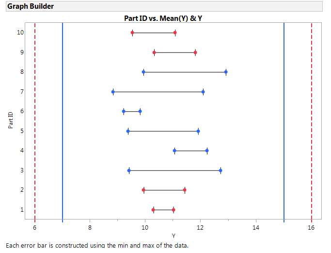
You can achieve your desired result with almost no JSL scripting. First create a bar chart with range error bars. Then set the transparency of the bars to zero, so they vanish. Now add a set of points by shift-clicking. Save this JSL to the script window.
The only bit of scripting is to use the Col Maximum()/Col Minimum() functions to draw on the reference lines.
Graph Builder(
	Size( 663, 468 ),
	Show Control Panel( 0 ),
	Show Legend( 0 ),
	Variables( X( :Y ), Y( :Part ID ) ),
	Elements(
		Bar( X, Y, Legend( 16 ), Error Bars( "Range" ) ),
		Points( X, Y, Legend( 14 ), Jitter( 0 ) )
	),
	SendToReport(
		Dispatch(
			{},
			"Y",
			ScaleBox,
			{Format( "Best", 12 ), Min( 5.64697504725641 ), Max( 16.37329465957 ),
			Inc( 2 ), Minor Ticks( 1 ),
			Add Ref Line( Col Minimum(:Y_LSL), "Dashed", "Red", "", 2 ),
			Add Ref Line( Col Maximum(:Y_USL), "Dashed", "Red", "", 2 ),
			Add Ref Line( Col Maximum(:Y_LSL), "Solid", "Blue", "", 2 ),
			Add Ref Line( Col Minimum(:Y_USL), "Solid", "Blue", "", 2 )}
		),
		Dispatch(
			{},
			"400",
			ScaleBox,
			{Legend Model(
				16,
				Properties( 0, {Fill Color( 2 ), Transparency( 0 )} )
			)}
		),
		Dispatch( {}, "Graph Builder", FrameBox, {Marker Size( 4 )} )
	)
);
- Mark as New
- Bookmark
- Subscribe
- Mute
- Subscribe to RSS Feed
- Get Direct Link
- Report Inappropriate Content
Re: Tricky Question about the Graph Builder
Hi,
If you right click on the x-axis, you can add reference lines that would represent the limits.
Will that work?
Chris
Data Scientist, Life Sciences - Global Technical Enablement
JMP Statistical Discovery, LLC. - Denver, CO
Tel: +1-919-531-9927 ▪ Mobile: +1-303-378-7419 ▪ E-mail: chris.kirchberg@jmp.com
www.jmp.com
- Mark as New
- Bookmark
- Subscribe
- Mute
- Subscribe to RSS Feed
- Get Direct Link
- Report Inappropriate Content
Re: Tricky Question about the Graph Builder
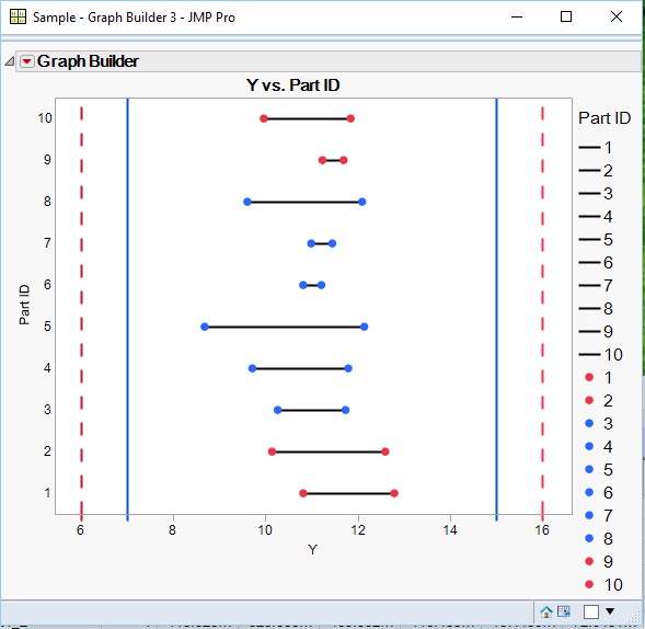
Here is a script that creates what you want for an output graph. I added a sample data table, as you had, but with one addition. The trick to get Graph Builder to use the same colors as the row state color, is actually to set the value colors for Part_ID to the colors you want. Then Graph Builder uses those colors for the Overlay. Also added to the Graph Builder code are axis reference lines. Now, the code I am providing is static code, but JSL could easily generate the platform code you need by reading the data table and figuring out the reference lines that are needed, and then to just modify the Graph Builder code as required. Finally, I modified the actual line colors manually, and then saved the whole Graph Builder script.. From your question, I assumed you wanted to see how to get the results you want. Thus my response. Creating the graph from generic data tables is not included in my response, but it can certainly be scripted.
Names Default to Here( 1 );
New Table( "Sample",
	Add Rows( 20 ),
	New Column( "Part ID",
		Numeric,
		"Nominal",
		Format( "Best", 12 ),
		Set Property( "Value Colors", {1 = 3, 2 = 3, 3 = 5, 4 = 5, 5 = 5, 6 = 5, 7 = 5, 8 = 5, 9 = 3, 10 = 3} ),
		Set Values( [1, 2, 3, 4, 5, 6, 7, 8, 9, 10, 1, 2, 3, 4, 5, 6, 7, 8, 9, 10] )
	),
	New Column( "X1",
		Numeric,
		"Continuous",
		Format( "Best", 12 ),
		Set Values( [0, 0, 0, 0, 0, 0, 0, 0, 0, 0, 0, 0, 0, 0, 0, 0, 0, 0, 0, 0] )
	),
	New Column( "X2",
		Character,
		"Nominal",
		Set Values(
			{"cold", "cold", "cold", "cold", "cold", "cold", "cold", "cold", "cold", "cold", "medium", "medium", "medium",
			"medium", "medium", "medium", "medium", "medium", "medium", "medium"}
		)
	),
	New Column( "Y",
		Numeric,
		"Continuous",
		Format( "Best", 12 ),
		Formula( If( :X2 == "cold", Random Normal() + 10, :X2 == "medium", Random Normal() + 12, Random Normal() ) )
	),
	New Column( "Y_USL",
		Numeric,
		"Continuous",
		Format( "Best", 12 ),
		Set Values( [15, 15, 15, 15, 15, 15, 15, 15, 15, 15, 16, 16, 16, 16, 16, 16, 16, 16, 16, 16] )
	),
	New Column( "Y_LSL",
		Numeric,
		"Continuous",
		Format( "Best", 12 ),
		Set Values( [7, 7, 7, 7, 7, 7, 7, 7, 7, 7, 6, 6, 6, 6, 6, 6, 6, 6, 6, 6] )
	),
	Set Row States(
		[768, 768, 1280, 1280, 1280, 1280, 1280, 1280, 768, 768, 768, 768, 1280, 1280, 1280, 1280, 1280, 1280, 768, 768]
	)
);

Graph Builder(
	Size( 509, 443 ),
	Show Control Panel( 0 ),
	Variables( X( :Y ), Y( :Part ID ), Overlay( :Part ID ) ),
	Elements( Line( X, Y, Legend( 4 ), Row order( 1 ) ), Points( X, Y, Legend( 6 ), Jitter( 0 ) ) ),
	SendToReport(
		Dispatch(
			{},
			"Y",
			ScaleBox,
			{Min( 5.43667408790577 ), Max( 16.635593220339 ), Inc( 2 ), Minor Ticks( 0 ),
			Add Ref Line( 16, "Dashed", "Red", "", 2 ), Add Ref Line( 15, "Solid", "Medium Dark Blue", "", 2 ),
			Add Ref Line( 7, "Solid", "Medium Dark Blue", "", 2 ), Add Ref Line( 6, "Dashed", "Medium Dark Red", "", 2 )}
		),
		Dispatch(
			{},
			"400",
			ScaleBox,
			{Legend Model(
				4,
				Properties( 0, {Line Color( 0 )} ),
				Properties( 1, {Line Color( 0 )} ),
				Properties( 2, {Line Color( 0 )} ),
				Properties( 3, {Line Color( 0 )} ),
				Properties( 4, {Line Color( 0 )} ),
				Properties( 5, {Line Color( 0 )} ),
				Properties( 6, {Line Color( 0 )} ),
				Properties( 7, {Line Color( 0 )} ),
				Properties( 8, {Line Color( 0 )} ),
				Properties( 9, {Line Color( 0 )} )
			), Legend Model(
				6,
				Properties( 0, {Marker( "FilledCircle" )} ),
				Properties( 1, {Marker( "FilledCircle" )} ),
				Properties( 2, {Marker( "FilledCircle" )} ),
				Properties( 3, {Marker( "FilledCircle" )} ),
				Properties( 4, {Marker( "FilledCircle" )} ),
				Properties( 5, {Marker( "FilledCircle" )} ),
				Properties( 6, {Marker( "FilledCircle" )} ),
				Properties( 7, {Marker( "FilledCircle" )} ),
				Properties( 8, {Marker( "FilledCircle" )} ),
				Properties( 9, {Marker( "FilledCircle" )} )
			)}
		)
	)
);
- Mark as New
- Bookmark
- Subscribe
- Mute
- Subscribe to RSS Feed
- Get Direct Link
- Report Inappropriate Content
Re: Tricky Question about the Graph Builder
You can achieve your desired result with almost no JSL scripting. First create a bar chart with range error bars. Then set the transparency of the bars to zero, so they vanish. Now add a set of points by shift-clicking. Save this JSL to the script window.
The only bit of scripting is to use the Col Maximum()/Col Minimum() functions to draw on the reference lines.
Graph Builder(
	Size( 663, 468 ),
	Show Control Panel( 0 ),
	Show Legend( 0 ),
	Variables( X( :Y ), Y( :Part ID ) ),
	Elements(
		Bar( X, Y, Legend( 16 ), Error Bars( "Range" ) ),
		Points( X, Y, Legend( 14 ), Jitter( 0 ) )
	),
	SendToReport(
		Dispatch(
			{},
			"Y",
			ScaleBox,
			{Format( "Best", 12 ), Min( 5.64697504725641 ), Max( 16.37329465957 ),
			Inc( 2 ), Minor Ticks( 1 ),
			Add Ref Line( Col Minimum(:Y_LSL), "Dashed", "Red", "", 2 ),
			Add Ref Line( Col Maximum(:Y_USL), "Dashed", "Red", "", 2 ),
			Add Ref Line( Col Maximum(:Y_LSL), "Solid", "Blue", "", 2 ),
			Add Ref Line( Col Minimum(:Y_USL), "Solid", "Blue", "", 2 )}
		),
		Dispatch(
			{},
			"400",
			ScaleBox,
			{Legend Model(
				16,
				Properties( 0, {Fill Color( 2 ), Transparency( 0 )} )
			)}
		),
		Dispatch( {}, "Graph Builder", FrameBox, {Marker Size( 4 )} )
	)
);
Recommended Articles
- © 2026 JMP Statistical Discovery LLC. All Rights Reserved.
- Terms of Use
- Privacy Statement
- Contact Us

