- Subscribe to RSS Feed
- Mark Topic as New
- Mark Topic as Read
- Float this Topic for Current User
- Bookmark
- Subscribe
- Mute
- Printer Friendly Page
Discussions
Solve problems, and share tips and tricks with other JMP users.- JMP User Community
- :
- Discussions
- :
- Temperature Profile - visualization
- Mark as New
- Bookmark
- Subscribe
- Mute
- Subscribe to RSS Feed
- Get Direct Link
- Report Inappropriate Content
Temperature Profile - visualization
Hi Guys,
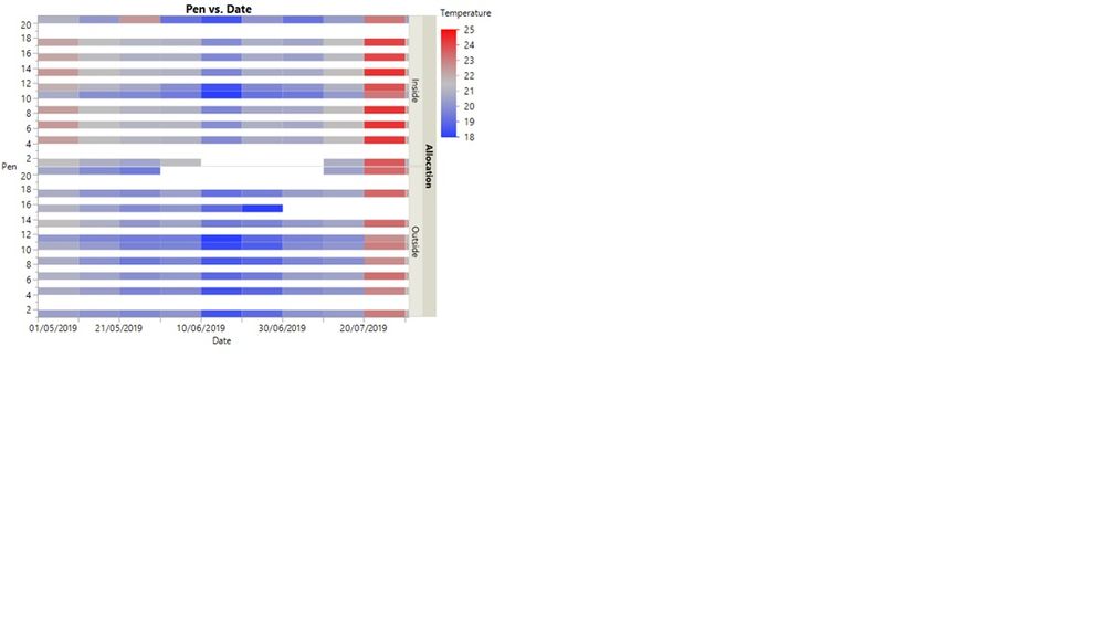
Could you please advice, how I can create below graph:
I have been looking into graph builder but no luck.
Thank you in advance
- Mark as New
- Bookmark
- Subscribe
- Mute
- Subscribe to RSS Feed
- Get Direct Link
- Report Inappropriate Content
Re: Temperature Profile - visualization
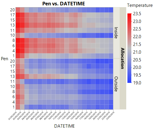
If you have the existing graph in JMP, use the red triangle menu and either redo->relaunch->OK to see the interactive builder, or save script to script window to get a script to reproduce it.
In Graph Builder, starting from scratch, drag variables to the drop zones and pick the heat map style (and turn off the other styles if dots are showing up.)
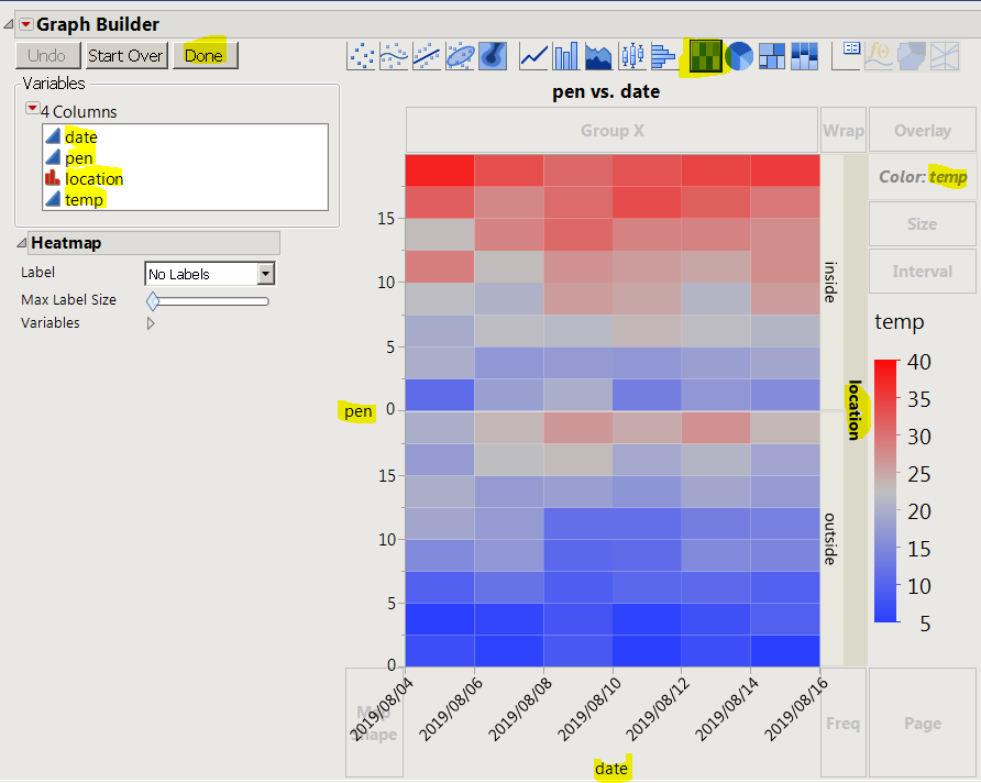
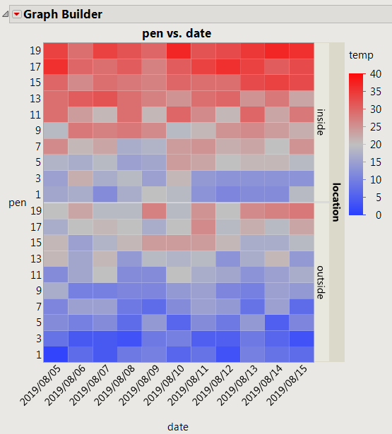
this script builds a test table and runs a graph builder script. Using ordinal for pen and date makes the axes behave the way you expect.
dt = New Table( "Untitled 2",
	Add Rows( 0 ),
	New Column( "date", Numeric, "ordinal", Format( "y/m/d", 12 ) ),
	New Column( "pen", Numeric, "ordinal", Format( "Best", 12 ) ),
	New Column( "location", Character, "Nominal" ),
	New Column( "temp", Numeric, "Continuous", Format( "Best", 12 ) )
);
For( t = Today(), t <= Today() + In Days( 10 ), t += In Days( 1 ),
	For( p = 1, p <= 20, p += 2,
		For( io = 0, io <= 1, io += 1,
			dt << addrows( 1 );
			dt:date = t;
			dt:pen = p;
			dt:location = If( io, "inside", "outside" );
			dt:temp = p + 10 * io + Random Integer( 0, 9 );
		)
	)
);

dt << Graph Builder(
	Size( 476, 580 ),
	Show Control Panel( 0 ),
	Variables( X( :date ), Y( :pen ), Group Y( :location ), Color( :temp ) ),
	Elements( Heatmap( X, Y, Legend( 42 ) ) )
);
- Mark as New
- Bookmark
- Subscribe
- Mute
- Subscribe to RSS Feed
- Get Direct Link
- Report Inappropriate Content
Re: Temperature Profile - visualization
Thank you very much for helping me out.
I struggle with pen numbers: my data loggers were allocated outside of pens : 1,4,6,8,10,11,13,15,17 and 20.
Could you please let me know how to present only this pens on Y axis.
I have been trying to do this in axis settings but no luck..
- Mark as New
- Bookmark
- Subscribe
- Mute
- Subscribe to RSS Feed
- Get Direct Link
- Report Inappropriate Content
Re: Temperature Profile - visualization
try making pen (and probably date as well) ordinal.
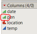
After deleting pens 3 and 5 I get this axis
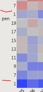
I think you are still using the continuous modeling type.
Recommended Articles
- © 2026 JMP Statistical Discovery LLC. All Rights Reserved.
- Terms of Use
- Privacy Statement
- Contact Us

