Turn on suggestions
Auto-suggest helps you quickly narrow down your search results by suggesting possible matches as you type.
Options
- Subscribe to RSS Feed
- Mark Topic as New
- Mark Topic as Read
- Float this Topic for Current User
- Bookmark
- Subscribe
- Mute
- Printer Friendly Page
Discussions
Solve problems, and share tips and tricks with other JMP users.- JMP User Community
- :
- Discussions
- :
- Re: Spacing in side-by-side bar chart
- Mark as New
- Bookmark
- Subscribe
- Mute
- Subscribe to RSS Feed
- Get Direct Link
- Report Inappropriate Content
Spacing in side-by-side bar chart
Jan 11, 2019 10:44 AM
(8333 views)
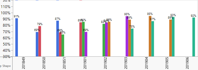
Is there anyway to put gaps between the side-by-side bars? I want to have the bars labeled but you can see that the labels look like garbage because they just overlap. I really don't want to make the font any smaller. Any ideas?
1 ACCEPTED SOLUTION
Accepted Solutions
- Mark as New
- Bookmark
- Subscribe
- Mute
- Subscribe to RSS Feed
- Get Direct Link
- Report Inappropriate Content
Re: Spacing in side-by-side bar chart
Created:
Jan 20, 2019 05:39 AM
| Last Modified: Jan 20, 2019 2:43 AM
(8260 views)
| Posted in reply to message from PNash 01-11-2019
@PNash, here are the main points of my reply:
- The number of bars, the frame size and bar width will control the spacing of the bars and allowable printable space, then of course font size.
- The x-axis, color categories and Group X will determine the number of bars.
- Your data as specified appears to add a new category every couple weeks, which creates empty bars, and hence, increases the number of bars.
- There are a couple of alternates that might be better.
Explanations:
- Take your graph and with your mouse drag the right edge. Note the spacing and bar size change and some of the overlapping labels will no longer overlap. Now right click in the graph space and select Bar on the left. Then change the Width Proportion from 0 to .6. Note there is more spacing between the bars, but that does not increase readability of the labels.
- Exclude a category and there will be more room for labels since there are fewer bars. The examples in #4 will demonstarte this.
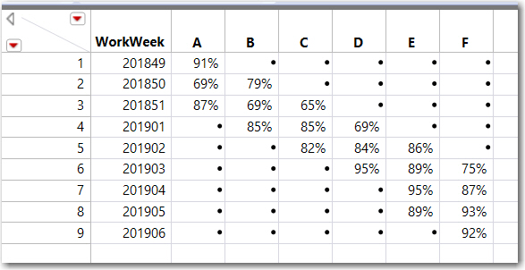
- I created a table that represents your summarized data, the Percent is the Y-axis, then unstacked it. See below. If a new category continues to be added every few weeks, your graph will be unreadable (as it is displayed in your post). The stacked table is attached.
- Below are several graphs. The first is the result of following the steps in #1. If the Legend Position is moved to the Bottom, none of the labels overlap, since moving the legend, makes the graph space bigger.
Plot #1 - Frame Size Increased, Bar Width ReducedThis next graph was uses a custom X axis that only plots the non-missing categories for that WorkWeek. The attached table displays the formula to create the custom column WorkWeek_Item.
Plot #2 - Custom X-Axis (empty categories not shown) & Bar Width ReducedThis third graph would require a summary column, and places the labels below the bars. This allows setting the label orientation to Angled or Perpendicular ... no overlapping labels
Plot #3 - Custom X-Axis Label, Bar Width & Legend on the BottomThis fourth graph demonstrates another method to reduce the number of bars. Both the bar labels and the :Label axis variable are shown. Here the width of the WorkWeek will be the max number of Categories in any one week, instead of the total number of Categories. For your data, there was a max of 3 Catgories in any one week so the spacing for WorkWeek is 3 bars.
Plot #4 - Number of Bars Reduced (no empty categories) & Bar Width ReducedThe stacked table with the new columns and a script are attached. The saved GraphBuilder script for each of the 4 plots is included.
This was tested on JMP PRO 14.2, Windows 10.
1 REPLY 1
- Mark as New
- Bookmark
- Subscribe
- Mute
- Subscribe to RSS Feed
- Get Direct Link
- Report Inappropriate Content
Re: Spacing in side-by-side bar chart
Created:
Jan 20, 2019 05:39 AM
| Last Modified: Jan 20, 2019 2:43 AM
(8261 views)
| Posted in reply to message from PNash 01-11-2019
@PNash, here are the main points of my reply:
- The number of bars, the frame size and bar width will control the spacing of the bars and allowable printable space, then of course font size.
- The x-axis, color categories and Group X will determine the number of bars.
- Your data as specified appears to add a new category every couple weeks, which creates empty bars, and hence, increases the number of bars.
- There are a couple of alternates that might be better.
Explanations:
- Take your graph and with your mouse drag the right edge. Note the spacing and bar size change and some of the overlapping labels will no longer overlap. Now right click in the graph space and select Bar on the left. Then change the Width Proportion from 0 to .6. Note there is more spacing between the bars, but that does not increase readability of the labels.
- Exclude a category and there will be more room for labels since there are fewer bars. The examples in #4 will demonstarte this.
- I created a table that represents your summarized data, the Percent is the Y-axis, then unstacked it. See below. If a new category continues to be added every few weeks, your graph will be unreadable (as it is displayed in your post). The stacked table is attached.
- Below are several graphs. The first is the result of following the steps in #1. If the Legend Position is moved to the Bottom, none of the labels overlap, since moving the legend, makes the graph space bigger.
Plot #1 - Frame Size Increased, Bar Width ReducedThis next graph was uses a custom X axis that only plots the non-missing categories for that WorkWeek. The attached table displays the formula to create the custom column WorkWeek_Item.
Plot #2 - Custom X-Axis (empty categories not shown) & Bar Width ReducedThis third graph would require a summary column, and places the labels below the bars. This allows setting the label orientation to Angled or Perpendicular ... no overlapping labels
Plot #3 - Custom X-Axis Label, Bar Width & Legend on the BottomThis fourth graph demonstrates another method to reduce the number of bars. Both the bar labels and the :Label axis variable are shown. Here the width of the WorkWeek will be the max number of Categories in any one week, instead of the total number of Categories. For your data, there was a max of 3 Catgories in any one week so the spacing for WorkWeek is 3 bars.
Plot #4 - Number of Bars Reduced (no empty categories) & Bar Width ReducedThe stacked table with the new columns and a script are attached. The saved GraphBuilder script for each of the 4 plots is included.
This was tested on JMP PRO 14.2, Windows 10.
Recommended Articles
- © 2026 JMP Statistical Discovery LLC. All Rights Reserved.
- Terms of Use
- Privacy Statement
- Contact Us

