- New to JMP? Let the Data Analysis Director guide you through selecting an analysis task, an analysis goal, and a data type. Available now in the JMP Marketplace!
- See how to install JMP Marketplace extensions to customize and enhance JMP.
- Subscribe to RSS Feed
- Mark Topic as New
- Mark Topic as Read
- Float this Topic for Current User
- Bookmark
- Subscribe
- Mute
- Printer Friendly Page
Discussions
Solve problems, and share tips and tricks with other JMP users.- JMP User Community
- :
- Discussions
- :
- Re: QQ-Plot double x-axis
- Mark as New
- Bookmark
- Subscribe
- Mute
- Subscribe to RSS Feed
- Get Direct Link
- Report Inappropriate Content
QQ-Plot double x-axis
Dear Community,
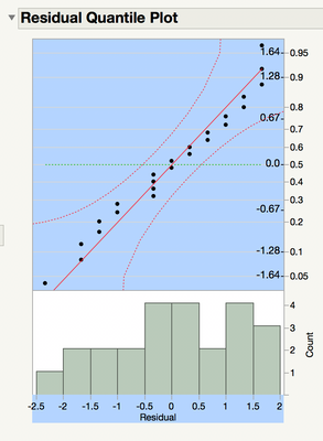
Please help, how do I change the ugly default QQ-Plot in jmp so that it does not have two x-axis and a histgoram but only a normal x- and y-axis?
- Mark as New
- Bookmark
- Subscribe
- Mute
- Subscribe to RSS Feed
- Get Direct Link
- Report Inappropriate Content
Re: QQ-Plot double x-axis
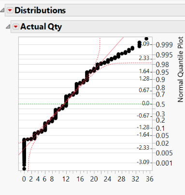
In Distribution? I don't ever have 2 x-axes. Here's what mine looks like when I turn off the histogram and outlier box plot. Is this what you want?
If that's what you're after, just go to the red-arrow > Histogram Options > Histogram (uncheck it), and then to red-arrow > Outlier Box Plot (uncheck it). You can also make that the default from Preferences for the Distribution platform, though I'm not sure why you'd use Distribution if you don't want to see the histogram.
Alternatively, if you just want the plots separately, add a normal fit to data. Then, in the fit report for the normal fit, click the red arrow > Diagnostic Plot. You'll get a QQ plot with just the usual X and Y axes.
- Mark as New
- Bookmark
- Subscribe
- Mute
- Subscribe to RSS Feed
- Get Direct Link
- Report Inappropriate Content
Re: QQ-Plot double x-axis
Thank you for your quick response! Thats what my plot looks like, too but with the histogram. But I do not have it in the distribution area but as a residual plot from a mixed model. Is there an easy way to get a normal QQ-Plot? Because I have never seen one like that in a paper. Do you think it is still useable like that or do I need to add a normal distribution to my data and create the QQ-Plot myself? That would be awful because I have to do 30 of these and do not have a lot of time to do that.
- Mark as New
- Bookmark
- Subscribe
- Mute
- Subscribe to RSS Feed
- Get Direct Link
- Report Inappropriate Content
Re: QQ-Plot double x-axis
Are you using the Mixed personality in Fit Model? If so, that is a JMP Pro feature, which I do not have access to. If you don't like the look of the QQ plot in Fit Model, I think you could get into Distribution with out nearly as much effort as you're thinking. If you have all 30 of your model fits in the same Fit Model report, you could probably save all of your conditional residuals to the data table at once by holding Ctrl as you do it for any one of them. If you are able to get that far, the rest is easy. You would plot all of your conditional residuals in Distribution and hold Ctrl as hide the histograms and box plots, or fit a normal distribution and turn on the diagnostic plot. Holding Ctrl is a powerful tool to easily do a repetitive task that works just about anywhere in JMP.
- Mark as New
- Bookmark
- Subscribe
- Mute
- Subscribe to RSS Feed
- Get Direct Link
- Report Inappropriate Content
Re: QQ-Plot double x-axis
The placement of the two scales is due to the fact that you modified the orientation of the plot by selecting Stack or change the Histogram orientation option.
I don't think that there is a way to achieve the same result with the default Histogram orientation. If uses a special type of scale. Right-click on the axis and select Axis Settings. You will see that the Type = Normal Probability.
- Mark as New
- Bookmark
- Subscribe
- Mute
- Subscribe to RSS Feed
- Get Direct Link
- Report Inappropriate Content
Re: QQ-Plot double x-axis
I did not chose stack.. By fitting a mixed model I cannot stack or unstack unfortunatley.
- Mark as New
- Bookmark
- Subscribe
- Mute
- Subscribe to RSS Feed
- Get Direct Link
- Report Inappropriate Content
Re: QQ-Plot double x-axis
Thank you for your quick response. My plot looks like that too but with the histogram. I cannot uncheck it because I am in the fit model section of a mixed model. I need to create residual plots like that. Is it a normal QQ-Plot with the histogram with the two y-axis'? I need 30 of these for my theses and feel like they do not look like these I have seen in papers. But is there a more efficient way than creating the QQ-Plots myself by adding a normal distribution to my data as a feel like that will take hours I unfortunately do not have left.
- Mark as New
- Bookmark
- Subscribe
- Mute
- Subscribe to RSS Feed
- Get Direct Link
- Report Inappropriate Content
Re: QQ-Plot double x-axis
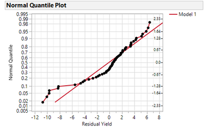
If you don't want the histogram, you can use the Selection tool (the fat plus) by pushing the S key on the keyboard and then click in the scatterplot to select it and shift+ctrl click on the X axis to select it.
It will look like this:
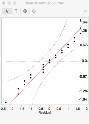
Then Journal it and you'll get one that looks like this:
- Mark as New
- Bookmark
- Subscribe
- Mute
- Subscribe to RSS Feed
- Get Direct Link
- Report Inappropriate Content
Re: QQ-Plot double x-axis
Thanks so much that looks great! But isn't it that on the x-axis hast to be the quantiles of the residuals or did I get there something wrong?
- Mark as New
- Bookmark
- Subscribe
- Mute
- Subscribe to RSS Feed
- Get Direct Link
- Report Inappropriate Content
Re: QQ-Plot double x-axis
When it is important to have really good looking graphs, like publications or training material, sometimes I like to save the residuals then do one of the following:
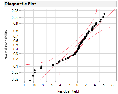
- Distribution > Fit Continuous > Normal > Normal Quantile > Diagnostic Plot
- Create a Character column named "id" where the constant value is the name of the model. Then use Fit Y by X where the residual is Y and id is X. Turn off show all graphs and select Normal Quantile and you can choose whether you want to fit Quantile by Actual or Actual by Quantile.
Below are the graphs resulting from the Scripting Index > Objects > Fit Mixed > Run Example > Save Residuals
Recommended Articles
- © 2026 JMP Statistical Discovery LLC. All Rights Reserved.
- Terms of Use
- Privacy Statement
- Contact Us

