- New to JMP? Join us Sept. 23-24 for the Early User Edition of Discovery Summit, tailor-made for new users. Register now for free!
- Subscribe to RSS Feed
- Mark Topic as New
- Mark Topic as Read
- Float this Topic for Current User
- Bookmark
- Subscribe
- Mute
- Printer Friendly Page
Discussions
Solve problems, and share tips and tricks with other JMP users.- JMP User Community
- :
- Discussions
- :
- Presenting stock data in form of box plot

- Mark as New
- Bookmark
- Subscribe
- Mute
- Subscribe to RSS Feed
- Get Direct Link
- Report Inappropriate Content
Presenting stock data in form of box plot
Hello Everybody,
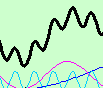
the data describing stock price movements is created by open/close price and max/min price. Is there any way to create box plot (candlestick chart) in JMP having real body from open and close price and upper and lower shadow having values in max (high) and min (low) prices respectively, like in the picture attached or is there better way to do that? The traditional Box Plot element, however, shows outlier or quantile box plots and provides a compact view of a distribution of values. I attached an example data table in which several timestamps and price values (min, open, close and high) are provided. I would appreciate for hints and suggestions.

(source: Wikipedia)
Best regards

- Mark as New
- Bookmark
- Subscribe
- Mute
- Subscribe to RSS Feed
- Get Direct Link
- Report Inappropriate Content
Re: Presenting stock data in form of box plot
Yes, the X-axis can display content other than the date.
But it is better to show the original date label when the mouse points over the graph.
That's what I was thinking.But I don't know how to change the code.
Thanks!
- Mark as New
- Bookmark
- Subscribe
- Mute
- Subscribe to RSS Feed
- Get Direct Link
- Report Inappropriate Content
Re: Presenting stock data in form of box plot


- Mark as New
- Bookmark
- Subscribe
- Mute
- Subscribe to RSS Feed
- Get Direct Link
- Report Inappropriate Content
Re: Presenting stock data in form of box plot
The columns that are displayed when you click on a data point, are columns that have the "Label" column property set. In my original code, the open and close columns have their Label values set. All you should have to do is to add a line for each of the columns you want to add the Label column property to.
- Mark as New
- Bookmark
- Subscribe
- Mute
- Subscribe to RSS Feed
- Get Direct Link
- Report Inappropriate Content
Re: Presenting stock data in form of box plot
I tried not to use date-spec data, but ended up not modifying JSL.It didn't work.
As in JSL below, how to draw box diagram with new data?Thank you very much!

dt = Open( "$SAMPLE_DATA/Stock Prices.jmp" );
dt << New Column( "tip", formula( Format( :Date, "yyyymmdd" ) ) );
dt << run formulas;
Column( "tip" ) << deleteFormula;
dt << delete columns( "Date" );
dt << New Column( "new", set each value( Row() ) );
dt:open << label;
dt:close << label;

gb = dt << Graph Builder(
	Size( 1289, 456 ),
	Show Control Panel( 0 ),
	Variables( X( :new ), Y( :High ), Y( :Low, Position( 1 ) ) ),
	Elements( Bar( X, Y( 1 ), Y( 2 ), Legend( 10 ), Bar Style( "Interval" ) ) ),
	SendToReport(
		Dispatch( {}, "new", ScaleBox, {Interval( "Day" ), Inc( 1 ), Minor Ticks( 0 )} ),
		Dispatch( {}, "400", ScaleBox, {Legend Model( 10, Properties( 0, {Line Width( 2 )}, Item ID( "High..Low", 1 ) ) )} )
	)
);

Report( gb )[framebox( 1 )] << add graphics script(
	halfDayincr = In Days( 1 ) / 2 * .8;
	days = (Col Max( :new ) - Col Min( :new )) / In Days( 1 );
	Pen Color( black );
	Pen Size( 2 );
	For( i = 1, i <= N Rows( dt ), i++,
		If( :Open[i] <= :close[i],
			Fill Color( light green ),
			Fill Color( light red )
		);
		Rect( :new[i] - halfDayincr, Max( :open[i], :close[i] ), :new[i] + halfDayincr, Min( :open[i], :close[i] ), 1 );
		Rect( :new[i] - halfDayincr, Max( :open[i], :close[i] ), :new[i] + halfDayincr, Min( :open[i], :close[i] ), 0 );
	);
);- Mark as New
- Bookmark
- Subscribe
- Mute
- Subscribe to RSS Feed
- Get Direct Link
- Report Inappropriate Content
Re: Presenting stock data in form of box plot
When you changed from using column Date, which is a JMP date column(the number of seconds since January 1, 1904), to the column New, which is just an integer where each row is just 1 more than it's previous value, you needed to change the calculation of the variables, "days" and "halfDayincr". The number of days is just the number of rows, and the halfDayincr, which is half the width of the rectangle to draw, is simply .4.

gb = dt << Graph Builder(
	Size( 1289, 456 ),
	Show Control Panel( 0 ),
	Variables( X( :new ), Y( :High ), Y( :Low, Position( 1 ) ) ),
	Elements( Bar( X, Y( 1 ), Y( 2 ), Legend( 10 ), Bar Style( "Interval" ) ) ),
	SendToReport(
		Dispatch(
			{},
			"new",
			ScaleBox,
			{ Interval( "new" ), Inc( 1 ),
			Minor Ticks( 0 )}
		),
		Dispatch(
			{},
			"400",
			ScaleBox,
			{Legend Model(
				10,
				Properties( 0, {Line Width( 2 )}, Item ID( "High..Low", 1 ) )
			)}
		)
	)
);

// Add the boxes to the chart
Report( gb )[framebox( 1 )] << add graphics script(
	//halfDayincr = In Days( 1 ) / 2 * .8;
	//days = (Col Max( :Date ) - Col Min( :Date )) / In Days( 1 );
	halfDayincr = .4;
	days = Col Max( :new ) - Col Min( :new );
	Pen Color( black );
	Pen Size( 2 );
	For( i = 1, i <= N Rows( dt ), i++,
		If( :Open[i] <= :close[i],
			Fill Color( light green );
		,
			Fill Color( light red );
		);
		Rect( :new[i] - halfDayincr, Max( :open[i], :close[i] ), :new[i] + halfDayincr, Min( :open[i], :close[i] ), 1 );
		Rect( :new[i] - halfDayincr, Max( :open[i], :close[i] ), :new[i] + halfDayincr, Min( :open[i], :close[i] ), 0 );
	);
);
It is my strong suggestion that you start studying the code provided by the Community, so you are not limited to only being able to cut and paste it. Please take the time to read the Scripting Guide, and to also take the time to study the community provided code, until you understand how it works.
- Mark as New
- Bookmark
- Subscribe
- Mute
- Subscribe to RSS Feed
- Get Direct Link
- Report Inappropriate Content
Re: Presenting stock data in form of box plot
Thank Jim!
I want to strengthen the basic functions and grammar study.Now it's straight to the answer.
- Mark as New
- Bookmark
- Subscribe
- Mute
- Subscribe to RSS Feed
- Get Direct Link
- Report Inappropriate Content
Re: Presenting stock data in form of box plot
Thanks again Jim for creating such an innovative image.
I tried to create the diagram manually myself, but still couldn't.
I'm going to take Jim's time again and ask if I can explain the process of making this diagram manually.Thank you very much!
I mainly want to add a smooth moving average to this graph.
In addition, can the black frame of each box diagram be removed?Because I've seen other posts that have boxes without black borders.

Thank Jim!
- Mark as New
- Bookmark
- Subscribe
- Mute
- Subscribe to RSS Feed
- Get Direct Link
- Report Inappropriate Content
Re: Presenting stock data in form of box plot
Here is a modification that handles the elimination of the black outline

Names Default To Here( 1 );

dt = Open( "$SAMPLE_DATA/Stock Prices.jmp" );
dt << New Column( "tip", formula( Format( :Date, "yyyymmdd" ) ) );
dt << delete columns( "Date" );
dt << New Column( "new", set each value( Row() ) );
dt << New Column( "Direction", character, set each value( If( :Open <= :Close, "Increasing", "Decreasing" ) ) );
dt << run formulas;
Column( "tip" ) << deleteFormula;
dt:open << label;
dt:close << label;

gb = dt << Graph Builder(
	Size( 1289, 456 ),
	Show Control Panel( 0 ),
	Variables( X( :new ), Y( :High ), Y( :Low, Position( 1 ) ), Color( :Direction ) ),
	Elements( Bar( X, Y( 1 ), Y( 2 ), Legend( 10 ), Bar Style( "Interval" ) ) ),
	SendToReport(
		Dispatch( {}, "new", ScaleBox, {Interval( "new" ), Inc( 1 ), Minor Ticks( 0 )} ),
		Dispatch(
			{},
			"400",
			ScaleBox,
			{Legend Model(
				10,
				Properties( 0, {Fill Color( light red )}, Item ID( "Decreasing", 1 ) ),
				Properties( 1, {Fill Color( light green )}, Item ID( "Increasing", 1 ) ),
				Properties( 0, {Line Color( 19 ), Line Width( 2 )}, Item ID( "High..Low", 1 ) )
			)}
		)
	)
);

// Add the boxes to the chart
Report( gb )[framebox( 1 )] << add graphics script(
	//halfDayincr = In Days( 1 ) / 2 * .8;
	//days = (Col Max( :Date ) - Col Min( :Date )) / In Days( 1 );
	halfDayincr = .4;
	days = Col Max( :new ) - Col Min( :new );
	Pen Size( 1 );
	For( i = 1, i <= N Rows( dt ), i++,
		If( :Open[i] <= :close[i],
			Pen Color( light green );
			Fill Color( light green );
		,
			Pen Color( light red );
			Fill Color( light red );
		);
		Rect( :new[i] - halfDayincr, Max( :open[i], :close[i] ), :new[i] + halfDayincr, Min( :open[i], :close[i] ), 1 );
		Rect( :new[i] - halfDayincr, Max( :open[i], :close[i] ), :new[i] + halfDayincr, Min( :open[i], :close[i] ), 0 );
	);
);
Concerning how to manually/interactively
- Drag the high and low columns to the Y axis drop area
- Drag the new column to the X axis drop area
- Right click on the chart and select Smoother=>Remove
- Right click on the chart and select Points=>Change=>Bar
- Right click on the chart and select Bar=>Bar Style=>Interval
- Drag the Direction column to the Color drop area
- In the legend, right click on the color box for Increasing and select Fill Color=>select a light green color
- In the legend right click on the color box for decreasing and select Fill Color=>select a light red color
- Now the boxes for each high and low need to be added. This is done by adding a graphic script to Graph Builder
- Right click on the chart and select Customize
- Click on the + box to add a new script
- In the script editor area, add the following script (the script is developed by the individual user. In this case, I wrote the script)
halfDayincr = 0.4;
days = Col Max( :new ) - Col Min( :new );
Pen Size( 1 );
For( i = 1, i <= N Rows( dt ), i++,
	If( :Open[i] <= :Close[i],
		Pen Color( light green );
		Fill Color( light green );
	,
		Pen Color( light red );
		Fill Color( light red );
	);
	Rect(
		:new[i] - halfDayincr,
		Max( :Open[i], :Close[i] ),
		:new[i] + halfDayincr,
		Min( :Open[i], :Close[i] ),
		1
	);
	Rect(
		:new[i] - halfDayincr,
		Max( :Open[i], :Close[i] ),
		:new[i] + halfDayincr,
		Min( :Open[i], :Close[i] ),
		0
	);
);
Click on OK
- Mark as New
- Bookmark
- Subscribe
- Mute
- Subscribe to RSS Feed
- Get Direct Link
- Report Inappropriate Content
Re: Presenting stock data in form of box plot
Thanks Jim for your patient guidance.Your code is great!
I learned it, too.Thank you very much!


- « Previous
-
- 1
- 2
- Next »
Recommended Articles
- © 2026 JMP Statistical Discovery LLC. All Rights Reserved.
- Terms of Use
- Privacy Statement
- Contact Us