- New to JMP? Let the Data Analysis Director guide you through selecting an analysis task, an analysis goal, and a data type. Available now in the JMP Marketplace!
- See how to install JMP Marketplace extensions to customize and enhance JMP.
- Subscribe to RSS Feed
- Mark Topic as New
- Mark Topic as Read
- Float this Topic for Current User
- Bookmark
- Subscribe
- Mute
- Printer Friendly Page
Discussions
Solve problems, and share tips and tricks with other JMP users.- JMP User Community
- :
- Discussions
- :
- Re: Presenting stock data in form of box plot
- Mark as New
- Bookmark
- Subscribe
- Mute
- Subscribe to RSS Feed
- Get Direct Link
- Report Inappropriate Content
Presenting stock data in form of box plot
Hello Everybody,
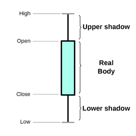
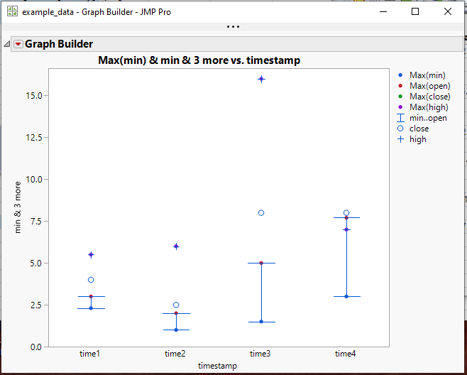
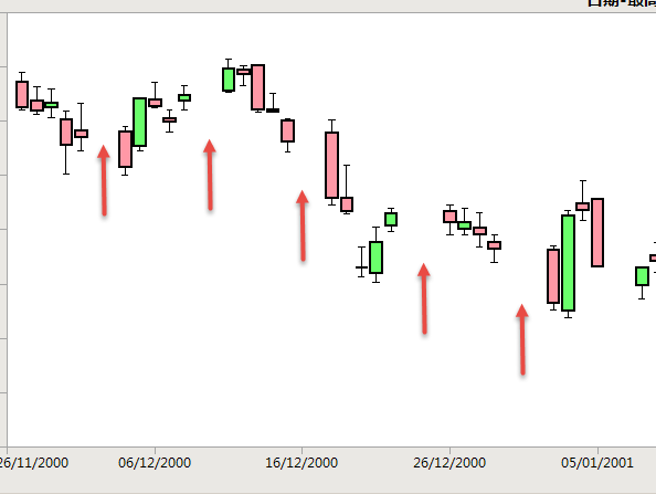
the data describing stock price movements is created by open/close price and max/min price. Is there any way to create box plot (candlestick chart) in JMP having real body from open and close price and upper and lower shadow having values in max (high) and min (low) prices respectively, like in the picture attached or is there better way to do that? The traditional Box Plot element, however, shows outlier or quantile box plots and provides a compact view of a distribution of values. I attached an example data table in which several timestamps and price values (min, open, close and high) are provided. I would appreciate for hints and suggestions.
(source: Wikipedia)
Best regards
Accepted Solutions
- Mark as New
- Bookmark
- Subscribe
- Mute
- Subscribe to RSS Feed
- Get Direct Link
- Report Inappropriate Content
Re: Presenting stock data in form of box plot
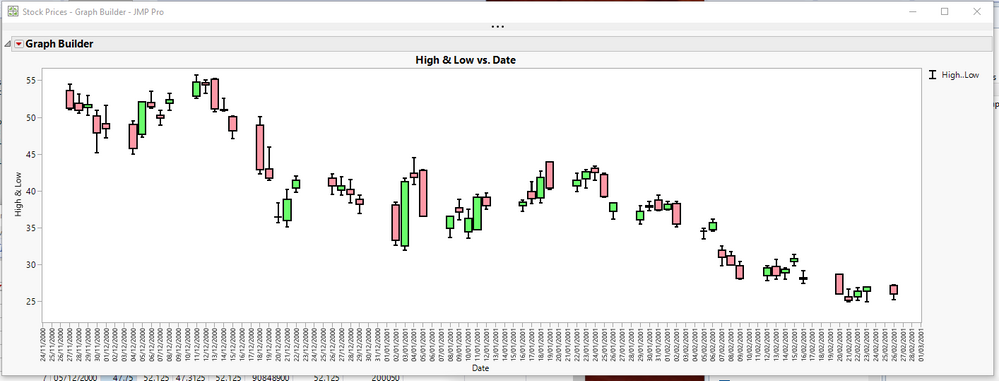
I had a little more time to look into this, and I think the easy solution below might be a workable solution for you.
Names Default To Here( 1 );
dt = Open( "$SAMPLE_DATA/Stock Prices.jmp" );

dt:open << label;
dt:close << label;

gb = dt << Graph Builder(
	Size( 1289, 456 ),
	Show Control Panel( 0 ),
	Variables( X( :Date ), Y( :High ), Y( :Low, Position( 1 ) ) ),
	Elements( Bar( X, Y( 1 ), Y( 2 ), Legend( 10 ), Bar Style( "Interval" ) ) ),
	SendToReport(
		Dispatch(
			{},
			"Date",
			ScaleBox,
			{ Interval( "Day" ), Inc( 1 ),
			Minor Ticks( 0 )}
		),
		Dispatch(
			{},
			"400",
			ScaleBox,
			{Legend Model(
				10,
				Properties( 0, {Line Width( 2 )}, Item ID( "High..Low", 1 ) )
			)}
		)
	)
);

// Add the boxes to the chart
Report( gb )[framebox( 1 )] << add graphics script(
	halfDayincr = In Days( 1 ) / 2 * .8;
	days = (Col Max( :Date ) - Col Min( :Date )) / In Days( 1 );
	Pen Color( black );
	Pen Size( 2 );
	For( i = 1, i <= N Rows( dt ), i++,
		If( :Open[i] <= :close[i],
			Fill Color( light green );
		,
			Fill Color( light red );
		);
		Rect( :date[i] - halfDayincr, Max( :open[i], :close[i] ), :date[i] + halfDayincr, Min( :open[i], :close[i] ), 1 );
		Rect( :date[i] - halfDayincr, Max( :open[i], :close[i] ), :date[i] + halfDayincr, Min( :open[i], :close[i] ), 0 );
	);
);
- Mark as New
- Bookmark
- Subscribe
- Mute
- Subscribe to RSS Feed
- Get Direct Link
- Report Inappropriate Content
inkRe: Presenting stock data in form of box plot
I think this is the best that JMP can do without scripting
But with a little bit of effort, one could easily write some JSL that would create the Candlestick plots.
- Mark as New
- Bookmark
- Subscribe
- Mute
- Subscribe to RSS Feed
- Get Direct Link
- Report Inappropriate Content
Re: Presenting stock data in form of box plot
Yes, as Jim points out, Graph Builder can do this easily. As you get more data, though, you might want to consider IR (individual moving range charts) as these will provide insight into consistency/stability of the metrics over time.
- Mark as New
- Bookmark
- Subscribe
- Mute
- Subscribe to RSS Feed
- Get Direct Link
- Report Inappropriate Content
Re: Presenting stock data in form of box plot
I had a little more time to look into this, and I think the easy solution below might be a workable solution for you.
Names Default To Here( 1 );
dt = Open( "$SAMPLE_DATA/Stock Prices.jmp" );

dt:open << label;
dt:close << label;

gb = dt << Graph Builder(
	Size( 1289, 456 ),
	Show Control Panel( 0 ),
	Variables( X( :Date ), Y( :High ), Y( :Low, Position( 1 ) ) ),
	Elements( Bar( X, Y( 1 ), Y( 2 ), Legend( 10 ), Bar Style( "Interval" ) ) ),
	SendToReport(
		Dispatch(
			{},
			"Date",
			ScaleBox,
			{ Interval( "Day" ), Inc( 1 ),
			Minor Ticks( 0 )}
		),
		Dispatch(
			{},
			"400",
			ScaleBox,
			{Legend Model(
				10,
				Properties( 0, {Line Width( 2 )}, Item ID( "High..Low", 1 ) )
			)}
		)
	)
);

// Add the boxes to the chart
Report( gb )[framebox( 1 )] << add graphics script(
	halfDayincr = In Days( 1 ) / 2 * .8;
	days = (Col Max( :Date ) - Col Min( :Date )) / In Days( 1 );
	Pen Color( black );
	Pen Size( 2 );
	For( i = 1, i <= N Rows( dt ), i++,
		If( :Open[i] <= :close[i],
			Fill Color( light green );
		,
			Fill Color( light red );
		);
		Rect( :date[i] - halfDayincr, Max( :open[i], :close[i] ), :date[i] + halfDayincr, Min( :open[i], :close[i] ), 1 );
		Rect( :date[i] - halfDayincr, Max( :open[i], :close[i] ), :date[i] + halfDayincr, Min( :open[i], :close[i] ), 0 );
	);
);
- Mark as New
- Bookmark
- Subscribe
- Mute
- Subscribe to RSS Feed
- Get Direct Link
- Report Inappropriate Content
Re: Presenting stock data in form of box plot
Thank you very much! I tried to use your code on the data from yahoo finance website, however, the data from there is saved as characters with "." decimal points which did not allow to convert values to correct numeric values. The below snippet converts values in columns and allows to plot them correctly. Thank you and best regards.
//open data
dt = open( "https://query1.finance.yahoo.com/v7/finance/download/URA?period1=1571303176&period2=1602925576&interval=1d&events=history&includeAdjustedClose=true" );

//change decimal point from "." to ",", otherwise later conversion to numeric format produces wrong results
nr = nrows(dt);
for (k = 1, k <= nr, k++,
	dt:Open[k] = substitute(dt:Open[k], ".", ",");
	dt:Close[k] = substitute(dt:Close[k], ".", ",");
	dt:High[k] = substitute(dt:High[k], ".", ",");
	dt:Low[k] = substitute(dt:Low[k], ".", ",");
	dt:name("Adj Close")[k] = substitute(dt:name("Adj Close")[k], ".", ",");
);

//change format to numeric
dt:Open << Data Type( numeric ) << Modeling Type( continuous );
dt:Close << Data Type( numeric ) << Modeling Type( continuous );
dt:High << Data Type( numeric ) << Modeling Type( continuous );
dt:Low << Data Type( numeric ) << Modeling Type( continuous );
dt:name("Adj Close") << Data Type( numeric ) << Modeling Type( continuous );- Mark as New
- Bookmark
- Subscribe
- Mute
- Subscribe to RSS Feed
- Get Direct Link
- Report Inappropriate Content
Re: Presenting stock data in form of box plot
- Mark as New
- Bookmark
- Subscribe
- Mute
- Subscribe to RSS Feed
- Get Direct Link
- Report Inappropriate Content
Re: Presenting stock data in form of box plot
OK, thank you, I will notice that. Best regards
- Mark as New
- Bookmark
- Subscribe
- Mute
- Subscribe to RSS Feed
- Get Direct Link
- Report Inappropriate Content
Re: Presenting stock data in form of box plot
Hi @lukasz
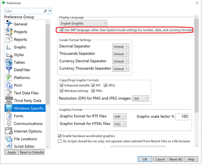
with respect to decimal points using "." or "," perhaps you can fix this from the preferences as in the picture below. Yet, i would assume that all other data sets that you are using will change for the wrong...
In this case, in order to just amend the format of a specific column in one file you can use the following command:
Format( x, "Currency", 20, <<Use Locale(0) );
Full description in this link:
https://www.jmp.com/support/help/zh-cn/15.2/index.shtml#page/jmp/formatting-numbers.shtml
let us know if it works.
ron
- Mark as New
- Bookmark
- Subscribe
- Mute
- Subscribe to RSS Feed
- Get Direct Link
- Report Inappropriate Content
Re: Presenting stock data in form of box plot
How can remove the gaps in the graph that are not trading days?
- Thank Jim!
- Mark as New
- Bookmark
- Subscribe
- Mute
- Subscribe to RSS Feed
- Get Direct Link
- Report Inappropriate Content
Re: Presenting stock data in form of box plot
You will most likely have to change X-axis to nominal and then possibly modify the graphics script to accommodate for that change.
Recommended Articles
- © 2026 JMP Statistical Discovery LLC. All Rights Reserved.
- Terms of Use
- Privacy Statement
- Contact Us
