- New to JMP? Let the Data Analysis Director guide you through selecting an analysis task, an analysis goal, and a data type. Available now in the JMP Marketplace!
- See how to install JMP Marketplace extensions to customize and enhance JMP.
- Subscribe to RSS Feed
- Mark Topic as New
- Mark Topic as Read
- Float this Topic for Current User
- Bookmark
- Subscribe
- Mute
- Printer Friendly Page
Discussions
Solve problems, and share tips and tricks with other JMP users.- JMP User Community
- :
- Discussions
- :
- Re: Pirate plots in Graph Builder
- Mark as New
- Bookmark
- Subscribe
- Mute
- Subscribe to RSS Feed
- Get Direct Link
- Report Inappropriate Content
Pirate plots in Graph Builder
Building on the advice given here (Pictures from the Gallery - Advanced Graph Building Journal) does anyone have any tips for making pirates plots (The Pirate Plot (2.0) – The RDI plotting choice of R pirates) in Graph Builder?
If I hold down shift I can get points, distribution and a bar chart correctly overlaid. When I convert the bars from single to floating it rescales the y-axis so it no longer starts at zero so instead I set the bars to opacity 0.5.
- Is it possible to add sensible estimates around the mean/median like the Bayesian Highest Density Intervals without lots of scripting or adding extra columns?
- Is is possible to set the density or bars to outline rather than filled? There is no 'blank' fill pattern I could find.
I am also interested in peoples thoughts about pirate plots and helping other to see the limitations of bar charts.
Thanks,
Stephen
Accepted Solutions
- Mark as New
- Bookmark
- Subscribe
- Mute
- Subscribe to RSS Feed
- Get Direct Link
- Report Inappropriate Content
Re: Pirate plots in Graph Builder
Hi Stephen.
Let me try to contribute (in my own little way) on your question:
- Is is possible to set the density or bars to outline rather than filled? There is no 'blank' fill pattern I could find.
I modified the Graph Builder script for the Violin (contour) plot with these settings:
Line Color( 0 ),
Fill Color( 2 ),
Transparency( 1 )
Then I adjusted the layering (z-order) of the graph elements - moved the contour plot at the back, bar graph in the middle and data points in the front within Graph Builder.
I tried to separate the transparency for both Line & Fill Colors. After many attempts, I just gave up.
As for the Bayesian 95% HDI, no clue on how to achieve this. I just used the mean and the 95% CI interval as an example.
I attempted to recreate (fig. 1) the Black & White Pirate Plot (fig. 2) to the best of my limited ability
- Randy, JMP newbie
fig. 1

fig. 2

- Mark as New
- Bookmark
- Subscribe
- Mute
- Subscribe to RSS Feed
- Get Direct Link
- Report Inappropriate Content
Re: Pirate plots in Graph Builder
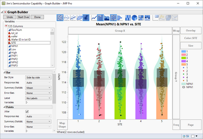
Might this be somewhat you want? It is just a point, bar, contour, box plot overlaid chart, with some color and transparency changes.
I am using the Semiconductor Capability data table from the SAMPLE_DATA
and once I made the graph, I went under the red triangle, and selected Script==>Save Script to Script Window
Graph Builder(
Variables( X( :SITE ), Y( :NPN1 ), Color( :SITE ) ),
Elements(
Bar( X, Y, Legend( 6 ) ),
Points( X, Y, Legend( 5 ) ),
Contour( X, Y, Legend( 7 ) ),
Box Plot( X, Y, Legend( 8 ) )
),
SendToReport(
Dispatch(
{},
"NPN1",
ScaleBox,
{Format( "Best", 10 ), Min( 106.636817992503 ), Max( 123.476204908244 ),
Inc( 2 ), Minor Ticks( 1 )}
),
Dispatch(
{},
"400",
ScaleBox,
{Legend Model(
6,
Properties( 0, {Fill Color( 69 )} ),
Properties( 1, {Fill Color( 67 )} ),
Properties( 2, {Fill Color( 44 )} ),
Properties( 3, {Fill Color( 40 )} ),
Properties( 4, {Fill Color( 70 )} )
)}
),
Dispatch(
{},
"Graph Builder",
FrameBox,
{DispatchSeg(
Box Plot Seg( "Box Plot (1)" ),
{Box Type( "Outlier" ), Fences( 0 ), Line Width( 3 ),
Fill Color( "Black" ), Transparency( 0.25 )}
), DispatchSeg( Marker Seg( "Outliers (1)" ), {Color( "White" )} ),
DispatchSeg(
Box Plot Seg( "Box Plot (2)" ),
{Box Type( "Outlier" ), Fences( 0 ), Fill Color( "Black" ),
Transparency( 0.25 )}
), DispatchSeg(
Box Plot Seg( "Box Plot (3)" ),
{Box Type( "Outlier" ), Fences( 0 ), Fill Color( "Black" ),
Transparency( 0.25 )}
), DispatchSeg(
Box Plot Seg( "Box Plot (4)" ),
{Box Type( "Outlier" ), Fences( 0 ), Fill Color( "Black" ),
Transparency( 0.25 )}
), DispatchSeg(
Box Plot Seg( "Box Plot (5)" ),
{Box Type( "Outlier" ), Fences( 0 ), Fill Color( "Black" ),
Transparency( 0.25 )}
)}
)
)
);
- Mark as New
- Bookmark
- Subscribe
- Mute
- Subscribe to RSS Feed
- Get Direct Link
- Report Inappropriate Content
Re: Pirate plots in Graph Builder
Yes, that is along the lines of what I mean. I was trying to avoid using box plots (which would have been my choice) as they require more explanation of what they are showing (to non-data comfortable people) than the value they add.
It was displaying some measure of uncertainty around the median that I am interested in knowing if there is some tip I am missing.
Using the second Y axis I could put the NPN1 (in your example) on twice. I could then format the data on this axis in a totally different way. One could be transparent bars, density and points and the other floating bars which if the scales on the two axis are the same has the effect of making the top of the bars bold.
- Mark as New
- Bookmark
- Subscribe
- Mute
- Subscribe to RSS Feed
- Get Direct Link
- Report Inappropriate Content
Re: Pirate plots in Graph Builder
Hi Stephen.
I just had an email conversation with the Pirate Plot author (Nathaniel Phillips) - had minor issues with the Pirate Plot Package (yarrr) in RStudio.
I asked him why the Black & White plots are rendering / appearing 1 by 1 with intervals ranging from 3 - 8 seconds per Pirate (6 pirates in total).
He said:
The function that creates the (Bayesian) HDIs uses the BEST package. ... the reason the B&W plot is so slow is because of the HDI calculation. This is why only some of the themes include HDIS. Soon, I hope to update the HDI calculation algorithm to make it faster.
Here's the link to the Pirate Plot Package (yarrr).
Hope this helps in your quest to incorporate HDI in JMP.
- Randy, JMP newbie
- Mark as New
- Bookmark
- Subscribe
- Mute
- Subscribe to RSS Feed
- Get Direct Link
- Report Inappropriate Content
Re: Pirate plots in Graph Builder
Here's a copy of the Pirates dataset in *jmp format from ndphillips' YaRrr package.
- Mark as New
- Bookmark
- Subscribe
- Mute
- Subscribe to RSS Feed
- Get Direct Link
- Report Inappropriate Content
Re: Pirate plots in Graph Builder
Hi Stephen.
Let me try to contribute (in my own little way) on your question:
- Is is possible to set the density or bars to outline rather than filled? There is no 'blank' fill pattern I could find.
I modified the Graph Builder script for the Violin (contour) plot with these settings:
Line Color( 0 ),
Fill Color( 2 ),
Transparency( 1 )
Then I adjusted the layering (z-order) of the graph elements - moved the contour plot at the back, bar graph in the middle and data points in the front within Graph Builder.
I tried to separate the transparency for both Line & Fill Colors. After many attempts, I just gave up.
As for the Bayesian 95% HDI, no clue on how to achieve this. I just used the mean and the 95% CI interval as an example.
I attempted to recreate (fig. 1) the Black & White Pirate Plot (fig. 2) to the best of my limited ability
- Randy, JMP newbie
fig. 1

fig. 2

Recommended Articles
- © 2026 JMP Statistical Discovery LLC. All Rights Reserved.
- Terms of Use
- Privacy Statement
- Contact Us


