- JMP will suspend normal business operations for our Winter Holiday beginning on Wednesday, Dec. 24, 2025, at 5:00 p.m. ET (2:00 p.m. ET for JMP Accounts Receivable).
Regular business hours will resume at 9:00 a.m. EST on Friday, Jan. 2, 2026. - We’re retiring the File Exchange at the end of this year. The JMP Marketplace is now your destination for add-ins and extensions.
- Subscribe to RSS Feed
- Mark Topic as New
- Mark Topic as Read
- Float this Topic for Current User
- Bookmark
- Subscribe
- Mute
- Printer Friendly Page
Discussions
Solve problems, and share tips and tricks with other JMP users.- JMP User Community
- :
- Discussions
- :
- Pie Charts - Label by Percent of Total Values
- Mark as New
- Bookmark
- Subscribe
- Mute
- Subscribe to RSS Feed
- Get Direct Link
- Report Inappropriate Content
Pie Charts - Label by Percent of Total Values
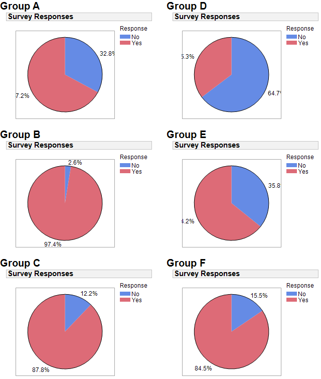
Hello. I scripted some pie charts using Graph Builder and labelled them by percent of total values.
Even though the frame size is a square (220x220), the labels are cut off by the frame/graph border. See pie charts A, D, & E:
Am I doing something wrong? Please see attached script.
Accepted Solutions
- Mark as New
- Bookmark
- Subscribe
- Mute
- Subscribe to RSS Feed
- Get Direct Link
- Report Inappropriate Content
Re: Pie Charts - Label by Percent of Total Values
A big thank you to all my topic responders...
- Dale: How to write a Column Formula for percent of total
- Jim: Info about Graph Builder labeling (non)functionality
- Kevin: A good laugh
While Dale's stacked bar chart suggestion was interesting, I couldn't use it since I've been tasked with creating dozens of scorecards -- each with its own pie chart and other metrics.
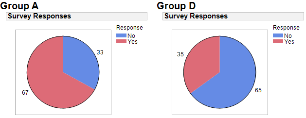
I ended up using a rounded percent (via Column Formula) and applying "Label by Value" to the pie chart. Here are updated graphs for A & D:
While it would be nice to display a percent "%" sign, the percent numbers now show completely. Cheers!
JB
- Mark as New
- Bookmark
- Subscribe
- Mute
- Subscribe to RSS Feed
- Get Direct Link
- Report Inappropriate Content
Re: Pie Charts - Label by Percent of Total Values
This is probably not what you were looking for, but I'd say what you are doing wrong is using pie charts. I've attached one version of what you are doing that I think works better (run the enclosed script). In my view, almost anything works better than pie charts for this data.
- Mark as New
- Bookmark
- Subscribe
- Mute
- Subscribe to RSS Feed
- Get Direct Link
- Report Inappropriate Content
Re: Pie Charts - Label by Percent of Total Values
And a somewhat improved version
- Mark as New
- Bookmark
- Subscribe
- Mute
- Subscribe to RSS Feed
- Get Direct Link
- Report Inappropriate Content
Re: Pie Charts - Label by Percent of Total Values
I will second @dale_lehman comment about pie charts. And I will also comment on the Graph Builder labeling. It isn't very strong. So I am sure that you are not doing anything wrong with the pie charts.
- Mark as New
- Bookmark
- Subscribe
- Mute
- Subscribe to RSS Feed
- Get Direct Link
- Report Inappropriate Content
Re: Pie Charts - Label by Percent of Total Values
- Mark as New
- Bookmark
- Subscribe
- Mute
- Subscribe to RSS Feed
- Get Direct Link
- Report Inappropriate Content
Re: Pie Charts - Label by Percent of Total Values
A big thank you to all my topic responders...
- Dale: How to write a Column Formula for percent of total
- Jim: Info about Graph Builder labeling (non)functionality
- Kevin: A good laugh
While Dale's stacked bar chart suggestion was interesting, I couldn't use it since I've been tasked with creating dozens of scorecards -- each with its own pie chart and other metrics.
I ended up using a rounded percent (via Column Formula) and applying "Label by Value" to the pie chart. Here are updated graphs for A & D:
While it would be nice to display a percent "%" sign, the percent numbers now show completely. Cheers!
JB
- Mark as New
- Bookmark
- Subscribe
- Mute
- Subscribe to RSS Feed
- Get Direct Link
- Report Inappropriate Content
Re: Pie Charts - Label by Percent of Total Values
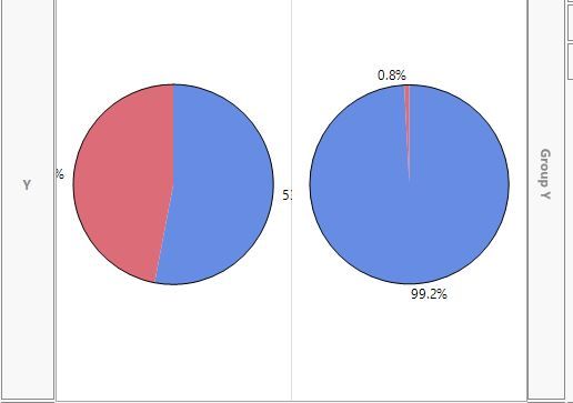
Is there a better solution than just removing the % signs? I am having the same issue as OP, but mine doesn't seem resolvable by removing the %. For context, I used graph builder, put my data as the X axis, created a pie chart, and used "vendor" as the wrap. I understand I can remove the wrap and see the full %, but this seems like a poor solution and I would like to see the two graphs next to each other.
Recommended Articles
- © 2026 JMP Statistical Discovery LLC. All Rights Reserved.
- Terms of Use
- Privacy Statement
- Contact Us


