- New to JMP? Let the Data Analysis Director guide you through selecting an analysis task, an analysis goal, and a data type. Available now in the JMP Marketplace!
- See how to install JMP Marketplace extensions to customize and enhance JMP.
- Subscribe to RSS Feed
- Mark Topic as New
- Mark Topic as Read
- Float this Topic for Current User
- Bookmark
- Subscribe
- Mute
- Printer Friendly Page
Discussions
Solve problems, and share tips and tricks with other JMP users.- JMP User Community
- :
- Discussions
- :
- Re: Overlaying multiple curve fits into one plot
- Mark as New
- Bookmark
- Subscribe
- Mute
- Subscribe to RSS Feed
- Get Direct Link
- Report Inappropriate Content
Overlaying multiple curve fits into one plot
Hi All,
I am looking for some help with data visualization. I have a dataset comprised of a temperature measurement and a voltage measurement for about 200 devices. For each device, a voltage was measured at 7 different temperatures. The voltage profile across temperature is non-linear. What I'm looking to do is fit a curve to the voltage across temperature for each device and overlay all these curves into one plot. Is this possible using JMP, and if so, what would be the best way to go about it?
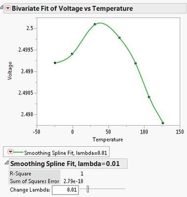
Using 'Fit Spline' in the Bivariate platform gives me the visualization I'm after but only on one device at a time. (see plot), but I would like to be able to overlay a number of devices over each other (or perhaps all of them).
Of course, there is probably a scripting solution to this, but I thought I would see if there are alternatives using JMP interactively. I would greatly appreciate some insight.
Thank you!
Accepted Solutions
- Mark as New
- Bookmark
- Subscribe
- Mute
- Subscribe to RSS Feed
- Get Direct Link
- Report Inappropriate Content
Re: Overlaying multiple curve fits into one plot
Try the 'Group By...' option in 'Fit Y By X':
Names Default To Here( 1 );
// Make a table
n = 10;
t1Vals = (1::n)` + J(n, 1, RandomNormal(0, 0.05));
t2Vals = (1::n)` + J(n, 1, RandomNormal(0, 0.05));
dt = New Table( "Voltage and Temperature",
New Column( "V1", Numeric, Continuous, Formula( Random Normal() ) ),
New Column( "T1", Numeric, Continuous, Values(t1Vals)),
New Column( "V2", Numeric, Continuous, Formula( Random Normal() ) ),
New Column( "T2", Numeric, Continuous, Values(t2Vals))
);
dt << runFormulas;
// Stack the table
dt2 = dt << Stack(
columns( :V1, :T1, :V2, :T2 ),
Source Label Column( "Label" ),
Stacked Data Column( "Data" ),
Stack By Row( 0 ),
Number of Series( 2 ),
OutputTable("Voltage and Temperature Stacked")
);
Column(dt2, "Data 2") << setName("Temperature");
Column(dt2, "Data") << setName("Voltage");
dt2 << deleteColumn("Label 2");
dt2 << colorByColumn(:Label);
// Use 'Group By' in 'Fit Y By X' . . .
biv = dt2 << Bivariate(
Y( :Voltage ),
X( :Temperature ),
Fit Where( :Label == "V1", Fit Spline( 0.1, {Line Color( {208, 64, 86} )} ) ),
Fit Where( :Label == "V2", Fit Spline( 0.1, {Line Color( {64, 110, 211} )} ) )
);
- Mark as New
- Bookmark
- Subscribe
- Mute
- Subscribe to RSS Feed
- Get Direct Link
- Report Inappropriate Content
Re: Overlaying multiple curve fits into one plot
If you have each voltage measurement in its own column, with Graph Builder you can just drag 'Temperature' to the X drop zone, select whichever of the voltages you like, and drag them all at the same time to the Y drop zone.
- Mark as New
- Bookmark
- Subscribe
- Mute
- Subscribe to RSS Feed
- Get Direct Link
- Report Inappropriate Content
Re: Overlaying multiple curve fits into one plot
Hi Ian,
Thanks for the helpful solution. Would be a quick way to do it all right, except for the fact that the measured temperature at the time the voltage was measured for each device is not the same. Sorry, I should have specified that a bit clearer (although they are close).
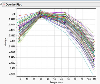
The closest output to what I want was using the overlay plot, specifying temp as the x variable and y as the voltage, and 'part id' as the grouping variable. Then by using the connect points option on the platform hotspot. (see plot below).
Of course the only problem is that I don't get that nice fitted curve for each device, or much customization on the lines themselves.
- Mark as New
- Bookmark
- Subscribe
- Mute
- Subscribe to RSS Feed
- Get Direct Link
- Report Inappropriate Content
Re: Overlaying multiple curve fits into one plot
Try the 'Group By...' option in 'Fit Y By X':
Names Default To Here( 1 );
// Make a table
n = 10;
t1Vals = (1::n)` + J(n, 1, RandomNormal(0, 0.05));
t2Vals = (1::n)` + J(n, 1, RandomNormal(0, 0.05));
dt = New Table( "Voltage and Temperature",
New Column( "V1", Numeric, Continuous, Formula( Random Normal() ) ),
New Column( "T1", Numeric, Continuous, Values(t1Vals)),
New Column( "V2", Numeric, Continuous, Formula( Random Normal() ) ),
New Column( "T2", Numeric, Continuous, Values(t2Vals))
);
dt << runFormulas;
// Stack the table
dt2 = dt << Stack(
columns( :V1, :T1, :V2, :T2 ),
Source Label Column( "Label" ),
Stacked Data Column( "Data" ),
Stack By Row( 0 ),
Number of Series( 2 ),
OutputTable("Voltage and Temperature Stacked")
);
Column(dt2, "Data 2") << setName("Temperature");
Column(dt2, "Data") << setName("Voltage");
dt2 << deleteColumn("Label 2");
dt2 << colorByColumn(:Label);
// Use 'Group By' in 'Fit Y By X' . . .
biv = dt2 << Bivariate(
Y( :Voltage ),
X( :Temperature ),
Fit Where( :Label == "V1", Fit Spline( 0.1, {Line Color( {208, 64, 86} )} ) ),
Fit Where( :Label == "V2", Fit Spline( 0.1, {Line Color( {64, 110, 211} )} ) )
);
- Mark as New
- Bookmark
- Subscribe
- Mute
- Subscribe to RSS Feed
- Get Direct Link
- Report Inappropriate Content
Re: Overlaying multiple curve fits into one plot
Hello nkelleh,
You have at least two options one of them isn't quite what you want, and the other is a bit tedious and would probably best done with a script.
Graph Builder is your first option where you can highlight and drag all 7 or your Voltage columns to the Y axis and then drag temperature to the X axis. Click the fit line icon on the top menu bar (3rd from the left) and scroll down on the left side of the dialogue box to the Line of Fit. The closest you will come to your spline fit is a cubic fit - so not quite what you want.
In the second option you will need to select your baseline fit and then for all of the others individually right click within the graph and select copy frame contents. After each copy go back to the baseline graph and right click and select Paste Frame Contents. As long as your axes are not to far off it should look pretty good. Just time consuming.
Recommended Articles
- © 2026 JMP Statistical Discovery LLC. All Rights Reserved.
- Terms of Use
- Privacy Statement
- Contact Us


