- New to JMP? Let the Data Analysis Director guide you through selecting an analysis task, an analysis goal, and a data type. Available now in the JMP Marketplace!
- See how to install JMP Marketplace extensions to customize and enhance JMP.
- Subscribe to RSS Feed
- Mark Topic as New
- Mark Topic as Read
- Float this Topic for Current User
- Bookmark
- Subscribe
- Mute
- Printer Friendly Page
Discussions
Solve problems, and share tips and tricks with other JMP users.- JMP User Community
- :
- Discussions
- :
- Re: Overlay plot -> how to change sections?
- Mark as New
- Bookmark
- Subscribe
- Mute
- Subscribe to RSS Feed
- Get Direct Link
- Report Inappropriate Content
Overlay plot -> how to change sections?
Hello,
sorry for that trival question but I can't find a solution for that by myself
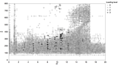
I have created an overlay plot with two axis (retention time and masses). The response (intensity) is displayed as different colors. So far so good everything works fine, but unfortunately the ranges for each color are already given and I'd like to change them.
For example 1-2 is red and 2-3 is green and so on, I'd like to have 1-1.5 red 1.5-3.0 green.That should be possible, but how?
Greetings!
Accepted Solutions
- Mark as New
- Bookmark
- Subscribe
- Mute
- Subscribe to RSS Feed
- Get Direct Link
- Report Inappropriate Content
Re: Overlay plot -> how to change sections?
Sorry for the late answer, that is my result. I grouped the intensities together into four levels and display them now in an overlay plot. Would be even better if each intensity value could be represented with a different color intensity, maybe that's also possible, but I'm ok with that!
Greetings!
/Marco
- Mark as New
- Bookmark
- Subscribe
- Mute
- Subscribe to RSS Feed
- Get Direct Link
- Report Inappropriate Content
Re: Overlay plot -> how to change sections?
I'm having a hard time visualizing what you've created. Which platform are you using?
Can you post a picture of what you've gotten so far?
-Jeff
- Mark as New
- Bookmark
- Subscribe
- Mute
- Subscribe to RSS Feed
- Get Direct Link
- Report Inappropriate Content
Re: Overlay plot -> how to change sections?
Sorry for the late answer, that is my result. I grouped the intensities together into four levels and display them now in an overlay plot. Would be even better if each intensity value could be represented with a different color intensity, maybe that's also possible, but I'm ok with that!
Greetings!
/Marco
Recommended Articles
- © 2026 JMP Statistical Discovery LLC. All Rights Reserved.
- Terms of Use
- Privacy Statement
- Contact Us


