- Subscribe to RSS Feed
- Mark Topic as New
- Mark Topic as Read
- Float this Topic for Current User
- Bookmark
- Subscribe
- Mute
- Printer Friendly Page
Discussions
Solve problems, and share tips and tricks with other JMP users.- JMP User Community
- :
- Discussions
- :
- Re: Overlay graphics from separate data tables
- Mark as New
- Bookmark
- Subscribe
- Mute
- Subscribe to RSS Feed
- Get Direct Link
- Report Inappropriate Content
Overlay graphics from separate data tables
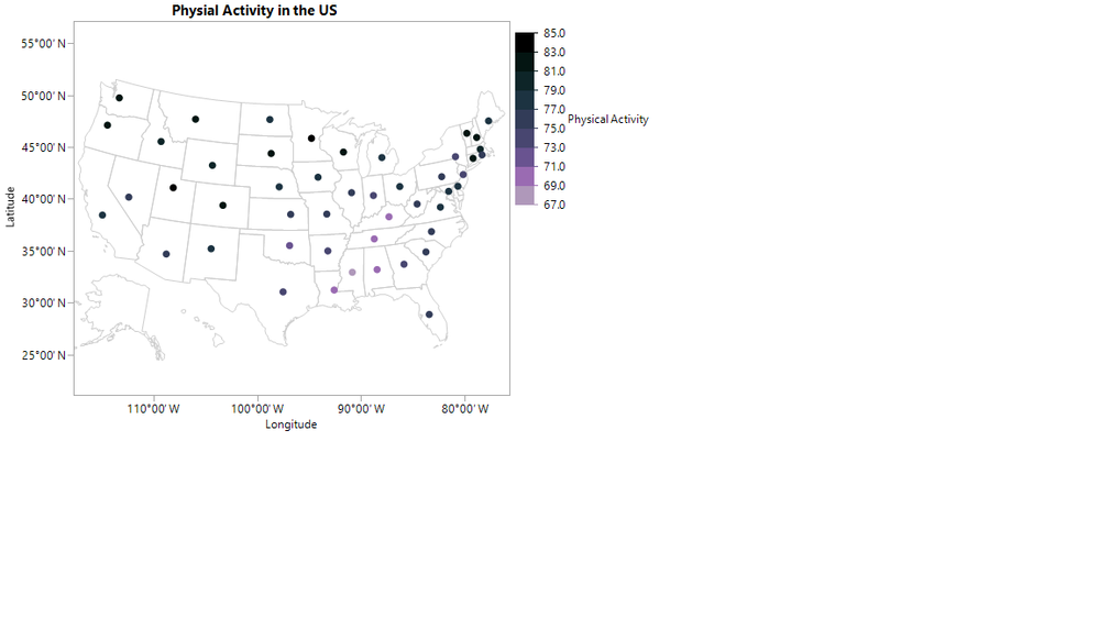
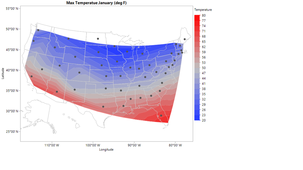
I would like overlay points from one data table onto a contour plot from a second data table without joining the data tables. I want to maintain the coloring and other properties from the points. I have tried to use the Copy/Paste Frame Contentents feature, however it provides the points but not the colors assigned to the points. Below is an example use JMP sample Data
A contour plot based on Cities.jmp
A map with points from US Demographics.jmp
However using Edit > Copy Frame Contents then Edit > Paste Frame Contents I lose the coloring properties of my points.
Accepted Solutions
- Mark as New
- Bookmark
- Subscribe
- Mute
- Subscribe to RSS Feed
- Get Direct Link
- Report Inappropriate Content
Re: Overlay graphics from separate data tables
You could try a virtual join: Virtual Joins in JMP
Or you could retain some of the customization capabilities using JMP customizations: Problem Solving in JMP and Using Graph Customizations to Create a Smith Chart
Best,
M
- Mark as New
- Bookmark
- Subscribe
- Mute
- Subscribe to RSS Feed
- Get Direct Link
- Report Inappropriate Content
Re: Overlay graphics from separate data tables
I cannot use a virtual join because the data I want to use this on does not have an unique identifier.
I think using JMP's customize feature is probably the best solution. Is there any documentation on what is available to use within customize? I found the section "Drawing Markers and Text" to be helpful, but I would just like more information on what features are available.
- Mark as New
- Bookmark
- Subscribe
- Mute
- Subscribe to RSS Feed
- Get Direct Link
- Report Inappropriate Content
Re: Overlay graphics from separate data tables
Hi, @abkram14 !
You can find all the customization games you can play (with examples) by going to Help > Scripting Index in JMP. From there in the first column look for Graphics(). Select that and the second column will filter down to the graphics options. That's your playground for Graph Customizations.
You can get additional information about what all you can do with additional examples in Help > Books > Scripting Guide. You want Chater 12 in JMP14.
Best,
M
- Mark as New
- Bookmark
- Subscribe
- Mute
- Subscribe to RSS Feed
- Get Direct Link
- Report Inappropriate Content
Re: Overlay graphics from separate data tables
Thanks, I have read the Scripting Guide Section on Graphics and it did not answer my questions, but the Graphics section in the Scripting Index helped.
Here is my solution for anyone else wondering about this. I wish I had found a better way to do the coloring and to add a legend to go with the coloring for the points from the US Demographics.jmp table.
cities = Data Table("Cities.jmp");

window = cities << Graph Builder(
	Variables( X( :Longitude ), Y( :Latitude ), Color( :Max deg. F Jan ) ),
	Elements( Contour( X, Y, Legend( 8 ), Number of Levels( 20 ) ) ),
	SendToReport(
		Dispatch(
			{},
			"Longitude",
			ScaleBox,
			{Min( -120.427580183506 ), Max( -73.4774650353953 ), Inc( 5 ),
			Minor Ticks( 0 )}
		),
		Dispatch(
			{},
			"Latitude",
			ScaleBox,
			{Min( 18.7755280157154 ), Max( 59.0478368517315 ), Inc( 5 ),
			Minor Ticks( 1 )}
		),
		Dispatch(
			{},
			"Graph Builder",
			FrameBox,
			{Background Map( Boundaries( "US States" ) ),
			Add Graphics Script(
				5,
				Description( "Script" ),
				dt = Data Table( "US Demographics.jmp" );
				Marker Size( 4 );
				color = "";
				For( i = 1, i < N Rows( dt ), i++,
					If(
						:Physical Activity[i] <= 72, color = " Light Green",
						72 < :Physical Activity[i] <= 75.5,
							color = "Medium Light Green",
						75.5 < :Physical Activity[i] <= 79, color = "Green",
						79 < :Physical Activity[i] <= 82.5,
							color = "Medium Dark Green",
						82.5 < :Physical Activity[i], color = "Dark Green",

					);
					Marker( Color State( color ), {:Longitude[i], :Latitude[i]} );
				);

				Close( dt, nosave );
			), Grid Line Order( 3 ), Reference Line Order( 4 )}
		)
	)
);- Mark as New
- Bookmark
- Subscribe
- Mute
- Subscribe to RSS Feed
- Get Direct Link
- Report Inappropriate Content
Re: Overlay graphics from separate data tables
A manual way to do this is to right-click the graph with the single data points, and select Edit > Copy Frame Contents. Then in the other graph right click and select Edit > Paste Frame Contents.
You lose some interactivity this way, but it does the job sometimes. When I do this, I usually first journal each graph, then do the above steps on the graphs in the journal.
- Mark as New
- Bookmark
- Subscribe
- Mute
- Subscribe to RSS Feed
- Get Direct Link
- Report Inappropriate Content
Re: Overlay graphics from separate data tables
I originally tried using Edit > Copy Frame Contents and Edit > Paste Frame Contents. However I then lost the coloring of the points I was trying to copy, which I needed to keep for what I am doing.
I really wish it would copy the legend settings with the points.
- Mark as New
- Bookmark
- Subscribe
- Mute
- Subscribe to RSS Feed
- Get Direct Link
- Report Inappropriate Content
Re: Overlay graphics from separate data tables
Best,
M
Recommended Articles
- © 2026 JMP Statistical Discovery LLC. All Rights Reserved.
- Terms of Use
- Privacy Statement
- Contact Us


