- New to JMP? Let the Data Analysis Director guide you through selecting an analysis task, an analysis goal, and a data type. Available now in the JMP Marketplace!
- See how to install JMP Marketplace extensions to customize and enhance JMP.
- Subscribe to RSS Feed
- Mark Topic as New
- Mark Topic as Read
- Float this Topic for Current User
- Bookmark
- Subscribe
- Mute
- Printer Friendly Page
Discussions
Solve problems, and share tips and tricks with other JMP users.- JMP User Community
- :
- Discussions
- :
- Ordering points in a centered grid plot
- Mark as New
- Bookmark
- Subscribe
- Mute
- Subscribe to RSS Feed
- Get Direct Link
- Report Inappropriate Content
Ordering points in a centered grid plot
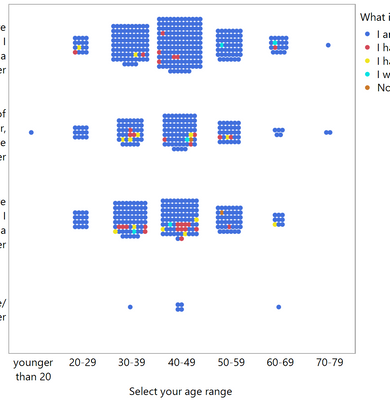
I have a scatterplot with centered grid:
I'd like to order the colors within each block of points (so, in each block of dots, reading left to right and top to bottom, first come all the blues, then the reds, etc). How can I accomplish this, preferably in Graph Builder with no JSL?
Accepted Solutions
- Mark as New
- Bookmark
- Subscribe
- Mute
- Subscribe to RSS Feed
- Get Direct Link
- Report Inappropriate Content
Re: Ordering points in a centered grid plot
If you would attach your data table it would be quite helpful. One thought is to add a column to the data table that designates the order you want. Then go to Rows>Color or Mark by Column and select the newly added column. You can customize the colors or markers.
- Mark as New
- Bookmark
- Subscribe
- Mute
- Subscribe to RSS Feed
- Get Direct Link
- Report Inappropriate Content
Re: Ordering points in a centered grid plot
Never mind, I was doing it wrong! I've attached the working solution
- Mark as New
- Bookmark
- Subscribe
- Mute
- Subscribe to RSS Feed
- Get Direct Link
- Report Inappropriate Content
Re: Ordering points in a centered grid plot
If you would attach your data table it would be quite helpful. One thought is to add a column to the data table that designates the order you want. Then go to Rows>Color or Mark by Column and select the newly added column. You can customize the colors or markers.
- Mark as New
- Bookmark
- Subscribe
- Mute
- Subscribe to RSS Feed
- Get Direct Link
- Report Inappropriate Content
Re: Ordering points in a centered grid plot
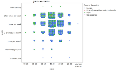
Here is a data table. It's a little different to the screenshot above, but same idea. You can run the script to generate this plot:
I tried Rows > Color or Mark by Column, but it just added a little colored dot to each row in the table; I couldn't figure out how to actually rearrange the points in Graph Builder (or script) such that all blue ones come first, then all green ones, etc. Any ideas?
- Mark as New
- Bookmark
- Subscribe
- Mute
- Subscribe to RSS Feed
- Get Direct Link
- Report Inappropriate Content
Re: Ordering points in a centered grid plot
Never mind, I was doing it wrong! I've attached the working solution
Recommended Articles
- © 2026 JMP Statistical Discovery LLC. All Rights Reserved.
- Terms of Use
- Privacy Statement
- Contact Us


