- New to JMP? Let the Data Analysis Director guide you through selecting an analysis task, an analysis goal, and a data type. Available now in the JMP Marketplace!
- See how to install JMP Marketplace extensions to customize and enhance JMP.
- Subscribe to RSS Feed
- Mark Topic as New
- Mark Topic as Read
- Float this Topic for Current User
- Bookmark
- Subscribe
- Mute
- Printer Friendly Page
Discussions
Solve problems, and share tips and tricks with other JMP users.- JMP User Community
- :
- Discussions
- :
- Subplots with different sizes?
- Mark as New
- Bookmark
- Subscribe
- Mute
- Subscribe to RSS Feed
- Get Direct Link
- Report Inappropriate Content
Subplots with different sizes?
Accepted Solutions
- Mark as New
- Bookmark
- Subscribe
- Mute
- Subscribe to RSS Feed
- Get Direct Link
- Report Inappropriate Content
Re: Subplots with different sizes?
Hi @hogi ,
Yes, it can be a bit challenging to do it, but it is possible :)
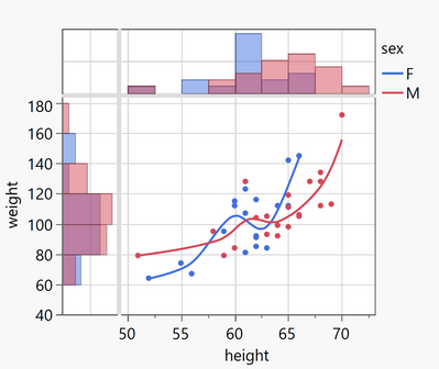
Here is the result on JMP :
And here is the script to realize it on JMP (with the "Big Class" dataset like in your example):
Graph Builder(
	Size( 638, 610 ),
	Show Control Panel( 0 ),
	Variables( X( :X ), X( :height ), Y( :height ), Y( :weight ), Overlay( :sex ) ),
	Relative Sizes( "X", [157 427] ),
	Relative Sizes( "Y", [114 246] ),
	Elements( Position( 1, 1 ) ),
	Elements( Position( 1, 2 ), Histogram( X, Y, Legend( 44 ) ) ),
	Elements( Position( 2, 1 ), Histogram( X, Y, Legend( 42 ) ) ),
	Elements(
		Position( 2, 2 ),
		Points( X, Y, Legend( 36 ) ),
		Smoother( X, Y, Legend( 45 ) )
	),
	SendToReport(
		Dispatch(
			{},
			"X",
			ScaleBox,
			{Label Row(
				{Automatic Font Size( 0 ), Automatic Tick Marks( 0 ),
				Show Major Labels( 0 ), Show Major Ticks( 0 ), Show Minor Ticks( 0 )
				}
			)}
		),
		Dispatch(
			{},
			"height",
			ScaleBox( 2 ),
			{Label Row(
				{Automatic Font Size( 0 ), Automatic Tick Marks( 0 ),
				Show Major Labels( 0 ), Show Major Ticks( 0 ), Show Minor Ticks( 0 )
				}
			)}
		),
		Dispatch(
			{},
			"400",
			ScaleBox,
			{Legend Model(
				42,
				Base( 0, 0, 0, Item ID( "F", 1 ) ),
				Base( 1, 0, 0, Item ID( "M", 1 ) )
			), Legend Model(
				36,
				Base( 0, 0, 0, Item ID( "F", 1 ) ),
				Base( 1, 0, 0, Item ID( "M", 1 ) )
			)}
		),
		Dispatch( {}, "X title", TextEditBox, {Set Text( "" )} ),
		Dispatch( {}, "Y title", TextEditBox, {Set Text( "" )} ),
		Dispatch(
			{},
			"400",
			LegendBox,
			{Legend Position(
				{44, [-1, -1], 42, [-1, -1], 36, [-1, -1], 45, [0, 1]}
			)}
		)
	)
);
The "trick" is to create a dummy variable column "X" in your datatable (only with value "1" for example), to realize the subplot in the left corner. You can then hide all the graphs ticks and values. On the X axis, you have two variables : "X" and "height", and on the Y axis, you have two variables "height" and "weight".
To resize an element in the graph independently, just move your mouse on the axis until you have a double arrow on the diagonal, and then click and move this double arrow to resize the axis/element you want.
I hope this will help you,
PS: If you don't know it already, I highly recommend to see the tips and tricks on Graph Builder done in the serie "Pictures from the Gallery" by @scwise (Scott Wise), always interesting and insightful !
"It is not unusual for a well-designed experiment to analyze itself" (Box, Hunter and Hunter)
- Mark as New
- Bookmark
- Subscribe
- Mute
- Subscribe to RSS Feed
- Get Direct Link
- Report Inappropriate Content
Re: Subplots with different sizes?
Victor and Hogi,
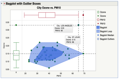
Thank you Victor for the nice shout out to the Pictures in the Gallery Advanced Graph Builder views and for your nice scripting solution. There is also a less elegant, but non-coding way to accomplish this desired graph view. It is featured as one of the methods in the "Pictures form the Gallery 5", and you can access the video and download the journal with steps, data and scripts through this link: Discovery-Summit-Munich-2020-Pictures-From-the-Gallery-5 . The trick is to set-up dummy variables, that can be used to put the additional graph types on the side and top in order to generate another view, like in this case Box Plots around a Scatter Plot over the same X and Y Axes.
Hope this helps and keep having fun exploring and visualizing in JMP!
Scott
- Mark as New
- Bookmark
- Subscribe
- Mute
- Subscribe to RSS Feed
- Get Direct Link
- Report Inappropriate Content
Re: Subplots with different sizes?
@Victor_G wrote:To resize an element in the graph independently, just move your mouse on the axis until you have a double arrow on the diagonal, and then click and move this double arrow to resize the axis/element you want.
Fantastic!
I just added an entry to the list of easter eggs:
CTRL/Alt/Shift + click/select/double click/right click
- Mark as New
- Bookmark
- Subscribe
- Mute
- Subscribe to RSS Feed
- Get Direct Link
- Report Inappropriate Content
Re: Subplots with different sizes?
Can I flip the histogram on the left to let the bars point to the left?
- Mark as New
- Bookmark
- Subscribe
- Mute
- Subscribe to RSS Feed
- Get Direct Link
- Report Inappropriate Content
Re: Subplots with different sizes?
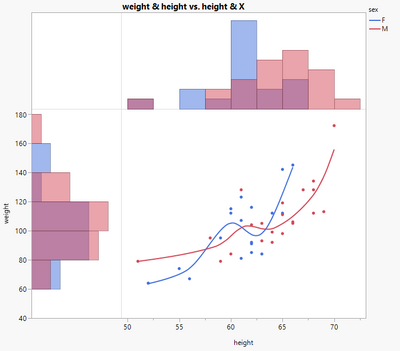
Yes @hogi, simply right-click on the left side of the x-axis , go to "Axis Settings" and then check the option "Reverse Order" :
You should get this graph with the desired orientation:
Here is the script:
Graph Builder(
	Size( 638, 610 ),
	Show Control Panel( 0 ),
	Variables( X( :X ), X( :height ), Y( :height ), Y( :weight ), Overlay( :sex ) ),
	Relative Sizes( "X", [157 427] ),
	Relative Sizes( "Y", [114 246] ),
	Elements( Position( 1, 1 ) ),
	Elements( Position( 1, 2 ), Histogram( X, Y, Legend( 44 ) ) ),
	Elements( Position( 2, 1 ), Histogram( X, Y, Legend( 42 ) ) ),
	Elements(
		Position( 2, 2 ),
		Points( X, Y, Legend( 36 ) ),
		Smoother( X, Y, Legend( 45 ) )
	),
	SendToReport(
		Dispatch( {}, "X", ScaleBox,
			{Reversed Scale, Label Row(
				{Automatic Font Size( 0 ), Automatic Tick Marks( 0 ),
				Show Major Labels( 0 ), Show Major Ticks( 0 ), Show Minor Ticks( 0 )
				}
			)}
		),
		Dispatch( {}, "height", ScaleBox( 2 ),
			{Label Row(
				{Automatic Font Size( 0 ), Automatic Tick Marks( 0 ),
				Show Major Labels( 0 ), Show Major Ticks( 0 ), Show Minor Ticks( 0 )
				}
			)}
		),
		Dispatch( {}, "400", ScaleBox,
			{Legend Model(
				42,
				Base( 0, 0, 0, Item ID( "F", 1 ) ),
				Base( 1, 0, 0, Item ID( "M", 1 ) )
			), Legend Model(
				36,
				Base( 0, 0, 0, Item ID( "F", 1 ) ),
				Base( 1, 0, 0, Item ID( "M", 1 ) )
			)}
		),
		Dispatch( {}, "X title", TextEditBox, {Set Text( "" )} ),
		Dispatch( {}, "Y title", TextEditBox, {Set Text( "" )} ),
		Dispatch( {}, "400", LegendBox,
			{Legend Position(
				{44, [-1, -1], 42, [-1, -1], 36, [-1, -1], 45, [0, 1]}
			)}
		)
	)
);
Remember to add a dummy column in your dataset (here labelled "X") with only constant values (here 1) to be able to add visualizations like in this situation.
Hope this answer will help you,
"It is not unusual for a well-designed experiment to analyze itself" (Box, Hunter and Hunter)
- Mark as New
- Bookmark
- Subscribe
- Mute
- Subscribe to RSS Feed
- Get Direct Link
- Report Inappropriate Content
Re: Subplots with different sizes?
Ah!
In general I use a nominal X for "all rows = same category" - which doesn't allow to reverse the plot.
The trick: change the modeling type to continuous.
dt = Open( "$SAMPLE_DATA/Big Class.jmp" );
new column ("X", Nominal,Set each  value(1));
Graph Builder(
	Size( 638, 610 ),
	Show Control Panel( 0 ),
	Graph Spacing( 4 ),
	Variables( X( :X ), X( :height ), Y( :height ), Y( :weight ), Overlay( :sex ) ),
	Relative Sizes( "X", [157 427] ),
	Relative Sizes( "Y", [114 246] ),
	Elements( Position( 1, 1 ) ),
	Elements( Position( 1, 2 ), Histogram( X, Y ) ),
	Elements( Position( 2, 1 ), Histogram( X, Y ) ),
	Elements( Position( 2, 2 ), Points( X, Y), Smoother( X, Y) ),
	SendToReport( Dispatch( {}, {:X}, ScaleBox, {Reversed Scale} ) ),
	SendToReport(
		Dispatch( {}, "X", ScaleBox,
			{Reversed Scale}
		)
));

wait(3);

:X << Set Modeling Type( "Continuous" );Recommended Articles
- © 2026 JMP Statistical Discovery LLC. All Rights Reserved.
- Terms of Use
- Privacy Statement
- Contact Us


