- Subscribe to RSS Feed
- Mark Topic as New
- Mark Topic as Read
- Float this Topic for Current User
- Bookmark
- Subscribe
- Mute
- Printer Friendly Page
Discussions
Solve problems, and share tips and tricks with other JMP users.- JMP User Community
- :
- Discussions
- :
- Re: Multiplex MSD 96 Well Plate with Spots Map File
- Mark as New
- Bookmark
- Subscribe
- Mute
- Subscribe to RSS Feed
- Get Direct Link
- Report Inappropriate Content
Multiplex MSD 96 Well Plate with Spots Map File
I have used your files and created map file for MSD 96 well multiplex plates with 10 spots per well. I have named the 10 spots "1" to "10" and the well as a whole "11" all in the Part ID column. The Shape ID's are all still the 96 wells using the LetterNumber notation. This looks GREAT, but when I go to use it, speficying Well as for the Map Role, I only color the entire well, not the individual spots within each well. How do I access the Part ID portion of the shape file in the Map Role?
Thanks,
Martin
Accepted Solutions
- Mark as New
- Bookmark
- Subscribe
- Mute
- Subscribe to RSS Feed
- Get Direct Link
- Report Inappropriate Content
Re: Multiplex MSD 96 Well Plate with Spots Map File
Yes, that is correct. There is one column that uses the same name as the one used to define the Name and the XY file. You might make an easy-to-use scheme based on concatenation. Easy for you (Well and Spot), easy for JMP (Location). For example:
So the location value is the name used in the Name and the XY shape files. But the scheme is entirely up to you. I tried to make my original scheme as straight-forward and easy as possible because I intended to release it in the JMP Community.
- Mark as New
- Bookmark
- Subscribe
- Mute
- Subscribe to RSS Feed
- Get Direct Link
- Report Inappropriate Content
Re: Multiplex MSD 96 Well Plate with Spots Map File
Graph Builder uses shape files to render data with a geometric interpretation. The shapes are defined by two JMP data tables (Name and XY). JMP published the specification for the required format of these files. JMP installs with many pairs of shape files for geographical entities. But you can make your own shape files for any custom geometry. You just need to follow the specification and it should work without any problem.
I used the specification to make the shape files for standard 96-well plates. The specification provides the means for each shape to be comprised of more than one part. So you could make your own shape files with 10 parts (spot) per shape (plate well) to display your nested data.
- Mark as New
- Bookmark
- Subscribe
- Mute
- Subscribe to RSS Feed
- Get Direct Link
- Report Inappropriate Content
Re: Multiplex MSD 96 Well Plate with Spots Map File
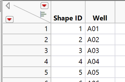
So the shapes that are referenced in your data table are based on the second column in the Name file, right? This is a clip from my Name file:
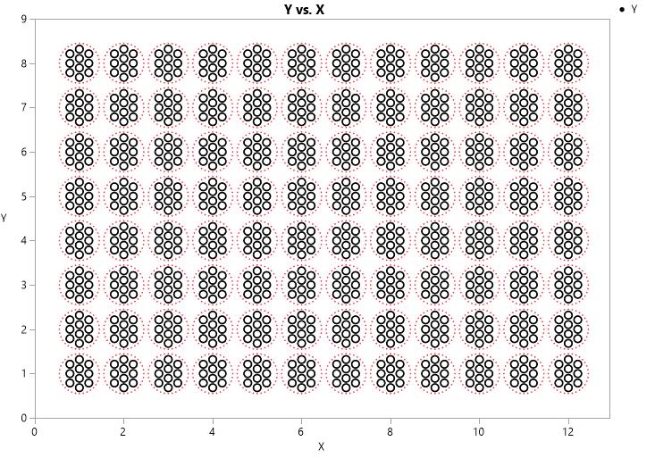
but what I have done is add 10 additional Part ID's (one for each spot within each of the 96 wells) for each Shape ID in my XY file. So for each Shape ID in the XY file, I have 11 Part ID's (10 for spots and 1 for the outer circle). My final graph looks like this:
In order to use the individual spots, instead of the outer 96 wells, how do we use the combination of Well Number and Spot Number? I thought it was with different Part ID's, but can't seem to use them.
- Mark as New
- Bookmark
- Subscribe
- Mute
- Subscribe to RSS Feed
- Get Direct Link
- Report Inappropriate Content
Re: Multiplex MSD 96 Well Plate with Spots Map File
I apologize. I made a mistake. The map of a response value to a shape is key. So you should not use the part feature for each spot. Each spot should be its own shape. Then the mapping will work.
- Mark as New
- Bookmark
- Subscribe
- Mute
- Subscribe to RSS Feed
- Get Direct Link
- Report Inappropriate Content
Re: Multiplex MSD 96 Well Plate with Spots Map File
So Shape ID would represent country, and Part ID would just be the non-contiguous areas?
Thanks for the help.
- Mark as New
- Bookmark
- Subscribe
- Mute
- Subscribe to RSS Feed
- Get Direct Link
- Report Inappropriate Content
Re: Multiplex MSD 96 Well Plate with Spots Map File
Yes, that is the idea. But you do not have dis-contiguous areas. Part ID will always be 1.
The shape corresponding to a single response is a spot in the well. Each shape has presumably just one part. This one-to-one mapping is the same one that I used for the original plate well.
- Mark as New
- Bookmark
- Subscribe
- Mute
- Subscribe to RSS Feed
- Get Direct Link
- Report Inappropriate Content
Re: Multiplex MSD 96 Well Plate with Spots Map File
- Mark as New
- Bookmark
- Subscribe
- Mute
- Subscribe to RSS Feed
- Get Direct Link
- Report Inappropriate Content
Re: Multiplex MSD 96 Well Plate with Spots Map File
Yes, that is correct. There is one column that uses the same name as the one used to define the Name and the XY file. You might make an easy-to-use scheme based on concatenation. Easy for you (Well and Spot), easy for JMP (Location). For example:
So the location value is the name used in the Name and the XY shape files. But the scheme is entirely up to you. I tried to make my original scheme as straight-forward and easy as possible because I intended to release it in the JMP Community.
- Mark as New
- Bookmark
- Subscribe
- Mute
- Subscribe to RSS Feed
- Get Direct Link
- Report Inappropriate Content
Re: Multiplex MSD 96 Well Plate with Spots Map File
From what you’ve described, it sounds like your shape file is correctly set up with 10 individual parts (spots) per well, labeled 1–10, plus the well as a whole labeled “11” in the Part ID column. The challenge you're facing is that when you assign “Well” as the Map Role, JMP only recognizes the entire well and not the individual spots within it. This happens because JMP uses the value in the Map Role to match what's in the Name column of your shape file, not the Part ID column.
To visualize individual spots within each 96 well plate template, you’ll need to ensure that each spot (i.e., each part within a well) has a unique identifier that combines both the well and spot information in a format that aligns with your data table. For instance, you might concatenate the well position (like A1, B1, etc.) with the spot number—something like “A1_1”, “A1_2”, etc.—and use that combined value in both the Name column of your shape file and your data table. Then, in Graph Builder, you can assign this combined value as the Map Role and JMP will match each spot individually.
I ran into a similar situation with a cytokine panel where I needed to display signal intensity per spot across a 96 well plate template, and using this naming strategy worked perfectly. If you need a visual starting point or inspiration, this site offers a variety of templates that helped me double-check my layout logic.
Recommended Articles
- © 2026 JMP Statistical Discovery LLC. All Rights Reserved.
- Terms of Use
- Privacy Statement
- Contact Us


