- Subscribe to RSS Feed
- Mark Topic as New
- Mark Topic as Read
- Float this Topic for Current User
- Bookmark
- Subscribe
- Mute
- Printer Friendly Page
Discussions
Solve problems, and share tips and tricks with other JMP users.- JMP User Community
- :
- Discussions
- :
- Re: Move "Group Y" to the left side of the graph plot in Graph Builder
- Mark as New
- Bookmark
- Subscribe
- Mute
- Subscribe to RSS Feed
- Get Direct Link
- Report Inappropriate Content
Move "Group Y" to the left side of the graph plot in Graph Builder
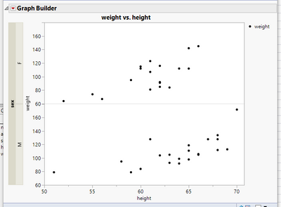
Is there a way I can move the "Group Y" in Graph builder so it is on the left side of my graph, rather than the right side (default location)?
- Mark as New
- Bookmark
- Subscribe
- Mute
- Subscribe to RSS Feed
- Get Direct Link
- Report Inappropriate Content
Re: Move "Group Y" to the left side of the graph plot in Graph Builder
See @jthi response below for the correct answer
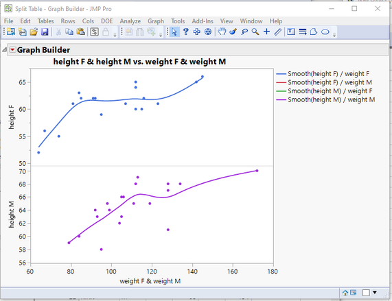
You can do what you want by splitting the data table by your Group Y and then plotting the split Y columns as separate columns on the Y axis, and the split X columns as combined columns on the X axis.
names default to here(1);
// Open Data Table: Big Class.jmp
// → Data Table( "Big Class" )
Open( "/C:/Program Files/SAS/JMPPRO/12/Samples/Data/Big Class.jmp" );

// Split data table
// → Data Table( "Untitled 13" )
Data Table( "Big Class" ) << Split(
	Split By( :sex ),
	Split( :height, :weight ),
	Group( :name, :sex ),
	Remaining Columns( Drop All ),
	Sort by Column Property,
	Output Table( "Split Table" )
);

Data Table( "Split Table" ) << Graph Builder(
	Size( 525, 454 ),
	Show Control Panel( 0 ),
	Variables(
		X( :weight F ),
		X( :weight M, Position( 1 ) ),
		Y( :height F ),
		Y( :height M )
	),
	Elements(
		Position( 1, 1 ),
		Points( X( 1 ), X( 2 ), Y, Legend( 25 ) ),
		Smoother( X( 1 ), X( 2 ), Y, Legend( 26 ) )
	),
	Elements(
		Position( 1, 2 ),
		Points( X( 1 ), X( 2 ), Y, Legend( 27 ) ),
		Smoother( X( 1 ), X( 2 ), Y, Legend( 28 ) )
	)
)
- Mark as New
- Bookmark
- Subscribe
- Mute
- Subscribe to RSS Feed
- Get Direct Link
- Report Inappropriate Content
Re: Move "Group Y" to the left side of the graph plot in Graph Builder
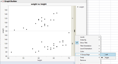
Right click on grouping and from Y Group Edge you can change grouping side
- Mark as New
- Bookmark
- Subscribe
- Mute
- Subscribe to RSS Feed
- Get Direct Link
- Report Inappropriate Content
Re: Move "Group Y" to the left side of the graph plot in Graph Builder
Wow @jthi I was not aware of that option...Once again, I learn something new with JMP every week.
- Mark as New
- Bookmark
- Subscribe
- Mute
- Subscribe to RSS Feed
- Get Direct Link
- Report Inappropriate Content
Re: Move "Group Y" to the left side of the graph plot in Graph Builder
@jthi Thank you! I wonder if there is a way to just jsl to move the group y into the graph plot so it's not outside of the plot? I assumed there wasn't a path forward with this, but it doesn't hurt to try!
Recommended Articles
- © 2026 JMP Statistical Discovery LLC. All Rights Reserved.
- Terms of Use
- Privacy Statement
- Contact Us


