- JMP Statement Regarding Critical PHP Remote Code Execution Vulnerabilities (CVE-2026-109618, CVE-2026-109619)
- Don’t miss your chance to experience Discovery Summit Europe at our best available rate! Early bird registration through 31 Oct.
- Graph Builder Toolbar streamlines interactive graphing. Creates shortcuts on Report and GraphBuilder Helpers toolbars. Download and install the extension.
- Subscribe to RSS Feed
- Mark Topic as New
- Mark Topic as Read
- Float this Topic for Current User
- Bookmark
- Subscribe
- Mute
- Printer Friendly Page
Discussions
Solve problems, and share tips and tricks with other JMP users.- User Community
- :
- Discussions
- :
- Re: Make Vertical bar chart showing only Top 10

- Mark as New
- Bookmark
- Subscribe
- Mute
- Subscribe to RSS Feed
- Get Direct Link
- Report Inappropriate Content
Make Vertical bar chart showing only Top 10
Hello JMP community,
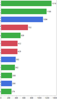
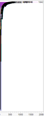
I would like to have vertical graph like on the left side. This graph is based on a data set far bigger. See on the right.
Now I would only like to show the top 10 or top 5.
Does anybody have a good idea for that?
Ben
What I tried so far, somehow works but not as I would intend it to:
Generally that is possible by:
Limiting with a local data filter for x so that the graph on the right becomes more readable.
Since I use very dynamic filtering option I tediously have to readjust the x-filter every time I Change some other filterings.
I also tried using col rank and sorting by that. With this I can directly choose how many TOPs to select-->Cool. But this won't work if I adjust the filter with some other options because the rank column is ranking totally (even if I subgroup within the formula by an other attribute).


- Mark as New
- Bookmark
- Subscribe
- Mute
- Subscribe to RSS Feed
- Get Direct Link
- Report Inappropriate Content
Re: Make Vertical bar chart showing only Top 10
Hello Ben,
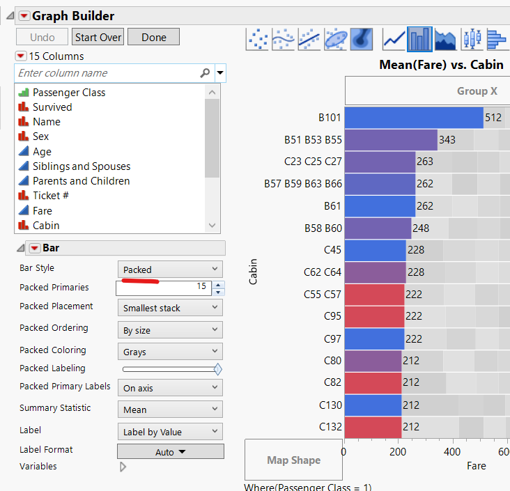
How about Packed bar? Packed bar is slightly different what you want, but it is easier way to do.
- Mark as New
- Bookmark
- Subscribe
- Mute
- Subscribe to RSS Feed
- Get Direct Link
- Report Inappropriate Content
Re: Make Vertical bar chart showing only Top 10
Hi Yuichi,
thanks for pointing out this option. I was not aware of the packed bar chart.
It is a kind of workaround, but as you mentioned, it is slightly different as I need it.
Still the other values appear as the secondary bars in gray (depending on the local data filter one has set).
But you can separate them via "Packed ordering" to the bottom and just readjust the y axis so their are not visible any more.
Thanks!
Recommended Articles
- © 2026 JMP Statistical Discovery LLC. All Rights Reserved.
- Terms of Use
- Privacy Statement
- Contact Us