- New to JMP? Let the Data Analysis Director guide you through selecting an analysis task, an analysis goal, and a data type. Available now in the JMP Marketplace!
- See how to install JMP Marketplace extensions to customize and enhance JMP.
- Subscribe to RSS Feed
- Mark Topic as New
- Mark Topic as Read
- Float this Topic for Current User
- Bookmark
- Subscribe
- Mute
- Printer Friendly Page
Discussions
Solve problems, and share tips and tricks with other JMP users.- JMP User Community
- :
- Discussions
- :
- Re: Logistic Plot interpretation of points
- Mark as New
- Bookmark
- Subscribe
- Mute
- Subscribe to RSS Feed
- Get Direct Link
- Report Inappropriate Content
Logistic Plot interpretation of points
I am trying to understand the points in the logistic plot. When I use Fit Y by X, with Y nominal and X continuous, I get a logistic curve. The curve is perfectly understandable, but the points make no sense to me. JMP help says: "The logistic probability plot gives a complete picture of what the logistic model is fitting. At each x value, the probability scale in the y direction is divided up (partitioned) into probabilities for each response category. The probabilities are measured as the vertical distance between the curves, with the total across all Y category probabilities summing to 1." With only 2 levels for Y, this provides an explanation for the vertical distance to the curve from the X axis and the distance above the curve - these are the probabilities for the two classes. But regarding the points, the only explanation I can find says: "Markers for the data are drawn at their x-coordinate, with the y position jittered randomly within the range corresponding to the response category for that row." Can someone tell me what that means? Why in the world would I want the points randomly jittered?
- Mark as New
- Bookmark
- Subscribe
- Mute
- Subscribe to RSS Feed
- Get Direct Link
- Report Inappropriate Content
Re: Logistic Plot interpretation of points
The logistic plot is related to the mosaic plot. Both are visualizations of proportions or probabilities versus levels of a predictor. The mosaic plot typically uses area to depict both the proportion (vertical) and the sample size (horizontal) for a categorical predictor. The mosaic plot and logistic plot both display a tic mark on the right side of the plot frame to indicate the cumulative marginal probability. The logistic curve displays a curve for each logit for the conditional probability that depends on the continuous predictor.
It is helpful in regression to plot the data and the model (the graph of the function) together. This plot can be used to assess the assumptions of regression and the overall data quality and detect lack of fit. How might the data be potted? In particular, what should the ordinate value be? JMP places the marker between the boundaries of probability 0, the logistic curves, and 1. But exactly where should the markers be plotted? The marginal probability? At a location half-way between the bounding conditional probabilities? JMP adds jitter so that the markers are spread out vertically.
This way assists the assessment the fit and the data.
How in the world would you plot the data?
- Mark as New
- Bookmark
- Subscribe
- Mute
- Subscribe to RSS Feed
- Get Direct Link
- Report Inappropriate Content
Re: Logistic Plot interpretation of points
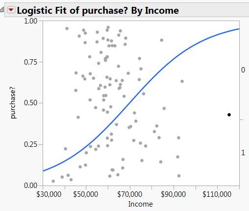
I am not following. Let's use the simpler example where there are only two groups: purchasers and non-purchasers. I created a simulated data set and this is the plot I get:

- Mark as New
- Bookmark
- Subscribe
- Mute
- Subscribe to RSS Feed
- Get Direct Link
- Report Inappropriate Content
Re: Logistic Plot interpretation of points
The abscissa is the Income value. The ordinate is below the logistic curve because the data is Purchase? = 1.
You should not interpret the ordinate value as a probability. The vertical location has no such meaning. The marker is placed between 0 and the conditional probability Purchase? = 1 with jitter. The marginal probability is the difference between tic marks and the conditional probability that Purchase? = 1 for all the data is the logistic curve.
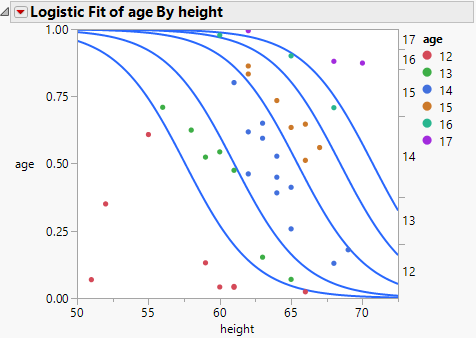
Some plots for logistic regression plot markers as you prefer: use the numeric categorical level or assign an index and use the result for the ordinate. This way leads to two problems. The first problem is that the markers overlap in a dense distribution. The solution is jitter. (Hint, hint) The second problem is that this solution is too simple. It does not generalize to cases with more than two levels. (Imagine plotting the data this way in the case of the my previous example of age versus height.)
- Mark as New
- Bookmark
- Subscribe
- Mute
- Subscribe to RSS Feed
- Get Direct Link
- Report Inappropriate Content
Re: Logistic Plot interpretation of points
- Mark as New
- Bookmark
- Subscribe
- Mute
- Subscribe to RSS Feed
- Get Direct Link
- Report Inappropriate Content
Re: Logistic Plot interpretation of points
Unfortunately, jittering along the 0 and 1 horizontal lines does not work because the location along the x-axis is important and already determined in the data. You can only jitter in the Y-direction.
- Mark as New
- Bookmark
- Subscribe
- Mute
- Subscribe to RSS Feed
- Get Direct Link
- Report Inappropriate Content
Re: Logistic Plot interpretation of points
I have essentially the same question as Dale. I would like to make a plot that:
a) Shows the estimated logistic curve
b) Shows the data in a way that imparts information regarding the value of the categorical response variable.
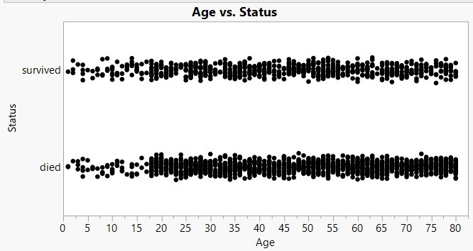
I mostly use logistic regression for binary reponse data. Here's an example using the classic Titanic survival data. The response variable is "Status", taking on the values survived or died. Using graph builder, I can make the plot that I believe Dale refered to in his last post, but without the logistic regression curve:
This has jitter, which is vital, but it is jitter that is constrained in a way that it is clear which data points belong to "survived" and which to "died".
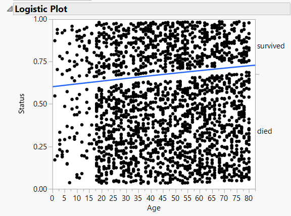
Here is the plot I get when I run the logistic regression model:
Now the vertical location of each point appears to be completely random, and thus it imparts no information. Am I missing something regarding what the vertical local means? I understand the value of jitter, but this looks like it's so much jitter that one can no longer discern which data points belong to which category of the response.
Is there a way (via the GUI) to combine these kinds of plots, so that we have the plot Graph Builder creates, with the logistic curve superimposed?
Thanks,
Ben
- Mark as New
- Bookmark
- Subscribe
- Mute
- Subscribe to RSS Feed
- Get Direct Link
- Report Inappropriate Content
Re: Logistic Plot interpretation of points
Try coloring by Status to see if that helps the interpretation of the mosaic plot in Logistic.
- Mark as New
- Bookmark
- Subscribe
- Mute
- Subscribe to RSS Feed
- Get Direct Link
- Report Inappropriate Content
Re: Logistic Plot interpretation of points
Recommended Articles
- © 2026 JMP Statistical Discovery LLC. All Rights Reserved.
- Terms of Use
- Privacy Statement
- Contact Us


