- New to JMP? Let the Data Analysis Director guide you through selecting an analysis task, an analysis goal, and a data type. Available now in the JMP Marketplace!
- See how to install JMP Marketplace extensions to customize and enhance JMP.
- Subscribe to RSS Feed
- Mark Topic as New
- Mark Topic as Read
- Float this Topic for Current User
- Bookmark
- Subscribe
- Mute
- Printer Friendly Page
Discussions
Solve problems, and share tips and tricks with other JMP users.- JMP User Community
- :
- Discussions
- :
- Re: Line graph Y axis is wrong
- Mark as New
- Bookmark
- Subscribe
- Mute
- Subscribe to RSS Feed
- Get Direct Link
- Report Inappropriate Content
Line graph Y axis is wrong
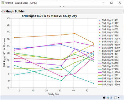
I'm trying to create a simple line graph and the y-axis is wrong. I've tried manually changing the y axis to span from -5 to 45 but it compresses the data within the lower portion of the screen. Please help.
| Study Day | SNR Right 1401 | SNR Right 1977 | SNR Right 2834 | SNR Right 4002 | SNR Right 5636 | SNR Right 7988 | SNR Right 11288 | SNR Right 12721 | SNR Right 14589 | SNR Right 16769 | SNR Right 19260 |
| -4 | 23 | 16 | 20 | 14 | 31 | 11 | 22 | 19 | 4 | 19 | 9 |
| 31 | 26 | 15 | 15 | 11 | 33 | 0 | 27 | 15 | 10 | 3 | 8 |
| 41 | 23 | 16 | 19 | 23 | 34 | 10 | 28 | 20 | 3 | 5 | 13 |
| 55 | 19 | 21 | 14 | 15 | 27 | 20 | 25 | 26 | -2 | 17 | 18 |
Accepted Solutions
- Mark as New
- Bookmark
- Subscribe
- Mute
- Subscribe to RSS Feed
- Get Direct Link
- Report Inappropriate Content
Re: Line graph Y axis is wrong
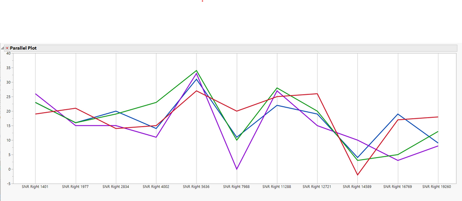
Using your provided data table, and
Graph=>Parallel Plot
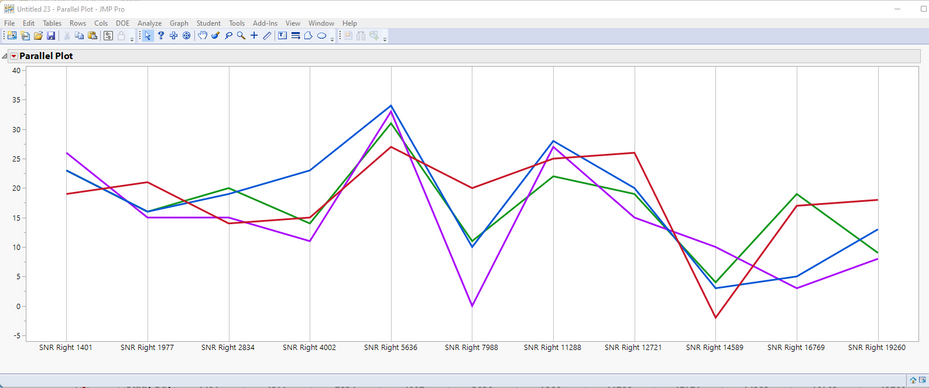
I get the following graph, which allows for the changing of the Y axis. Also, I have specified to Scale Uniformly
Here is the script
Parallel Plot(
	Scale Uniformly( 1 ),
	Center at zero( 0 ),
	Y(
		:SNR Right 1401, :SNR Right 1977, :SNR Right 2834, :SNR Right 4002,
		:SNR Right 5636, :SNR Right 7988, :SNR Right 11288, :SNR Right 12721,
		:SNR Right 14589, :SNR Right 16769, :SNR Right 19260
	),
	SendToReport(
		Dispatch(
			{},
			"1",
			ScaleBox,
			{Min( 0 ), Max( 11 ), Inc( 0.5 ), Minor Ticks( 0 )}
		),
		Dispatch(
			{},
			"2",
			ScaleBox,
			{Min( -6.01186672653397 ), Max( 40.6968191294088 ), Inc( 5 ),
			Minor Ticks( 1 )}
		),
		Dispatch(
			{},
			"Parallel Coord",
			FrameBox,
			{Frame Size( 1525, 470 ), Marker Size( 4 ),
			Marker Drawing Mode( "Normal" ),
			DispatchSeg( PolylineSeg( 1 ), {Line Width( 3 )} )}
		)
	)
)
.
- Mark as New
- Bookmark
- Subscribe
- Mute
- Subscribe to RSS Feed
- Get Direct Link
- Report Inappropriate Content
Re: Line graph Y axis is wrong
Is this the graph????
- Mark as New
- Bookmark
- Subscribe
- Mute
- Subscribe to RSS Feed
- Get Direct Link
- Report Inappropriate Content
Re: Line graph Y axis is wrong
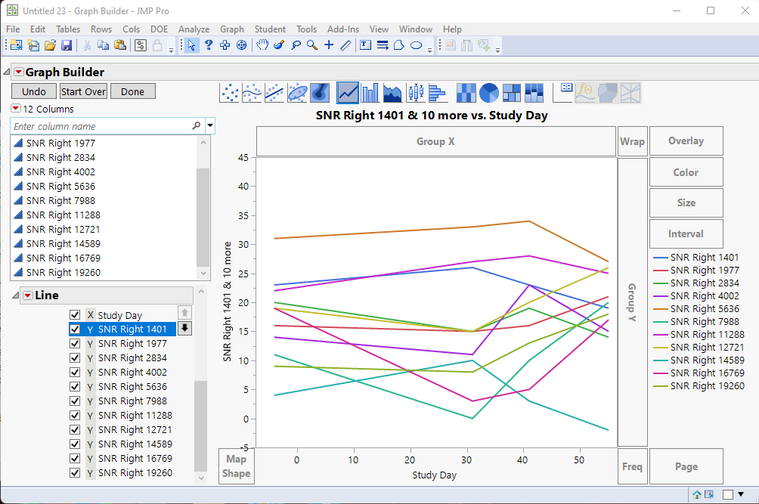
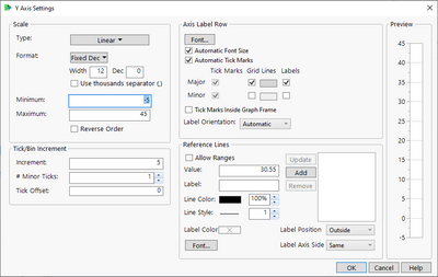
Can you post a picture of how the graph is incorrect? If you double-click on the Y axis you can set the min, max and increment.
I was able to reproduce Jim's version of the graph very easily.
Here's the JSL code:
Graph Builder(
	Size( 525, 454 ),
	Show Control Panel( 0 ),
	Variables(
		X( :Study Day ),
		Y( :SNR Right 1401 ),
		Y( :SNR Right 1977, Position( 1 ) ),
		Y( :SNR Right 2834, Position( 1 ) ),
		Y( :SNR Right 4002, Position( 1 ) ),
		Y( :SNR Right 5636, Position( 1 ) ),
		Y( :SNR Right 7988, Position( 1 ) ),
		Y( :SNR Right 11288, Position( 1 ) ),
		Y( :SNR Right 12721, Position( 1 ) ),
		Y( :SNR Right 14589, Position( 1 ) ),
		Y( :SNR Right 16769, Position( 1 ) ),
		Y( :SNR Right 19260, Position( 1 ) )
	),
	Elements(
		Points(
			X,
			Y( 1 ),
			Y( 2 ),
			Y( 3 ),
			Y( 4 ),
			Y( 5 ),
			Y( 6 ),
			Y( 7 ),
			Y( 8 ),
			Y( 9 ),
			Y( 10 ),
			Y( 11 ),
			Legend( 5 )
		),
		Line(
			X,
			Y( 1 ),
			Y( 2 ),
			Y( 3 ),
			Y( 4 ),
			Y( 5 ),
			Y( 6 ),
			Y( 7 ),
			Y( 8 ),
			Y( 9 ),
			Y( 10 ),
			Y( 11 ),
			Legend( 7 )
		)
	),
	SendToReport(
		Dispatch( {}, "Study Day", ScaleBox, {Label Row( Show Major Grid( 1 ) )} ),
		Dispatch(
			{},
			"SNR Right 1401",
			ScaleBox,
			{Min( -5 ), Max( 45 ), Inc( 5 ), Minor Ticks( 1 ),
			Label Row( Show Major Grid( 1 ) )}
		),
		Dispatch(
			{},
			"400",
			ScaleBox,
			{Legend Model(
				5,
				Base( 0, 0, 0, Item ID( "SNR Right 1401", 1 ) ),
				Base( 1, 0, 0, Item ID( "SNR Right 1977", 1 ) ),
				Base( 2, 0, 0, Item ID( "SNR Right 2834", 1 ) ),
				Base( 3, 0, 0, Item ID( "SNR Right 4002", 1 ) ),
				Base( 4, 0, 0, Item ID( "SNR Right 5636", 1 ) ),
				Base( 5, 0, 0, Item ID( "SNR Right 7988", 1 ) ),
				Base( 6, 0, 0, Item ID( "SNR Right 11288", 1 ) ),
				Base( 7, 0, 0, Item ID( "SNR Right 12721", 1 ) ),
				Base( 8, 0, 0, Item ID( "SNR Right 14589", 1 ) ),
				Base( 9, 0, 0, Item ID( "SNR Right 16769", 1 ) ),
				Base( 10, 0, 0, Item ID( "SNR Right 19260", 1 ) )
			)}
		)
	)
)- Mark as New
- Bookmark
- Subscribe
- Mute
- Subscribe to RSS Feed
- Get Direct Link
- Report Inappropriate Content
Re: Line graph Y axis is wrong
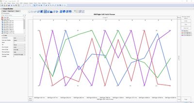
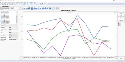
Thank you for trying to assist me. I'm graphing raw data. The top is what I'm seeing and the bottom is what I need (and what JMP is producing from the same data type). The SNR frequency data should be on the X-axis and timepoints across. The data is from a single individual. I tried to change the Y axis limits but it only compresses the data.
- Mark as New
- Bookmark
- Subscribe
- Mute
- Subscribe to RSS Feed
- Get Direct Link
- Report Inappropriate Content
Re: Line graph Y axis is wrong
Using your provided data table, and
Graph=>Parallel Plot
I get the following graph, which allows for the changing of the Y axis. Also, I have specified to Scale Uniformly
Here is the script
Parallel Plot(
	Scale Uniformly( 1 ),
	Center at zero( 0 ),
	Y(
		:SNR Right 1401, :SNR Right 1977, :SNR Right 2834, :SNR Right 4002,
		:SNR Right 5636, :SNR Right 7988, :SNR Right 11288, :SNR Right 12721,
		:SNR Right 14589, :SNR Right 16769, :SNR Right 19260
	),
	SendToReport(
		Dispatch(
			{},
			"1",
			ScaleBox,
			{Min( 0 ), Max( 11 ), Inc( 0.5 ), Minor Ticks( 0 )}
		),
		Dispatch(
			{},
			"2",
			ScaleBox,
			{Min( -6.01186672653397 ), Max( 40.6968191294088 ), Inc( 5 ),
			Minor Ticks( 1 )}
		),
		Dispatch(
			{},
			"Parallel Coord",
			FrameBox,
			{Frame Size( 1525, 470 ), Marker Size( 4 ),
			Marker Drawing Mode( "Normal" ),
			DispatchSeg( PolylineSeg( 1 ), {Line Width( 3 )} )}
		)
	)
)
.
- Mark as New
- Bookmark
- Subscribe
- Mute
- Subscribe to RSS Feed
- Get Direct Link
- Report Inappropriate Content
Re: Line graph Y axis is wrong
Hi Jim,
That is correct but I don't know how to replicate what you did to generate the plot.
- Mark as New
- Bookmark
- Subscribe
- Mute
- Subscribe to RSS Feed
- Get Direct Link
- Report Inappropriate Content
Re: Line graph Y axis is wrong
I started with your data table
I then when to
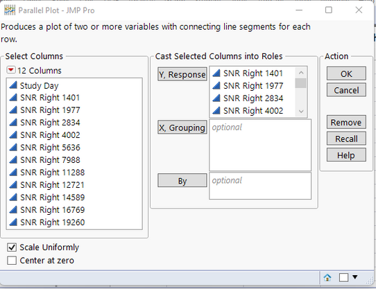
Graph=>Parallel Plot
I selected all of the SNR columns as the Y, Response columns and then selected Scale Uniformly
Then the remainder is just changing the line color and thickness, and adjusting the X and Y axes
To change the line colors, click directly on one of the lines. Then right click and select Row Colors and choose the color for the line. Repeat for each line
To change the line width, right click on the graph and select Customize
Select Polyline, and change the line width
Not all SNR values are being displayed. To change the X axis, right click on the axes and select Axis Settings
Change the Tick/Bin Increment to .5
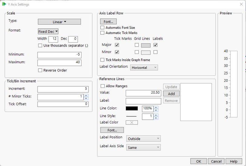
Lastly, the Y axis settings can be changed using the same method as the X axis. Right click on the axis, and select Axis Settings.
Change the Minimum and Maximum values to -5 and 40.
Change the Tick/Bin Increment to 5
Which ends up giving the following graph
- Mark as New
- Bookmark
- Subscribe
- Mute
- Subscribe to RSS Feed
- Get Direct Link
- Report Inappropriate Content
Re: Line graph Y axis is wrong
This was an amazing help! I just completed the graphs! Thank you so very much! I cannot tell you how much I appreciate your help.
Recommended Articles
- © 2026 JMP Statistical Discovery LLC. All Rights Reserved.
- Terms of Use
- Privacy Statement
- Contact Us

