- New to JMP? Let the Data Analysis Director guide you through selecting an analysis task, an analysis goal, and a data type. Available now in the JMP Marketplace!
- See how to install JMP Marketplace extensions to customize and enhance JMP.
- Subscribe to RSS Feed
- Mark Topic as New
- Mark Topic as Read
- Float this Topic for Current User
- Bookmark
- Subscribe
- Mute
- Printer Friendly Page
Discussions
Solve problems, and share tips and tricks with other JMP users.- JMP User Community
- :
- Discussions
- :
- Re: [JSL] add reference lines in graph builder with formula
- Mark as New
- Bookmark
- Subscribe
- Mute
- Subscribe to RSS Feed
- Get Direct Link
- Report Inappropriate Content
[JSL] add reference lines in graph builder with formula
Hi,
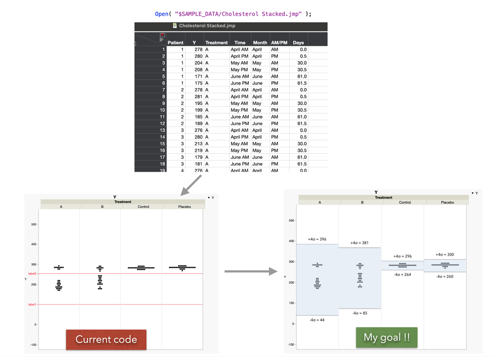
I am fairly new to JMP and I would like to be able to add variable references lines based on formula in the graph builder.
When I plot the Y with several X (groups), I would like to generate for each X in graph builder:
- 2 lines with the formula (Mean-4*Std ; Mean+4*Std)
- Fill the range with a color
- Label with the value on each line
I tried to add these lines in JSL but without success.
The following code works for a constant (200), and a simple variable (Column Mean (Y)) but I fail at adding more complexity (calculating the right value for each X group, fill the blank between the 2 lines, add label for the line)
I took a JMP data sample to show a quick example of my goal below (.PNG attached).
Thanks a lot for your help
Open( "$SAMPLE_DATA/Cholesterol Stacked.jmp" );
temp = Graph Builder(
	Size( 715, 637 ),
	Variables( Y( :Y ), Group X( :Treatment ) ),
	Elements( Points( Y, Legend( 5 ) ) ),
	SendToReport(
		Dispatch(
			{},
			"Y",
			ScaleBox,
			{Min( -123.790318945935 ), Max( 574.600650636745 ), Inc( 100 ),
			Minor Ticks( 1 )}
		)
	)
);


DataMean = 100;   /* that code works with a constant*/
DataMean2 = Col Mean( :Y ); /* that code works with a simple variable */
report(temp)[axisbox(2)] << Add Ref Line( DataMean, "solid", red, "label1", 1 );
report(temp)[axisbox(2)] << Add Ref Line( DataMean2, "solid", red, "label2", 1 );
Accepted Solutions
- Mark as New
- Bookmark
- Subscribe
- Mute
- Subscribe to RSS Feed
- Get Direct Link
- Report Inappropriate Content
Re: [JSL] add reference lines in graph builder with formula
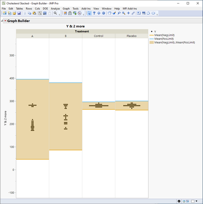
To calculate mean for each of the groups, you can create new column to your table using Col Mean with ByVar, other option is to use Summarize function (or create summary table).
Generally I would first trying to build something like this by creating new columns and using multiple plot types overlaid. New columns for lines and adding line chart. Getting to this point is easy
Names Default To Here(1);

dt = Open("$SAMPLE_DATA/Cholesterol Stacked.jmp");

dt << New Column("NegLimit", Numeric, Continuous, Formula(
	Col Mean(:Y, :Treatment) - 4 * Col Std Dev(:Y, :Treatment)
));

dt << New Column("PosLimit", Numeric, Continuous, Formula(
	Col Mean(:Y, :Treatment) + 4 * Col Std Dev(:Y, :Treatment)
));


gb = dt << Graph Builder(
	Size(673, 592),
	Show Control Panel(0),
	Variables(
		Y(:Y),
		Y(:NegLimit, Position(1)),
		Y(:PosLimit, Position(1)),
		Group X(:Treatment)
	),
	Elements(
		Points(Y(1), Legend(5)),
		Line(Y(2), Y(3), Legend(7), Fill("Fill Between"))
	),
	SendToReport(
		Dispatch(
			{},
			"Y",
			ScaleBox,
			{Min(-123.790318945935), Max(574.600650636745), Inc(100), Minor Ticks(1)
			}
		)
	)
);
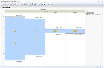
Then you start working on labels and it can quickly get very messy (labelling definitely isn't strong part of graph builder).
These could of course be built using graphic scripts, but how that should be scripted is 100% dependent on your data and your visualization (there is usually quite a lot to take into account).
Edit:
One option on how far you can get with new columns, new rows and graph builder
Names Default To Here(1);

dt = Open("$SAMPLE_DATA/Cholesterol Stacked.jmp");

dt << New Column("NegLimit", Numeric, Continuous, Formula(
	Col Mean(:Y, :Treatment) - 4 * Col Std Dev(:Y, :Treatment)
));

dt << New Column("PosLimit", Numeric, Continuous, Formula(
	Col Mean(:Y, :Treatment) + 4 * Col Std Dev(:Y, :Treatment)
));

dt << New Column("MarkerVal", Numeric, Continuous, Formula(
	If(!IsMissing(Days),
		.
	, Row() == Col Min(Row(), :Treatment, :Days),
		:NegLimit - 10
	,
		:PosLimit + 10

	)
));

dt << New Column("MarkerLabel", Character, Continuous, Label(1), Formula(
	If(!IsMissing(Days),
		.
	, Row() == Col Min(Row(), :Treatment, :Days),
		"-4Sigma " || Char(Round(:NegLimit, 2))
	,
		"+4Sigma " || Char(Round(:PosLimit, 2))
	)
));

Summarize(dt, uniq_treatments = by(:Treatment));
rows_added = 0;
For Each({cur_treatment}, uniq_treatments,
	dt << Add Rows({Treatment = cur_treatment});
	dt << Add Rows({Treatment = cur_treatment});
	rows_added = rows_added + 2;
);
dt << Select Rows((N Rows(dt) - rows_added + 1)::N Rows(dt)) << Label(1) << Clear Select;

gb = dt << Graph Builder(
	Size(1126, 772),
	Show Control Panel(0),
	Variables(
		Y(:Y, Combine("Merged")),
		Y(:NegLimit, Position(1), Combine("Merged")),
		Y(:PosLimit, Position(1), Combine("Merged")),
		Y(:MarkerVal, Position(1), Combine("Merged")),
		Group X(:Treatment)
	),
	Elements(
		Line(
			Y(2),
			Y(3),
			Legend(7),
			Fill("Fill Between"),
			Missing Factors("Treat as Missing"),
			Missing Values("Connect Faded")
		),
		Points(Y(1), Legend(5)),
		Points(Y(4), Legend(11))
	),
	SendToReport(
		Dispatch(
			{},
			"400",
			ScaleBox,
			{Legend Model(
				7,
				Properties(0, {Line Color(16)}, Item ID("Mean(NegLimit)", 1)),
				Properties(1, {Line Color(16)}, Item ID("Mean(PosLimit)", 1)),
				Properties(
					2,
					{Fill Color(37)},
					Item ID("Mean(NegLimit)..Mean(PosLimit)", 1)
				)
			), Legend Model(
				11,
				Properties(
					0,
					{Line Color(0), Marker(" "), Marker Size(0)},
					Item ID("MarkerVal", 1)
				)
			)}
		),
		Dispatch(
			{},
			"400",
			LegendBox,
			{Legend Position({7, [1, 2, 3], 5, [0], 11, [4]})}
		)
	)
);
- Mark as New
- Bookmark
- Subscribe
- Mute
- Subscribe to RSS Feed
- Get Direct Link
- Report Inappropriate Content
Re: [JSL] add reference lines in graph builder with formula
Hello Jarmo,
That works great, thanks a lot for your help!!!
Julien
Recommended Articles
- © 2026 JMP Statistical Discovery LLC. All Rights Reserved.
- Terms of Use
- Privacy Statement
- Contact Us


