- Don’t miss your chance to experience Discovery Summit Europe at our best available rate! Early bird registration through 31 Oct.
- Graph Builder Toolbar streamlines interactive graphing. Creates shortcuts on Report and GraphBuilder Helpers toolbars. Download and install the extension.
- Subscribe to RSS Feed
- Mark Topic as New
- Mark Topic as Read
- Float this Topic for Current User
- Bookmark
- Subscribe
- Mute
- Printer Friendly Page
Discussions
Solve problems, and share tips and tricks with other JMP users.- User Community
- :
- Discussions
- :
- Re: Is it Possible to Create a Scatter Plot with Pairs of Points Connected in Gr...

- Mark as New
- Bookmark
- Subscribe
- Mute
- Subscribe to RSS Feed
- Get Direct Link
- Report Inappropriate Content
Is it Possible to Create a Scatter Plot with Pairs of Points Connected in GraphBuilder?
Hi,
I would like to create a large number (~100) of partially connected scatter plots similar to the mock example below:
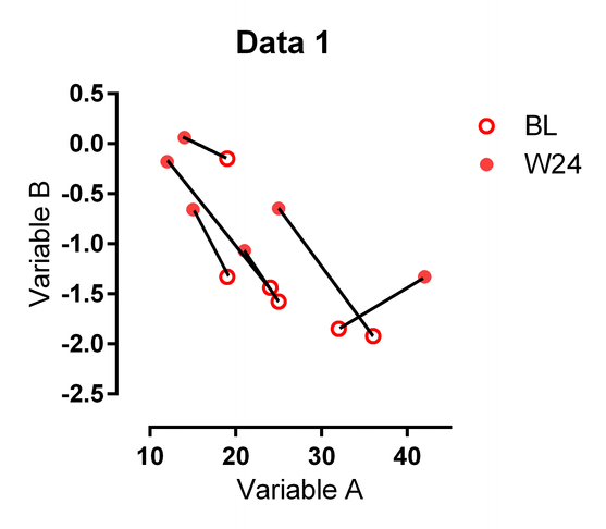
Each connecting line connects the Baseline (BL) point to the Week 24 (W24) point for a patient.
The data would be in the folling format
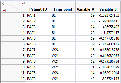
Let me know if you have any ideas: I certainly don't want to draw each connecting line by hand like I did on the mock satter plot above.
Thank you for your help.
Accepted Solutions


- Mark as New
- Bookmark
- Subscribe
- Mute
- Subscribe to RSS Feed
- Get Direct Link
- Report Inappropriate Content
Re: Is it Possible to Create a Scatter Plot with Pairs of Points Connected in GraphBuilder?
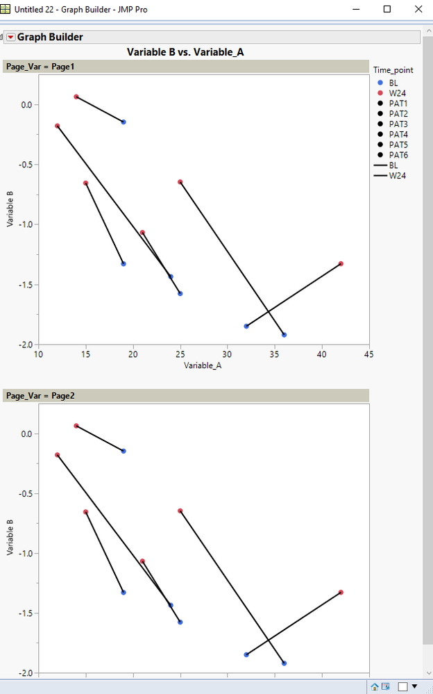
Here is an attempt at what you want. It is pretty close to what you are requesting. I added a column to your data table which is being used as a Page separator, which I am imagining will be your 1-100 graphs. Here is the output, followed by the script that generates the sample data table and the graphic output:
Names Default to here(1);
dt = New Table( "Sample",
	Add Rows( 24 ),
	New Column( "Patient_ID",
		Character,
		"Nominal",
		Set Values(
			{"PAT1", "PAT2", "PAT3", "PAT4", "PAT5", "PAT6", "PAT1", "PAT2", "PAT3",
			"PAT4", "PAT5", "PAT6", "PAT1", "PAT2", "PAT3", "PAT4", "PAT5", "PAT6",
			"PAT1", "PAT2", "PAT3", "PAT4", "PAT5", "PAT6"}
		)
	),
	New Column( "Time_point",
		Character,
		"Nominal",
		Set Selected,
		Set Values(
			{"BL", "BL", "BL", "BL", "BL", "BL", "W24", "W24", "W24", "W24", "W24",
			"W24", "BL", "BL", "BL", "BL", "BL", "BL", "W24", "W24", "W24", "W24",
			"W24", "W24"}
		)
	),
	New Column( "Variable_A",
		Numeric,
		"Continuous",
		Format( "Best", 12 ),
		Set Values(
			[19, 36, 24, 25, 19, 32, 15, 25, 12, 21, 14, 42, 19, 36, 24, 25, 19, 32,
			15, 25, 12, 21, 14, 42]
		)
	),
	New Column( "Variable B",
		Numeric,
		"Continuous",
		Format( "Best", 12 ),
		Set Values(
			[-1.3287, -1.9208, -1.436, -1.577, -0.1477, -1.849, -0.65601, -0.64708,
			-0.17958, -1.06807, 0.06291, -1.328, -1.3287, -1.9208, -1.436, -1.577,
			-0.1477, -1.849, -0.65601, -0.64708, -0.17958, -1.06807, 0.06291, -1.328
			]
		)
	),
	New Column( "Page_Var",
		Character,
		"Nominal",
		Set Values(
			{"Page1", "Page1", "Page1", "Page1", "Page1", "Page1", "Page1", "Page1",
			"Page1", "Page1", "Page1", "Page1", "Page2", "Page2", "Page2", "Page2",
			"Page2", "Page2", "Page2", "Page2", "Page2", "Page2", "Page2", "Page2"}
		)
	)
);

dt << Graph Builder(
	Size( 534, 954 ),
	Show Control Panel( 0 ),
	Variables(
		X( :Variable_A ),
		Y( :Variable B ),
		Page( :Page_Var ),
		Overlay( :Patient_ID ),
		Color( :Time_point )
	),
	Elements( Points( X, Y, Legend( 3 ) ), Line( X, Y, Legend( 5 ) ) ),
	SendToReport(
		Dispatch(
			{},
			"400",
			ScaleBox,
			{Legend Model(
				3,
				Properties( 0, {Marker( "FilledCircle" )} ),
				Properties( 1, {Marker( "FilledCircle" )} ),
				Properties( 2, {Marker( "FilledCircle" )} ),
				Properties( 3, {Marker( "FilledCircle" )} ),
				Properties( 4, {Marker( "FilledCircle" )} ),
				Properties( 5, {Marker( "FilledCircle" )} ),
				Properties( 6, {Marker( "FilledCircle" )} ),
				Properties( 7, {Marker( "FilledCircle" )} )
			), Legend Model(
				5,
				Properties( 0, {Line Color( 0 )} ),
				Properties( 1, {Line Color( 0 )} )
			)}
		),
 Dispatch( {}, "Graph Builder", FrameBox, {Marker Size( 5 )} ),
 Dispatch( {}, "Graph Builder", FrameBox( 2 ), {Marker Size( 5 )} )
	)
);- Mark as New
- Bookmark
- Subscribe
- Mute
- Subscribe to RSS Feed
- Get Direct Link
- Report Inappropriate Content
Re: Is it Possible to Create a Scatter Plot with Pairs of Points Connected in GraphBuilder?
Here is an attempt at what you want. It is pretty close to what you are requesting. I added a column to your data table which is being used as a Page separator, which I am imagining will be your 1-100 graphs. Here is the output, followed by the script that generates the sample data table and the graphic output:
Names Default to here(1);
dt = New Table( "Sample",
	Add Rows( 24 ),
	New Column( "Patient_ID",
		Character,
		"Nominal",
		Set Values(
			{"PAT1", "PAT2", "PAT3", "PAT4", "PAT5", "PAT6", "PAT1", "PAT2", "PAT3",
			"PAT4", "PAT5", "PAT6", "PAT1", "PAT2", "PAT3", "PAT4", "PAT5", "PAT6",
			"PAT1", "PAT2", "PAT3", "PAT4", "PAT5", "PAT6"}
		)
	),
	New Column( "Time_point",
		Character,
		"Nominal",
		Set Selected,
		Set Values(
			{"BL", "BL", "BL", "BL", "BL", "BL", "W24", "W24", "W24", "W24", "W24",
			"W24", "BL", "BL", "BL", "BL", "BL", "BL", "W24", "W24", "W24", "W24",
			"W24", "W24"}
		)
	),
	New Column( "Variable_A",
		Numeric,
		"Continuous",
		Format( "Best", 12 ),
		Set Values(
			[19, 36, 24, 25, 19, 32, 15, 25, 12, 21, 14, 42, 19, 36, 24, 25, 19, 32,
			15, 25, 12, 21, 14, 42]
		)
	),
	New Column( "Variable B",
		Numeric,
		"Continuous",
		Format( "Best", 12 ),
		Set Values(
			[-1.3287, -1.9208, -1.436, -1.577, -0.1477, -1.849, -0.65601, -0.64708,
			-0.17958, -1.06807, 0.06291, -1.328, -1.3287, -1.9208, -1.436, -1.577,
			-0.1477, -1.849, -0.65601, -0.64708, -0.17958, -1.06807, 0.06291, -1.328
			]
		)
	),
	New Column( "Page_Var",
		Character,
		"Nominal",
		Set Values(
			{"Page1", "Page1", "Page1", "Page1", "Page1", "Page1", "Page1", "Page1",
			"Page1", "Page1", "Page1", "Page1", "Page2", "Page2", "Page2", "Page2",
			"Page2", "Page2", "Page2", "Page2", "Page2", "Page2", "Page2", "Page2"}
		)
	)
);

dt << Graph Builder(
	Size( 534, 954 ),
	Show Control Panel( 0 ),
	Variables(
		X( :Variable_A ),
		Y( :Variable B ),
		Page( :Page_Var ),
		Overlay( :Patient_ID ),
		Color( :Time_point )
	),
	Elements( Points( X, Y, Legend( 3 ) ), Line( X, Y, Legend( 5 ) ) ),
	SendToReport(
		Dispatch(
			{},
			"400",
			ScaleBox,
			{Legend Model(
				3,
				Properties( 0, {Marker( "FilledCircle" )} ),
				Properties( 1, {Marker( "FilledCircle" )} ),
				Properties( 2, {Marker( "FilledCircle" )} ),
				Properties( 3, {Marker( "FilledCircle" )} ),
				Properties( 4, {Marker( "FilledCircle" )} ),
				Properties( 5, {Marker( "FilledCircle" )} ),
				Properties( 6, {Marker( "FilledCircle" )} ),
				Properties( 7, {Marker( "FilledCircle" )} )
			), Legend Model(
				5,
				Properties( 0, {Line Color( 0 )} ),
				Properties( 1, {Line Color( 0 )} )
			)}
		),
 Dispatch( {}, "Graph Builder", FrameBox, {Marker Size( 5 )} ),
 Dispatch( {}, "Graph Builder", FrameBox( 2 ), {Marker Size( 5 )} )
	)
);Recommended Articles
- © 2026 JMP Statistical Discovery LLC. All Rights Reserved.
- Terms of Use
- Privacy Statement
- Contact Us