- Instantly extract effect sizes, F-ratios, and FDR-adjusted p-values from your models with the Calculate Effects Sizes extension, available now in the JMP Marketplace!
- New to JMP? Join us Sept. 23-24 for the Early User Edition of Discovery Summit, tailor-made for new users. Register now for free!
- Your voice matters! Tell us how you prefer to receive JMP updates, so we can tailor our communication to your needs. Take short survey.
- Subscribe to RSS Feed
- Mark Topic as New
- Mark Topic as Read
- Float this Topic for Current User
- Bookmark
- Subscribe
- Mute
- Printer Friendly Page
Discussions
Solve problems, and share tips and tricks with other JMP users.- JMP User Community
- :
- Discussions
- :
- Re: Interpretation of Normal Quantile Plot done as part of a regression

- Mark as New
- Bookmark
- Subscribe
- Mute
- Subscribe to RSS Feed
- Get Direct Link
- Report Inappropriate Content
Interpretation of Normal Quantile Plot done as part of a regression
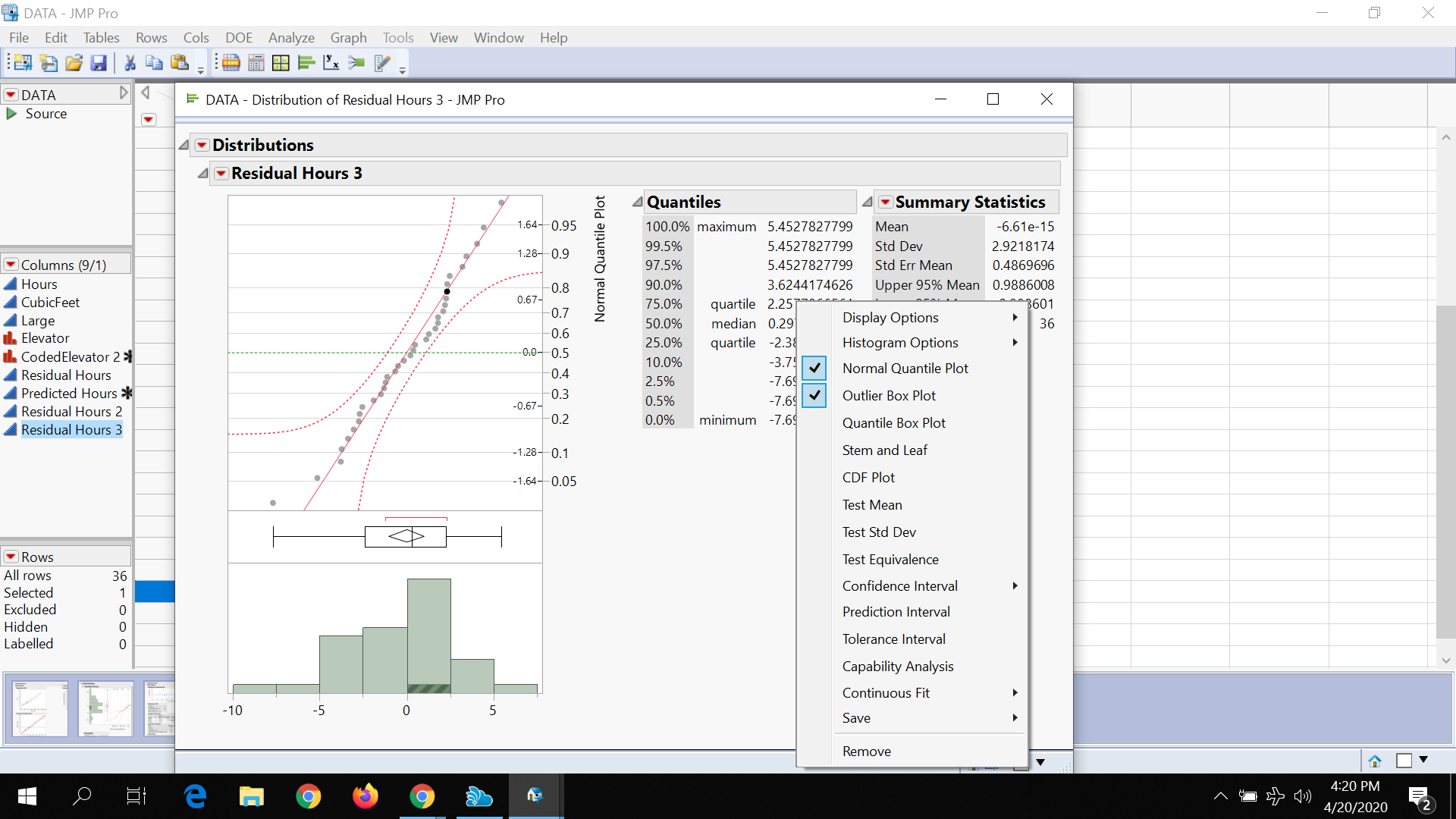
This plot was produced.
What is the fact that one point is black (not gray) telling me?
What is the shading at the bottom of one histogram bar telling me?
No scripting involved.
Accepted Solutions

- Mark as New
- Bookmark
- Subscribe
- Mute
- Subscribe to RSS Feed
- Get Direct Link
- Report Inappropriate Content
Re: Interpretation of Normal Quantile Plot done as part of a regression
What you are seeing is one of the backbone elements of JMP. Interactive data exploration involves the ability to see patterns within data. Therefore JMP allows for the interactive selection of data points in graphs or rows within a data table. The selected rows in a data table by default appear highlighted in graphs, and if one selects data point(s) in a graph, in turn the rows those points come from are selected in the data table.
So the issue is, you have selected rows in the data table your histogram was built from and the data values in the graph are highlighted
- Mark as New
- Bookmark
- Subscribe
- Mute
- Subscribe to RSS Feed
- Get Direct Link
- Report Inappropriate Content
Re: Interpretation of Normal Quantile Plot done as part of a regression
that I had done so.
Recommended Articles
- © 2026 JMP Statistical Discovery LLC. All Rights Reserved.
- Terms of Use
- Privacy Statement
- Contact Us