- New to JMP? Let the Data Analysis Director guide you through selecting an analysis task, an analysis goal, and a data type. Available now in the JMP Marketplace!
- See how to install JMP Marketplace extensions to customize and enhance JMP.
- Subscribe to RSS Feed
- Mark Topic as New
- Mark Topic as Read
- Float this Topic for Current User
- Bookmark
- Subscribe
- Mute
- Printer Friendly Page
Discussions
Solve problems, and share tips and tricks with other JMP users.- JMP User Community
- :
- Discussions
- :
- Re: How to visualize new vectors in a PCA biplot
- Mark as New
- Bookmark
- Subscribe
- Mute
- Subscribe to RSS Feed
- Get Direct Link
- Report Inappropriate Content
How to visualize new vectors in a PCA biplot
I created a PCA model to reduce 3 dimensions (3 numerical attributes describing the object set) to 2 for the express purpose of visualization. The model was created from the set of objects assumed to cover the feature space of interest.
Is it possible to project new cases onto the original biplot so that their placement relative to the original set is seen? I would think this may be done since components and distances automatically get computed when new cases are entered.
I am interested in an interactive explanation.
Accepted Solutions
- Mark as New
- Bookmark
- Subscribe
- Mute
- Subscribe to RSS Feed
- Get Direct Link
- Report Inappropriate Content
Re: How to visualize new vectors in a PCA biplot
Hi @TCM , I first tried to work with Hide/Exclude, but didn't work, because excluded rows have not shown in the Biplot, too.
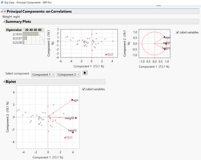
Then I introduced a new column "wght", that is the weight of the row for the PCA analysis. I added one row to the Big Class Datatable, gave it marker and color, and performed PCA Analysis. And this gave the plot you may want.
You can add as many rows you want, give it a wght=0, they will not contribute to the model. But they will be shown in the plot (give it another color/marker as well to be able to identify it). By performing the PCA analysis, you will get your new plot then.
See Screenshot and table for the example.
- Mark as New
- Bookmark
- Subscribe
- Mute
- Subscribe to RSS Feed
- Get Direct Link
- Report Inappropriate Content
Re: How to visualize new vectors in a PCA biplot
Brilliant! Thank you so much!
Recommended Articles
- © 2026 JMP Statistical Discovery LLC. All Rights Reserved.
- Terms of Use
- Privacy Statement
- Contact Us
