- New to JMP? Let the Data Analysis Director guide you through selecting an analysis task, an analysis goal, and a data type. Available now in the JMP Marketplace!
- See how to install JMP Marketplace extensions to customize and enhance JMP.
- Subscribe to RSS Feed
- Mark Topic as New
- Mark Topic as Read
- Float this Topic for Current User
- Bookmark
- Subscribe
- Mute
- Printer Friendly Page
Discussions
Solve problems, and share tips and tricks with other JMP users.- JMP User Community
- :
- Discussions
- :
- Re: How to update the x-axis to be zoomed in?
- Mark as New
- Bookmark
- Subscribe
- Mute
- Subscribe to RSS Feed
- Get Direct Link
- Report Inappropriate Content
How to update the x-axis to be zoomed in?
Hello,
I have this following script for the graph in which increment of x-axis is 10, but I want to update the x-axis so that increment from 0 to 10 is 1 and after that increment should be 10 for rest of the axis. Is there anyway to update this script to get that?
Graph Builder(
	Variables( X( :"Time (min)"n ), Y( :"A -024"n ) ),
	Elements( Points( X, Y, Legend( 7 ) ), Smoother( X, Y, Legend( 8 ) ) ),
	SendToReport(
		Dispatch(
			{},
			"Time (min)",
			ScaleBox,
			{Format( "Best", 12 ), Min( 0 ), Max( 80 ), Inc( 10 ),
			Minor Ticks( 1 )}
		)
	)
)Accepted Solutions
- Mark as New
- Bookmark
- Subscribe
- Mute
- Subscribe to RSS Feed
- Get Direct Link
- Report Inappropriate Content
Re: How to update the x-axis to be zoomed in?
Hi @billi ,
Sure, so in the example that I posted, I used the Big Class.jmp file, which you can find in the Help > Sample Index menu.
The first thing you'll want to do is change your preferences so the graph spacing is zero, not just unchecked (default).
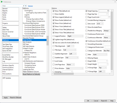
This time, I actually set the graph spacing to 0. Last time, I just unchecked the box in preferences (leaves vertical line as before), but if you actually set it to 0, then there is no vertical line separating the graphs. To get to preferences, go File > Preferences, Select Platforms and then scroll down to select Graph Builder:
Make sure the checkbox for Graph Spacing is marked, and then set the spacing to 0.
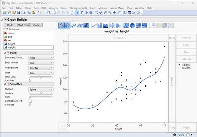
Go to Graph Builder, then you can click and drag your columns to the respective axes. Here it is with just one column for each axis:
If you click and drag your same column for the x-axis and then move it off to the right of the original axis, like so:
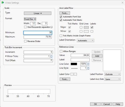
you'll get a graph with the same curve on two axes. Double click the left axis and you'll get the axis setting window, this is the default:
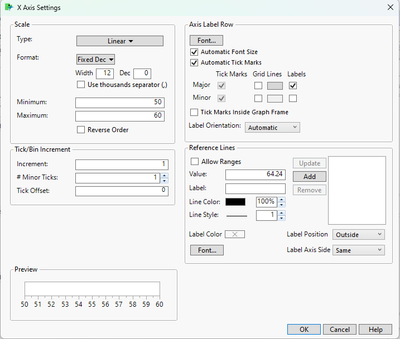
Chang ethe Maximum value for the x-axis to whatever your new x2 value is, in this case I'm choosing 60, and change the Increment value to whatever you want. In this case 1, then click OK:
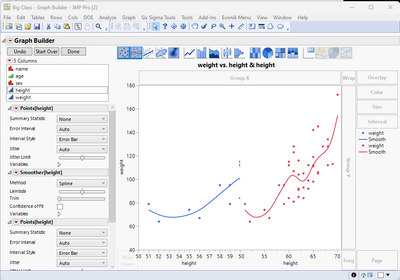
and your graph will now look like this:
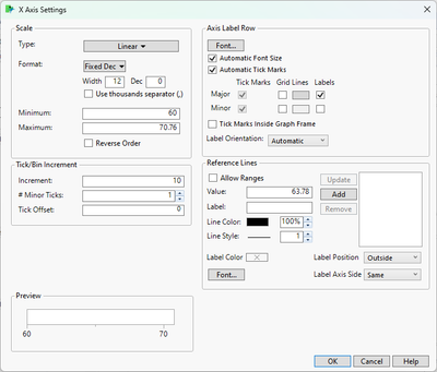
You'll do something similar for the right x-axis, but change the Minimum to the same value as what you had before for the maximum on the other axis, in this case 60. I'm leaving the max default to what it says, and changing the Increment to 10. Click OK.
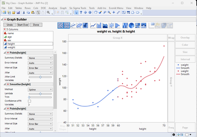
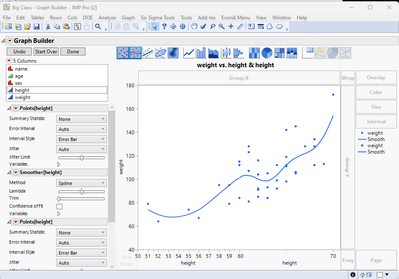
Your graph should now look like this:
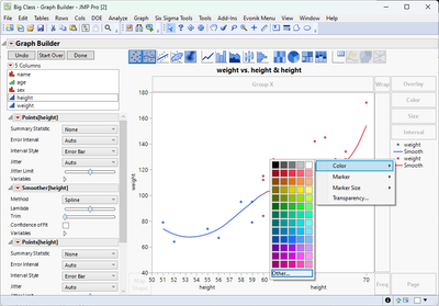
To change the color of the second graph, right click the marker icon (do the same for the line icon), and select the correct color so that it's the same as the left-hand graph:
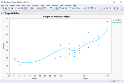
Your graph should now look like this:
Below is the JSL code saved to a scripting window that was used to generate the above graph
Graph Builder(
	Graph Spacing( 0 ),
	Variables( X( :height ), X( :height ), Y( :weight ) ),
	Elements(
		Position( 1, 1 ),
		Points( X, Y, Legend( 26 ) ),
		Smoother( X, Y, Legend( 27 ) )
	),
	Elements(
		Position( 2, 1 ),
		Points( X, Y, Legend( 28 ) ),
		Smoother( X, Y, Legend( 29 ) )
	),
	SendToReport(
		Dispatch(
			{},
			"height",
			ScaleBox,
			{Min( 50 ), Max( 60 ), Inc( 1 ), Minor Ticks( 1 )}
		),
		Dispatch(
			{},
			"height",
			ScaleBox( 2 ),
			{Min( 60 ), Max( 70.76 ), Inc( 10 ), Minor Ticks( 1 )}
		),
		Dispatch(
			{},
			"400",
			ScaleBox,
			{Legend Model(
				28,
				Properties( 0, {Line Color( 5 )}, Item ID( "weight", 1 ) )
			), Legend Model(
				29,
				Properties( 0, {Line Color( 5 )}, Item ID( "Smooth", 1 ) )
			)}
		)
	)
);
I hope this helps.
Good luck!,
DS
- Mark as New
- Bookmark
- Subscribe
- Mute
- Subscribe to RSS Feed
- Get Direct Link
- Report Inappropriate Content
Re: How to update the x-axis to be zoomed in?
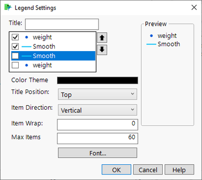
One very small thing you can add is to hide those "extra" legend items. Double click on legend and unselect them
Note depending on your data, be sure that it is obvious to the readers that the x-axis is changing as it can be very difficult to spot.
- Mark as New
- Bookmark
- Subscribe
- Mute
- Subscribe to RSS Feed
- Get Direct Link
- Report Inappropriate Content
Re: How to update the x-axis to be zoomed in?
Hi @billi ,
If I understand your request correctly, you'd like to have a single x-axis with two different increment values, right? Where a portion of the x-axis, say from x1 to x2 has an increment of 1 while from x2 to x3, the increment is 10?
If that's the case, I don't think there is a way that you can get JMP to use two different increment values for the same axis. You can however use Graph Builder and "trick" it into getting something similar to what you want, but with some less than ideal graphical quirks.
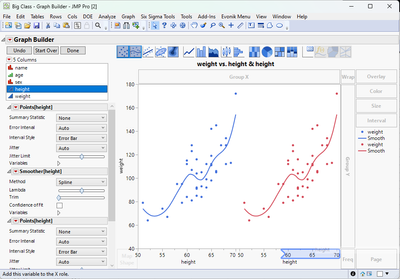
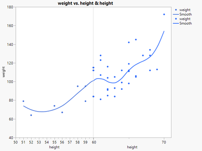
As an example, I'm using the Big Class.jmp file and graphing :weight vs :height, but I also use :height as a second x-axis. I graph the first x-axis from 50-60 and the second from 60-71 and set the increments to 1 and 10, respectively. You get a graph that looks like this:
So in a way it's possible to do that, but you'll have two x-axes and then the thin vertical line separating the two graphs (this is with graph spacing set to 0). It may not be exactly what you're looking for, but it's a solution that could work.
Hope this helps!,
DS
- Mark as New
- Bookmark
- Subscribe
- Mute
- Subscribe to RSS Feed
- Get Direct Link
- Report Inappropriate Content
Re: How to update the x-axis to be zoomed in?
@SDF1 Thank you very much, this solution will work. Could you please walk me through the steps to create graph you showed above or point me to any documentation that I can look up that would be very helpful?
- Mark as New
- Bookmark
- Subscribe
- Mute
- Subscribe to RSS Feed
- Get Direct Link
- Report Inappropriate Content
Re: How to update the x-axis to be zoomed in?
Hi @billi ,
Sure, so in the example that I posted, I used the Big Class.jmp file, which you can find in the Help > Sample Index menu.
The first thing you'll want to do is change your preferences so the graph spacing is zero, not just unchecked (default).
This time, I actually set the graph spacing to 0. Last time, I just unchecked the box in preferences (leaves vertical line as before), but if you actually set it to 0, then there is no vertical line separating the graphs. To get to preferences, go File > Preferences, Select Platforms and then scroll down to select Graph Builder:
Make sure the checkbox for Graph Spacing is marked, and then set the spacing to 0.
Go to Graph Builder, then you can click and drag your columns to the respective axes. Here it is with just one column for each axis:
If you click and drag your same column for the x-axis and then move it off to the right of the original axis, like so:
you'll get a graph with the same curve on two axes. Double click the left axis and you'll get the axis setting window, this is the default:
Chang ethe Maximum value for the x-axis to whatever your new x2 value is, in this case I'm choosing 60, and change the Increment value to whatever you want. In this case 1, then click OK:
and your graph will now look like this:
You'll do something similar for the right x-axis, but change the Minimum to the same value as what you had before for the maximum on the other axis, in this case 60. I'm leaving the max default to what it says, and changing the Increment to 10. Click OK.
Your graph should now look like this:
To change the color of the second graph, right click the marker icon (do the same for the line icon), and select the correct color so that it's the same as the left-hand graph:
Your graph should now look like this:
Below is the JSL code saved to a scripting window that was used to generate the above graph
Graph Builder(
	Graph Spacing( 0 ),
	Variables( X( :height ), X( :height ), Y( :weight ) ),
	Elements(
		Position( 1, 1 ),
		Points( X, Y, Legend( 26 ) ),
		Smoother( X, Y, Legend( 27 ) )
	),
	Elements(
		Position( 2, 1 ),
		Points( X, Y, Legend( 28 ) ),
		Smoother( X, Y, Legend( 29 ) )
	),
	SendToReport(
		Dispatch(
			{},
			"height",
			ScaleBox,
			{Min( 50 ), Max( 60 ), Inc( 1 ), Minor Ticks( 1 )}
		),
		Dispatch(
			{},
			"height",
			ScaleBox( 2 ),
			{Min( 60 ), Max( 70.76 ), Inc( 10 ), Minor Ticks( 1 )}
		),
		Dispatch(
			{},
			"400",
			ScaleBox,
			{Legend Model(
				28,
				Properties( 0, {Line Color( 5 )}, Item ID( "weight", 1 ) )
			), Legend Model(
				29,
				Properties( 0, {Line Color( 5 )}, Item ID( "Smooth", 1 ) )
			)}
		)
	)
);
I hope this helps.
Good luck!,
DS
- Mark as New
- Bookmark
- Subscribe
- Mute
- Subscribe to RSS Feed
- Get Direct Link
- Report Inappropriate Content
Re: How to update the x-axis to be zoomed in?
One very small thing you can add is to hide those "extra" legend items. Double click on legend and unselect them
Note depending on your data, be sure that it is obvious to the readers that the x-axis is changing as it can be very difficult to spot.
- Mark as New
- Bookmark
- Subscribe
- Mute
- Subscribe to RSS Feed
- Get Direct Link
- Report Inappropriate Content
Re: How to update the x-axis to be zoomed in?
Recommended Articles
- © 2026 JMP Statistical Discovery LLC. All Rights Reserved.
- Terms of Use
- Privacy Statement
- Contact Us

