- We’re retiring the File Exchange at the end of this year. The JMP Marketplace is now your destination for add-ins and extensions.
- JMP 19 is here! Learn more about the new features.
- Subscribe to RSS Feed
- Mark Topic as New
- Mark Topic as Read
- Float this Topic for Current User
- Bookmark
- Subscribe
- Mute
- Printer Friendly Page
Discussions
Solve problems, and share tips and tricks with other JMP users.- JMP User Community
- :
- Discussions
- :
- Re: How to show the value in a colour map shape graph
- Mark as New
- Bookmark
- Subscribe
- Mute
- Subscribe to RSS Feed
- Get Direct Link
- Report Inappropriate Content
How to show the value in a colour map shape graph
Dear all
I would like to show the values in a Map shape coloured graph. I try to label all rows and plot the desired column but my graph did not show the value in it. I can see the map shape graph (essentially is a rectangular graph 14 X10 ) but I do not manage to see the value for each box for this graph.
Can sombody help me please?
Thansk in advance
Kind regards
Accepted Solutions
- Mark as New
- Bookmark
- Subscribe
- Mute
- Subscribe to RSS Feed
- Get Direct Link
- Report Inappropriate Content
Re: How to show the value in a colour map shape graph
Dear Olivia
I manage to make it work, I used tabulate and statistical max and group by my first column. Thansk again for all you advices.
Kind regards
Marco
- Mark as New
- Bookmark
- Subscribe
- Mute
- Subscribe to RSS Feed
- Get Direct Link
- Report Inappropriate Content
Re: How to show the value in a colour map shape graph
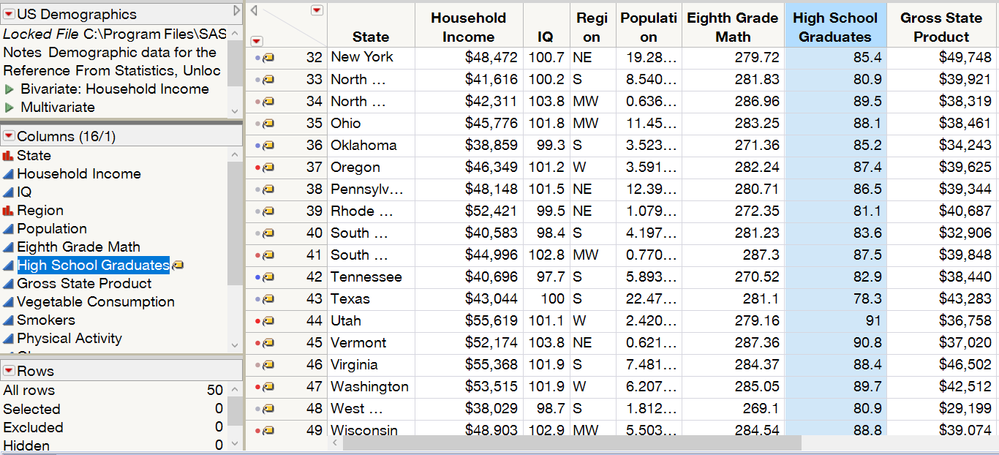
Do you have both the rows labeled as well as the column label turned on? You should see yellow label symbols as row states and next to the column with the values you wish to label in the left side columns panel. For example, I want to label all the US States by the percentage of high school graduates.
Steps:
-Rows menu>Row Selection>Select All Rows
-Once all the rows are selected, go to the Rows menu>Label
-Right Click on the column with the values I want to label by and select Label
-Olivia
- Mark as New
- Bookmark
- Subscribe
- Mute
- Subscribe to RSS Feed
- Get Direct Link
- Report Inappropriate Content
Re: How to show the value in a colour map shape graph
Dear Olivia
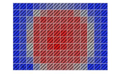
Thanks a lot for getting back to me. By doing what you suggested, we get all the square box selected but there are not the number inside. I attached the result of doing your procedure. In addition to this I use your procedure for builing a non map shape graph and it work i.e. I can see the values of the point inside the graph. Looks like as soon I transform my column in Map role using an external file for the Shape name use option something goes wrong.
Any other suggestion?
Thanks again
Kind regards
Marco
- Mark as New
- Bookmark
- Subscribe
- Mute
- Subscribe to RSS Feed
- Get Direct Link
- Report Inappropriate Content
Re: How to show the value in a colour map shape graph
Hi Marco,
Thank you for attaching the image of your result. I see there are some 0 labels on the left bottom 3 squares. This combined with the note that you can see the labeling when it is not a map shape leads me to believe it may have to do with the font size of the labels in your map fitting into the squares. To determine if this is the cause, when in your map try going to the Windows menu>Font Size>Decrease Font Size and decrease the font size a couple of times. Alternatively you can use the keyboard shortcut of Ctrl-Shift-Minus. Do your labels now start to appear?
If this works for you, you can control the label size directly by going to File>Preferences>Fonts. The labels are controlled by the text font.
-Olivia
- Mark as New
- Bookmark
- Subscribe
- Mute
- Subscribe to RSS Feed
- Get Direct Link
- Report Inappropriate Content
Re: How to show the value in a colour map shape graph
Dear Olivia
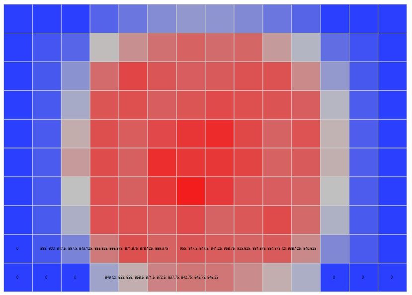
Thanks once again for gettig back to me. By decreasing the font size using Ctr-shift-minus, other number appears but unfortunately they do not go inside the other squares. I attached the image, the 0 sems to be ok but the rest is not.
Any other suggestion?
Sorry again for asking this.
Thanks in advance
regards
Marco
- Mark as New
- Bookmark
- Subscribe
- Mute
- Subscribe to RSS Feed
- Get Direct Link
- Report Inappropriate Content
Re: How to show the value in a colour map shape graph
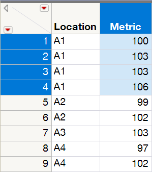
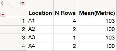
Do you have multiple rows in your datatable per location on your map shape? For instance, like the example table below which is giving the labeling of 100; 103(2); 106 for A1.
To label by the average of the location, create a summary table at the location level by placing the location variable in the group spot under Tables>Summary. This will give you the example table below. Make sure the column of the metric is formatted to the correct decimal place you would like to display in the label.
-Olivia
- Mark as New
- Bookmark
- Subscribe
- Mute
- Subscribe to RSS Feed
- Get Direct Link
- Report Inappropriate Content
Re: How to show the value in a colour map shape graph
Dear Olivia
I created a summary table but the problem is I do not manage to put the Map shape in it. I am trying but I am a bit lost.
I attached my data in case you would like to try to plot them.
Please do not feel obligated to do so. I am writing this because is two days that I try to figure out how to make this graph and it start to became a bit frustrating.
Thanks again for your time
Kind regards
Marco Candelaresi
- Mark as New
- Bookmark
- Subscribe
- Mute
- Subscribe to RSS Feed
- Get Direct Link
- Report Inappropriate Content
Re: How to show the value in a colour map shape graph
Dear Olivia
I manage to make it work, I used tabulate and statistical max and group by my first column. Thansk again for all you advices.
Kind regards
Marco
Recommended Articles
- © 2025 JMP Statistical Discovery LLC. All Rights Reserved.
- Terms of Use
- Privacy Statement
- Contact Us

