- New to JMP? Let the Data Analysis Director guide you through selecting an analysis task, an analysis goal, and a data type. Available now in the JMP Marketplace!
- See how to install JMP Marketplace extensions to customize and enhance JMP.
- Subscribe to RSS Feed
- Mark Topic as New
- Mark Topic as Read
- Float this Topic for Current User
- Bookmark
- Subscribe
- Mute
- Printer Friendly Page
Discussions
Solve problems, and share tips and tricks with other JMP users.- JMP User Community
- :
- Discussions
- :
- Re: How to set min/max colour gradient for cell plot
- Mark as New
- Bookmark
- Subscribe
- Mute
- Subscribe to RSS Feed
- Get Direct Link
- Report Inappropriate Content
How to set min/max colour gradient for cell plot
Hello,
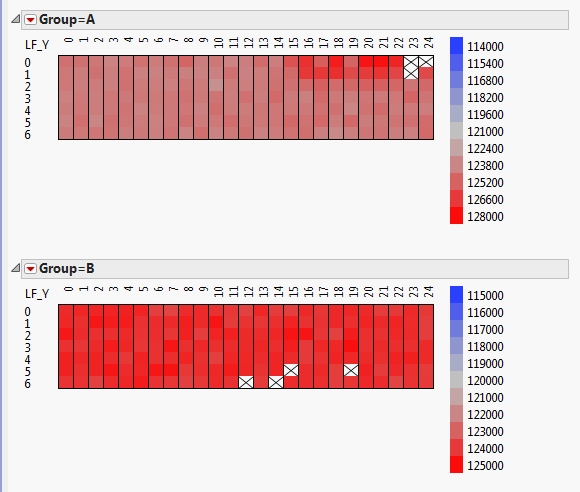
I have cell plots from a table, in groups.
The cells are coloured by gradient according to the min/max in a group; each group has a different min/max.
Is it possible to set each group to have the same min/max colour gradient?
Thank you in advance
- Mark as New
- Bookmark
- Subscribe
- Mute
- Subscribe to RSS Feed
- Get Direct Link
- Report Inappropriate Content
Re: How to set min/max colour gradient for cell plot
You can also get what you want by changing the Modeling Type to Nominal, and then set the cell color in a script, based upon the scaling and coloring you want.
- Mark as New
- Bookmark
- Subscribe
- Mute
- Subscribe to RSS Feed
- Get Direct Link
- Report Inappropriate Content
Re: How to set min/max colour gradient for cell plot
Dear Jim,
This kind of plot would do the trick of multiple Y axes
However the scaling problem mentioned by charleslean is not easily overcome!
Is there a script I can use, because 1) uniform scaling does not work since it makes the range too wide and 2) I did not understand how to implement cell color according to nominal modeling.
Here is the cell plot script output from the dialog menu:
Cell Plot(
Scale Uniformly( 1 ), // Ideally there should be a way to set max and min range for the color plot here
Center at zero( 1 ),
Y( :Name( "% of transcript" ) ),
X( :Function Class ),
Label( :Gene Ontology, :Function ),
Legend( 1 ),
SendToReport(
Dispatch( {}, "Cell Plot Report", FrameBox, {Frame Size( 616, 106 )} ),
Dispatch( {}, "Cell Plot Report", FrameBox( 3 ), {Frame Size( 616, 106 )} ),
Dispatch( {}, "Cell Plot Report", FrameBox( 5 ), {Frame Size( 616, 106 )} ),
Dispatch( {}, "", NumberColBox, {Set Format( "Fixed Dec", 6, 0 )} )
)
);
Your wizardry would be greatly appreciated!
Best, ezra
- Mark as New
- Bookmark
- Subscribe
- Mute
- Subscribe to RSS Feed
- Get Direct Link
- Report Inappropriate Content
Re: How to set min/max colour gradient for cell plot
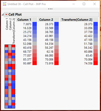
You can accomplish the graph colorization the way you want, by creating a transform column. In the example below, the data table has Column 1 with a range of 7.3-93.9, while Column 2 has a range of 28.4-73.9. As can be seen in the Cell plot, the color patterns are very different for ranges of Column 1 and Column 2. However, when Column 2 is transformed, the color ranges are the same.
The key is to create the transform column using the following formula
If(
	:Column 1 < 25, x = Col Min( :Column 2 ),
	:Column 1 > 75, x = Col Max( :Column 2 ),
	x = :Column 1
);
x;
From a scripting standpoint, if you wanted to create a Cell Plot on Column 1 and Column 2, but restrict the color rage to the smaller range from Column 2, here is the script that would do that
Cell Plot(
	Scale Uniformly( 0 ),
	Center at zero( 0 ),
	Y(
		:Column 2,
		Transform Column(
			"Transform[Column 2]",
			Formula(
				If(
					:Column 1 < 25, x = Col Min( :Column 2 ),
					:Column 1 > 75, x = Col Max( :Column 2 ),
					x = :Column 1
				);
				x;
			)
		)
	),
	Legend( 1 )
);- Mark as New
- Bookmark
- Subscribe
- Mute
- Subscribe to RSS Feed
- Get Direct Link
- Report Inappropriate Content
Re: How to set min/max colour gradient for cell plot
Dear Jim,
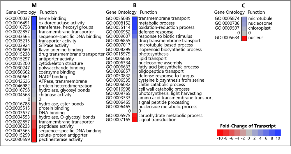
As a matter of fact I did something very similar! I manually changed the extreme values to a max and min of 10 and -10, respectively. That way the legend is the same for all graphs. and I preserve sensitivity to changes that are close to the middle (0) Here is the result:
This is a publication ready graph after much manipulation. I really wish there was more integration between the cell plot which creates nicely standardized color maps and graph builder functionality (e.g. legend labels etc)
thanks again for your help,
Recommended Articles
- © 2026 JMP Statistical Discovery LLC. All Rights Reserved.
- Terms of Use
- Privacy Statement
- Contact Us


