- New to JMP? Let the Data Analysis Director guide you through selecting an analysis task, an analysis goal, and a data type. Available now in the JMP Marketplace!
- See how to install JMP Marketplace extensions to customize and enhance JMP.
- Subscribe to RSS Feed
- Mark Topic as New
- Mark Topic as Read
- Float this Topic for Current User
- Bookmark
- Subscribe
- Mute
- Printer Friendly Page
Discussions
Solve problems, and share tips and tricks with other JMP users.- JMP User Community
- :
- Discussions
- :
- Re: How to plot individual peak fit curves on histogram (fitted 2 normal mixture...
- Mark as New
- Bookmark
- Subscribe
- Mute
- Subscribe to RSS Feed
- Get Direct Link
- Report Inappropriate Content
How to plot individual peak fit curves on histogram (fitted 2 normal mixture)
Hello,
I have a data set which contains multiple peaks, which I am able to fit nicely using the histogram plot's Fitted Normal 2 Mixture option. This outputs the mean and sigma for each peak as well as the weights as numeric values and overlays the fit curve over the histogram. Is there a way to visualize the individual peak fits overlaid on the histogram as well?
Thanks!
Denny
Accepted Solutions
- Mark as New
- Bookmark
- Subscribe
- Mute
- Subscribe to RSS Feed
- Get Direct Link
- Report Inappropriate Content
Re: How to plot individual peak fit curves on histogram (fitted 2 normal mixture)
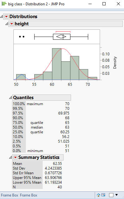
There are a couple of ways to do this. Both require the adding of JSL to your code. Method 1, is to Right Click on the graph, and select "Customize...". This will allow you to modify the graph, or to add to it. If you Click on the "+" it will allow you to add a script, and one of the Samples allows for the creation of a normal curve. With some knowlege of plotting using the Y Function and the Normal Density function, you could add in such a curve.
Below is an example of adding JSL to a script to generate 2 normal curves on top of the sample data. The Add Graphics Script() function does the work. I took a couple of shortcuts by hard coding in the 2 different means and standard deviations and also, the scale factors based upon the total number of data points divided by the data points for the maximum bar in the histogram distribution. These data values would have to be calculated within any given script, based upon what exactly you are proposing.
Names Default To Here( 1 );
dt = Open( "$SAMPLE_DATA\Big Class.jmp" );

Dis = dt << Distribution(
	Continuous Distribution( Column( :height ), Vertical( 0 ), Density Axis( 1 ) )
);

Report( Dis )[Frame Box( 2 )] << Add Graphics Script(
	mu = 63;
	sigma = 3.2;
	Pen Color( "Red" );
	Y Function( Normal Density( (x - mu) / sigma ) / (40 / 12), x );

	mu = 51.5;
	sigma = .87;
	Pen Color( "Blue" );
	Y Function( Normal Density( (x - mu) / sigma ) / (40 / 2), x );
);
The code that is within the Add Graphics Script() function is the same code that you would add to the script if you choose the Customize... option
- Mark as New
- Bookmark
- Subscribe
- Mute
- Subscribe to RSS Feed
- Get Direct Link
- Report Inappropriate Content
Re: How to plot individual peak fit curves on histogram (fitted 2 normal mixture)
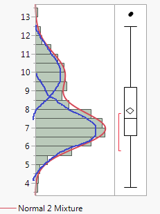
This distribution platform can show the curve fit:
dt = New Table( "Two Peaks",
	Add Rows( 500 ),
	New Column( "Column 1",
		Numeric, "Continuous", Format( "Best", 12 ),
		Formula(
			If( Random Uniform() > 0.3,
				Random Normal( 5 ),
				Random Normal( 10 )
			)
		)
	)
);

dist =Distribution(
	Continuous Distribution(
		Column( :Column 1 ),
		Fit Distribution( Normal Mixtures( Clusters( 2 ) ) )
	)
);- Mark as New
- Bookmark
- Subscribe
- Mute
- Subscribe to RSS Feed
- Get Direct Link
- Report Inappropriate Content
Re: How to plot individual peak fit curves on histogram (fitted 2 normal mixture)
Hi ih,
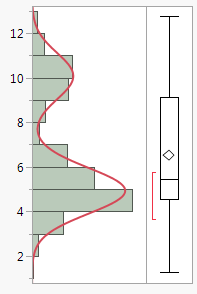
I did see the option to display the overall curve fit but not the individual peaks. Here is what I want to output (excuse my crude drawing):
Thanks!
- Mark as New
- Bookmark
- Subscribe
- Mute
- Subscribe to RSS Feed
- Get Direct Link
- Report Inappropriate Content
Re: How to plot individual peak fit curves on histogram (fitted 2 normal mixture)
There are a couple of ways to do this. Both require the adding of JSL to your code. Method 1, is to Right Click on the graph, and select "Customize...". This will allow you to modify the graph, or to add to it. If you Click on the "+" it will allow you to add a script, and one of the Samples allows for the creation of a normal curve. With some knowlege of plotting using the Y Function and the Normal Density function, you could add in such a curve.
Below is an example of adding JSL to a script to generate 2 normal curves on top of the sample data. The Add Graphics Script() function does the work. I took a couple of shortcuts by hard coding in the 2 different means and standard deviations and also, the scale factors based upon the total number of data points divided by the data points for the maximum bar in the histogram distribution. These data values would have to be calculated within any given script, based upon what exactly you are proposing.
Names Default To Here( 1 );
dt = Open( "$SAMPLE_DATA\Big Class.jmp" );

Dis = dt << Distribution(
	Continuous Distribution( Column( :height ), Vertical( 0 ), Density Axis( 1 ) )
);

Report( Dis )[Frame Box( 2 )] << Add Graphics Script(
	mu = 63;
	sigma = 3.2;
	Pen Color( "Red" );
	Y Function( Normal Density( (x - mu) / sigma ) / (40 / 12), x );

	mu = 51.5;
	sigma = .87;
	Pen Color( "Blue" );
	Y Function( Normal Density( (x - mu) / sigma ) / (40 / 2), x );
);
The code that is within the Add Graphics Script() function is the same code that you would add to the script if you choose the Customize... option
- Mark as New
- Bookmark
- Subscribe
- Mute
- Subscribe to RSS Feed
- Get Direct Link
- Report Inappropriate Content
Re: How to plot individual peak fit curves on histogram (fitted 2 normal mixture)
- Mark as New
- Bookmark
- Subscribe
- Mute
- Subscribe to RSS Feed
- Get Direct Link
- Report Inappropriate Content
Re: How to plot individual peak fit curves on histogram (fitted 2 normal mixture)
Hello @txnelson,
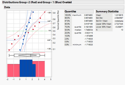
Can something similar be done on the normal quantile plot? I'd like to produce something like the attached (two separate modes) but do it in an automated (reproducible way), not just using Edit > Copy Frame contents and Edit Paste Frame contents after adding customizations to one graph and pasting them into another graph.
- Mark as New
- Bookmark
- Subscribe
- Mute
- Subscribe to RSS Feed
- Get Direct Link
- Report Inappropriate Content
Re: How to plot individual peak fit curves on histogram (fitted 2 normal mixture)
Hi, I tried out this technique using (as described in the post)
dist =Distribution( Continuous Distribution(
Column( :Column 1 ),
Fit Distribution( Normal Mixtures( Clusters( 2 ) ) ) ));
for another data datable of my own and it works nicely. However I want to be able to grab the parameter estimates using <<Make into Data Table, but was unable to find the correct syntax for it.
I used
Fit Distribution( Normal Mixtures( Clusters( 2 ) ) ) ))<<Make into Data table;I've probably made some elemental error, but cannot find it.
Further should I succeed, with kind help from the Community, I would very much like to learn how to include by-parameter values, should I have used that (I have to perform this analysis for many sub sets in the data table).
Thanks very much in advance.
Poul Ravn Sørensen
- Mark as New
- Bookmark
- Subscribe
- Mute
- Subscribe to RSS Feed
- Get Direct Link
- Report Inappropriate Content
Re: How to plot individual peak fit curves on histogram (fitted 2 normal mixture)
Try this:
Names Default To Here( 1 );
platform = Data Table( "Big Class.jmp" ) <<
Distribution(
	Continuous Distribution(
		Column( :height ),
		Fit Distribution( Normal Mixtures( Clusters( 2 ) ) )
	)
);
Wait( 0 );
Report( platform )[Outline Box( "Distributions" )][Outline Box( "height" )][
Outline Box( "Fitted Normal 2 Mixture" )][Outline Box( "Parameter Estimates" )][
Table Box( 1 )] << Make Into Data Table;
and here it is with a By column:
Names Default To Here( 1 );
platform = Data Table( "Big Class.jmp" ) <<
Distribution(
	Continuous Distribution(
		Column( :height ),
		Fit Distribution( Normal Mixtures( Clusters( 2 ) ) )
	),
	by(:sex)
);
Wait( 0 );
Report( platform[1] )[Outline Box( 1 )][Outline Box( "height" )][
Outline Box( "Fitted Normal 2 Mixture" )][Outline Box( "Parameter Estimates" )][
Table Box( 1 )] << Make Combined Data Table;
The difference with a By column is that "platform" now has a list of platforms, not a single platform. So, we have to index into with a [1] to get the first entry in the list. Also, the first outline box in the report now has a by group value in it. So, its easier to indext to it by number instead of name.
Recommended Articles
- © 2026 JMP Statistical Discovery LLC. All Rights Reserved.
- Terms of Use
- Privacy Statement
- Contact Us


