Turn on suggestions
Auto-suggest helps you quickly narrow down your search results by suggesting possible matches as you type.
- JMP will suspend normal business operations for our Winter Holiday beginning on Wednesday, Dec. 24, 2025, at 5:00 p.m. ET (2:00 p.m. ET for JMP Accounts Receivable).
Regular business hours will resume at 9:00 a.m. EST on Friday, Jan. 2, 2026. - We’re retiring the File Exchange at the end of this year. The JMP Marketplace is now your destination for add-ins and extensions.
Options
- Subscribe to RSS Feed
- Mark Topic as New
- Mark Topic as Read
- Float this Topic for Current User
- Bookmark
- Subscribe
- Mute
- Printer Friendly Page
Discussions
Solve problems, and share tips and tricks with other JMP users.- JMP User Community
- :
- Discussions
- :
- How to plot different spec limit for different group
- Mark as New
- Bookmark
- Subscribe
- Mute
- Subscribe to RSS Feed
- Get Direct Link
- Report Inappropriate Content
How to plot different spec limit for different group
Jan 7, 2019 06:23 PM
(6442 views)
For example: I have a data table including 2 columns:
Value Group
12 1
65 2
13 1
67 2
Group 1 and Group 2 has different spec limits. How can I set them up and plot the corret spec limit in Graphic builder?
Thanks!
2 REPLIES 2
- Mark as New
- Bookmark
- Subscribe
- Mute
- Subscribe to RSS Feed
- Get Direct Link
- Report Inappropriate Content
Re: How to plot different spec limit for different group
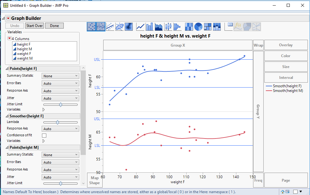
Here is one method for doing what you want. It envolves splitting the data into separate columns, and then setting spec limits for the split columns. Finally the data are plotted using Graph Builder.
names default to here(1);
dt=open("$SAMPLE_DATA/big class.jmp");

dtSplit = dt << Split(
	Split By( :sex ),
	Split( :height, :weight ),
	Remaining Columns( Drop All ),
	Sort by Column Property
);

dtSplit:Name("Height F") << set property("spec limits",{LSL( 57 ), USL( 65 ), Show Limits( 1 )});
dtSplit:Name("Height M") << set property("spec limits",{LSL( 60 ), USL( 70 ), Show Limits( 1 )});

Graph Builder(
	Variables( X( :weight F ), Y( :height F ), Y( :height M ) ),
	Elements(
		Position( 1, 1 ),
		Points( X, Y, Legend( 57 ) ),
		Smoother( X, Y, Legend( 58 ) )
	),
	Elements(
		Position( 1, 2 ),
		Points( X, Y, Legend( 59 ) ),
		Smoother( X, Y, Legend( 60 ) )
	)
);
You could also just specify to add reference lines to the Graph Builder platform, based upon the different spec limits.
Jim
- Mark as New
- Bookmark
- Subscribe
- Mute
- Subscribe to RSS Feed
- Get Direct Link
- Report Inappropriate Content
Re: How to plot different spec limit for different group
If you don't want to split your data table, you can use the Process Screening platform (This platform can use your data table as it is currently set up). I have a blog post that details how to do this.
Recommended Articles
- © 2026 JMP Statistical Discovery LLC. All Rights Reserved.
- Terms of Use
- Privacy Statement
- Contact Us


