- New to JMP? Let the Data Analysis Director guide you through selecting an analysis task, an analysis goal, and a data type. Available now in the JMP Marketplace!
- See how to install JMP Marketplace extensions to customize and enhance JMP.
- Subscribe to RSS Feed
- Mark Topic as New
- Mark Topic as Read
- Float this Topic for Current User
- Bookmark
- Subscribe
- Mute
- Printer Friendly Page
Discussions
Solve problems, and share tips and tricks with other JMP users.- JMP User Community
- :
- Discussions
- :
- Re: How to extract values from an analysis and plot on the original graph?
- Mark as New
- Bookmark
- Subscribe
- Mute
- Subscribe to RSS Feed
- Get Direct Link
- Report Inappropriate Content
How to extract values from an analysis and plot on the original graph?
I have a graph of voltage against current from this I have ran a standard least squares analysis which has a data filter for different target values (I have attached the analysis). I want to plot the value from each target values regression plot back on to the original graph.
Any help is appreciated.
Here is the code for the data fit and standard least squares (not sure if it is useful to answer the question):
Data Table("Sorted") << Data Filter(
	Location({890, 387}),
	Mode(Show(1)),
	Mode(Include(1)),
	Add Filter(
		columns(:Segment),
		Where(:Segment == -100),
		Display(:Segment, N Items(target_values))
	)
);

Data Table("Sorted") << Fit Model(
	SendToByGroup(Bygroup Default),
	Y(:VCE),
	By(:Source Table 2),
	Effects(:ICE),
	Personality("Standard Least Squares"),
//Emphasis( "Effect Leverage" ),
	Run(
		:VCE << {Summary of Fit(0), Analysis of Variance(0), Parameter Estimates(0),
		Lack of Fit(0), Scaled Estimates(0), Plot Actual by Predicted(0),
		Plot Residual by Predicted(0), Plot Studentized Residuals(0), Plot Effect Leverage(0),
		Plot Residual by Normal Quantiles(0), Box Cox Y Transformation(0)}
	),
	Automatic Recalc(1)
);
- Mark as New
- Bookmark
- Subscribe
- Mute
- Subscribe to RSS Feed
- Get Direct Link
- Report Inappropriate Content
Re: How to extract values from an analysis and plot on the original graph?
If I understand correctly you might be able to create the data you need by adding some of the possible formula columns (hold Ctrl when you click on the red triangle to broadcast it to all groups as you are using By column)
If you want to get all possible values you can change with Data Filter, you might have to add that column also as by variable
- Mark as New
- Bookmark
- Subscribe
- Mute
- Subscribe to RSS Feed
- Get Direct Link
- Report Inappropriate Content
Re: How to extract values from an analysis and plot on the original graph?
The save columns wont work for this as the wanted value isn't on of those I believe.
I need to take the value of this line at (in this case) - 10. I need to take the values for all the target values for all the temperatures. Then plot these values as dots on top of the original graph.
- Mark as New
- Bookmark
- Subscribe
- Mute
- Subscribe to RSS Feed
- Get Direct Link
- Report Inappropriate Content
Re: How to extract values from an analysis and plot on the original graph?
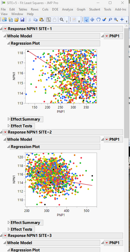
Here is an example using the semiconductor capability data table. The data points being plotted are not as organized as your data, however, the example show how to plot all data points on the Regression Plot
Names Default To Here( 1 );
dt =
// Open Data Table: semiconductor capability.jmp
// → Data Table( "semiconductor capability" )
Open( "$SAMPLE_DATA/semiconductor capability.jmp" );
dt:wafer << modeling type( ordinal );

Data Table( "Semiconductor Capability" ) << Data Filter(
	Location( {890, 387} ),
	Mode( Show( 1 ) ),
	Mode( Include( 1 ) ),
	Add Filter(
		columns( :wafer ),
		Where( :wafer == 1 ),
		Display( :wafer )//, N Items(target_values))
	)
);

fm = Data Table( "Semiconductor Capability" ) << Fit Model(
	SendToByGroup( Bygroup Default ),
	Y( :NPN1 ),
	By( :Site ),
	Effects( :PNP1 ),
	Personality( "Standard Least Squares" ),
//Emphasis( "Effect Leverage" ),
	Run(
		:NPN1 << {Summary of Fit( 0 ), Analysis of Variance( 0 ), Parameter Estimates( 0 ), Lack of Fit( 0 ),
		Scaled Estimates( 0 ), Plot Actual by Predicted( 0 ), Plot Residual by Predicted( 0 ),
		Plot Studentized Residuals( 0 ), Plot Effect Leverage( 0 ), Plot Residual by Normal Quantiles( 0 ),
		Box Cox Y Transformation( 0 )}
	),
	Automatic Recalc( 1 )
);

Summarize( byvals = by( :site ) );
For Each( {level}, byvals,
	fmr = Report( fm[Num( level )] );
	fmr["Regression Plot", framebox( 1 )] << add graphics script(

		theVals = dt:NPN2 << get values;
		For Each( {val, theRow}, theVals,
			colorList = {"Red", "Green", "Blue", "Orange", "Yellow"};
			x = "fill color( \!"" || Char( Eval( colorList[dt:site[theRow]] ) ) || "\!");";
			Eval( Parse( x ) );
			thematrix = {};
			Insert Into( thematrix, dt:PNP1[theRow] );
			Insert Into( thematrix, val );
			Transparency( 1 );
			Circle( PixelRadius( 3 ), thematrix, "FILL" );
		);
	);
);
Recommended Articles
- © 2026 JMP Statistical Discovery LLC. All Rights Reserved.
- Terms of Use
- Privacy Statement
- Contact Us


