- New to JMP? Let the Data Analysis Director guide you through selecting an analysis task, an analysis goal, and a data type. Available now in the JMP Marketplace!
- See how to install JMP Marketplace extensions to customize and enhance JMP.
- Subscribe to RSS Feed
- Mark Topic as New
- Mark Topic as Read
- Float this Topic for Current User
- Bookmark
- Subscribe
- Mute
- Printer Friendly Page
Discussions
Solve problems, and share tips and tricks with other JMP users.- JMP User Community
- :
- Discussions
- :
- How to do a funnel plot?
- Mark as New
- Bookmark
- Subscribe
- Mute
- Subscribe to RSS Feed
- Get Direct Link
- Report Inappropriate Content
How to do a funnel plot?
I wonder how to do a funnel plot. I would like to be able to do a funnel plot answering the following problem which I describe here.
In Sweden there are different counties. In all the counties they operate cholecystectomies for which there are two main indications cholecystitis or colic. We believe that the frequency of cholecystectomies with cholecystitis, which is more difficult to operate and has more complications, differ significantly between the different counties or regions. I would like to, in a funnel plot, plot the proportion of cholecystitis indication for each different county but I do not know exactly how to do it.
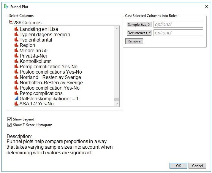
I found on the web a funnel plot add In but I do not exactly understand how to use it:
See enclosed photo
Here below is an example of file:
Region Indication Cholecystitis=1
A Cholecystitis 1
B Colic 0
D Colic 0
A Cholecystitis 1
B Cholecystitis 1
C Colic 0
Etc.
I would appreciate if you could tell me if it is possible to do in JMP and if so how I should do it.
Sincerely yours
Lars
Accepted Solutions
- Mark as New
- Bookmark
- Subscribe
- Mute
- Subscribe to RSS Feed
- Get Direct Link
- Report Inappropriate Content
Re: How to do a funnel plot?
Sorry. I am not the author of this add-in. I don't use funnel plots or this add-in.
It is a simple scatter plot. Your data set must be arranged with the sample size in one column and the corresponding occurrences (count) in another column. It does not provide any way to account for groups. I think that such levels are represented by the rows. That is, the rows represent the groupings that are meaningful to you. So you could use the Tables > Summary command to create the data table for the add-in if your raw data are single observations. You can group by Region and sub-group by Indication. You will automatically get N counts. You can then add a column with a formula to sum N for both indications. The funnel plot will then use the sum for the total and the N for the indication of interest for occurrences.
- Mark as New
- Bookmark
- Subscribe
- Mute
- Subscribe to RSS Feed
- Get Direct Link
- Report Inappropriate Content
Re: How to do a funnel plot?
A search in the JMP Community returned this contributed add-in for funnel plots.
- Mark as New
- Bookmark
- Subscribe
- Mute
- Subscribe to RSS Feed
- Get Direct Link
- Report Inappropriate Content
Re: How to do a funnel plot?
Thank you for the advice for the automatic search for the Funnel Plot add-in. However, I already found that add-in the problem is that when I use it the way I supposed that I should use it I do not get the reply I expected - in fact I did only get a skeleton of a graph but without any dots so obvioulsy I get it wrong. The original file as an example is shown below:
Here below is an example of file:
Region Indication Cholecystitis=1
A Cholecystitis 1
B Colic 0
D Colic 0
A Cholecystitis 1
B Cholecystitis 1
C Colic 0
Etc.
The question is could I get the proportions of cholecystitis plotted against the different regions from this table using the Funnel Plot AddIn or should I reorganize a new table in a somwhat different fashion in order to use the Funnel Plot AddIn?
Sincerely yours
Lars Enochsson
Professor of Surgery
- Mark as New
- Bookmark
- Subscribe
- Mute
- Subscribe to RSS Feed
- Get Direct Link
- Report Inappropriate Content
Re: How to do a funnel plot?
Sorry. I am not the author of this add-in. I don't use funnel plots or this add-in.
It is a simple scatter plot. Your data set must be arranged with the sample size in one column and the corresponding occurrences (count) in another column. It does not provide any way to account for groups. I think that such levels are represented by the rows. That is, the rows represent the groupings that are meaningful to you. So you could use the Tables > Summary command to create the data table for the add-in if your raw data are single observations. You can group by Region and sub-group by Indication. You will automatically get N counts. You can then add a column with a formula to sum N for both indications. The funnel plot will then use the sum for the total and the N for the indication of interest for occurrences.
Recommended Articles
- © 2026 JMP Statistical Discovery LLC. All Rights Reserved.
- Terms of Use
- Privacy Statement
- Contact Us

