Turn on suggestions
Auto-suggest helps you quickly narrow down your search results by suggesting possible matches as you type.
- JMP will suspend normal business operations for our Winter Holiday beginning on Wednesday, Dec. 24, 2025, at 5:00 p.m. ET (2:00 p.m. ET for JMP Accounts Receivable).
Regular business hours will resume at 9:00 a.m. EST on Friday, Jan. 2, 2026. - We’re retiring the File Exchange at the end of this year. The JMP Marketplace is now your destination for add-ins and extensions.
Options
- Subscribe to RSS Feed
- Mark Topic as New
- Mark Topic as Read
- Float this Topic for Current User
- Bookmark
- Subscribe
- Mute
- Printer Friendly Page
Discussions
Solve problems, and share tips and tricks with other JMP users.- JMP User Community
- :
- Discussions
- :
- How to create a stacked pareto chart?
- Mark as New
- Bookmark
- Subscribe
- Mute
- Subscribe to RSS Feed
- Get Direct Link
- Report Inappropriate Content
How to create a stacked pareto chart?
Apr 4, 2013 10:50 PM
(13244 views)
Example:
Series 1: Numeric data (Quantity)
Series 2: Categorical (Supplier)
Series 3: Categorical (Design)
Would like to have a pareto of Qty(Y axis) by supplier (X axis) with "design" as stacked column. I have JMP9.
1 ACCEPTED SOLUTION
Accepted Solutions
- Mark as New
- Bookmark
- Subscribe
- Mute
- Subscribe to RSS Feed
- Get Direct Link
- Report Inappropriate Content
Re: How to create a stacked pareto chart?
Created:
Aug 31, 2015 10:30 AM
| Last Modified: Oct 18, 2016 5:30 PM
(14308 views)
| Posted in reply to message from jy8 08-31-2015
3 REPLIES 3
- Mark as New
- Bookmark
- Subscribe
- Mute
- Subscribe to RSS Feed
- Get Direct Link
- Report Inappropriate Content
Re: How to create a stacked pareto chart?
Created:
Aug 27, 2015 06:06 PM
| Last Modified: Oct 18, 2016 5:29 PM
(12749 views)
| Posted in reply to message from rallyjo 04-04-2013
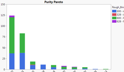
I too have this same question. Doesn't look like it's possible.
I have found a work around by running a summary table and then using graph builder to make the display come out correct, but it would be way nicer if I could easily have a second category in the pareto chart function.
- Mark as New
- Bookmark
- Subscribe
- Mute
- Subscribe to RSS Feed
- Get Direct Link
- Report Inappropriate Content
Re: How to create a stacked pareto chart?
Created:
Aug 31, 2015 10:00 AM
| Last Modified: Oct 18, 2016 5:30 PM
(12749 views)
| Posted in reply to message from rallyjo 04-04-2013
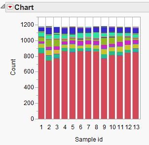
You can use the Chart platform and select the Stack Bars option :
- Mark as New
- Bookmark
- Subscribe
- Mute
- Subscribe to RSS Feed
- Get Direct Link
- Report Inappropriate Content
Re: How to create a stacked pareto chart?
Created:
Aug 31, 2015 10:30 AM
| Last Modified: Oct 18, 2016 5:30 PM
(14309 views)
| Posted in reply to message from jy8 08-31-2015
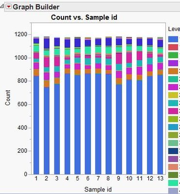
Can also be done with Graph Builder :
Recommended Articles
- © 2025 JMP Statistical Discovery LLC. All Rights Reserved.
- Terms of Use
- Privacy Statement
- Contact Us


